Dorothy Cosonas on the Odyssey Collection
In conversation with the KnollTextiles creative director on her latest designs
Having helmed KnollTextiles as its creative director since 2005, Dorothy Cosonas knows how to multitask. On a recent day at the Knoll New York office, she could be found in a glass-walled conference room, sifting through a dizzying number of fabric boards in preparation for the upcoming New York Textiles Month. Among the many textured swatches scattered across the table, traces of her latest collection for KnollTextiles, from first iteration to final product, could be glimpsed. Introduced in July 2016, the Odyssey Collection is an amalgam of two histories: the modernist, technological bent of Knoll and KnollTextiles, and an older, more personal heritage. Amidst the controlled chaos, Cosonas took a few moments to reflect on the Odyssey Collection and its roots.

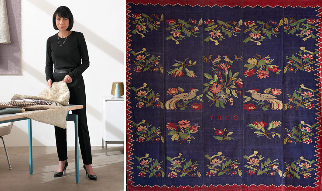
Left: Dorothy Cosonas, Creative Director, KnollTextiles. Right: The original heirloom rug woven for Cosonas' grandmother in 1913 by nuns on the Greek island of Lesbos.
KNOLL INSPIRATION: The source of inspiration for the Odyssey Collection was an heirloom rug. Do you have any specific memories of it?
Dorothy Cosonas: The rug was handwoven by nuns for my grandmother’s dowry the year she was born, which is why the date is woven in. It was never in my mother’s home when she got to the United States; she never had it out, probably for more emotional reasons than anything else. But as a child, we had it stored in the basement and I would look at its colors, trying to convince her to let me play with it outside—my sister and I used it once to create a tent. Then finally, as an adult, she gave it to me, so I have it now in my apartment in New York.
Looking at it, being surrounded by all of the color and pattern and weave structure within this rug—the rest of my apartment is fairly minimalist—it was really the only true pattern in the apartment. I kept looking at it and thinking that this is such a part of my past and the fact that I now have it was important to me. I thought, what could I do? Being responsible for six collections a year at KnollTextiles, we look to many places for inspiration. It can come from fashion, art, nature, history—so this time it’s a little more personal.
Why did you choose the name Odyssey?
Well, it’s somewhat personal again. To me, ‘odyssey’ means a journey: this rug took a journey and my mother certainly had a journey. It’s related to Greek mythology and the written word—the Iliad and the Odyssey. All roads lead back to a Greek ideal. The names are related to the islands that my mother is from or various places within the Aegean area. That’s why there’s Helios, which means the sun; Yeni is an ancient mosque on the island from when the Turks occupied it. Each name has a meaning.
“To me, ‘odyssey’ means a journey: this rug took a journey and my mother certainly had a journey.”
—Dorothy Cosonas

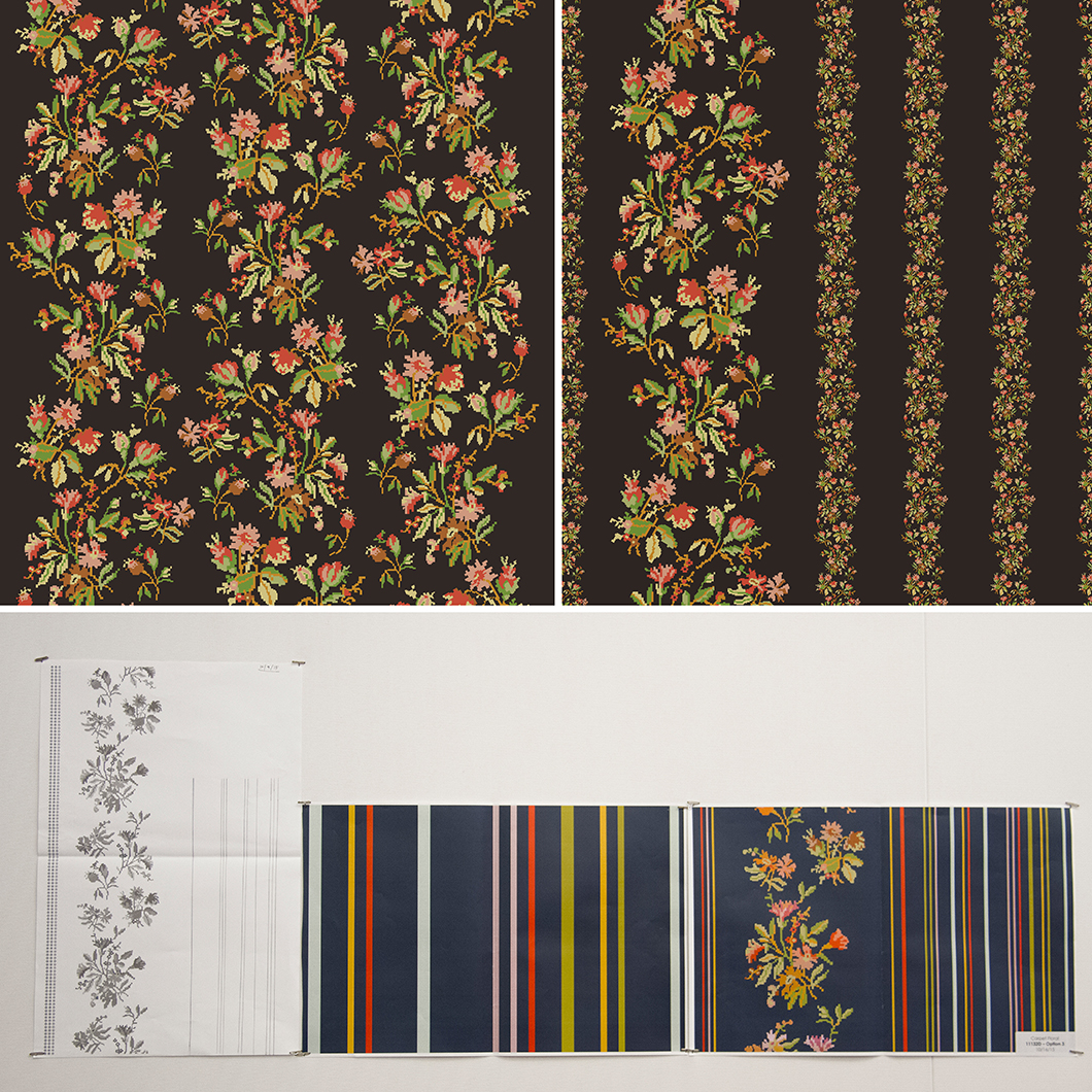
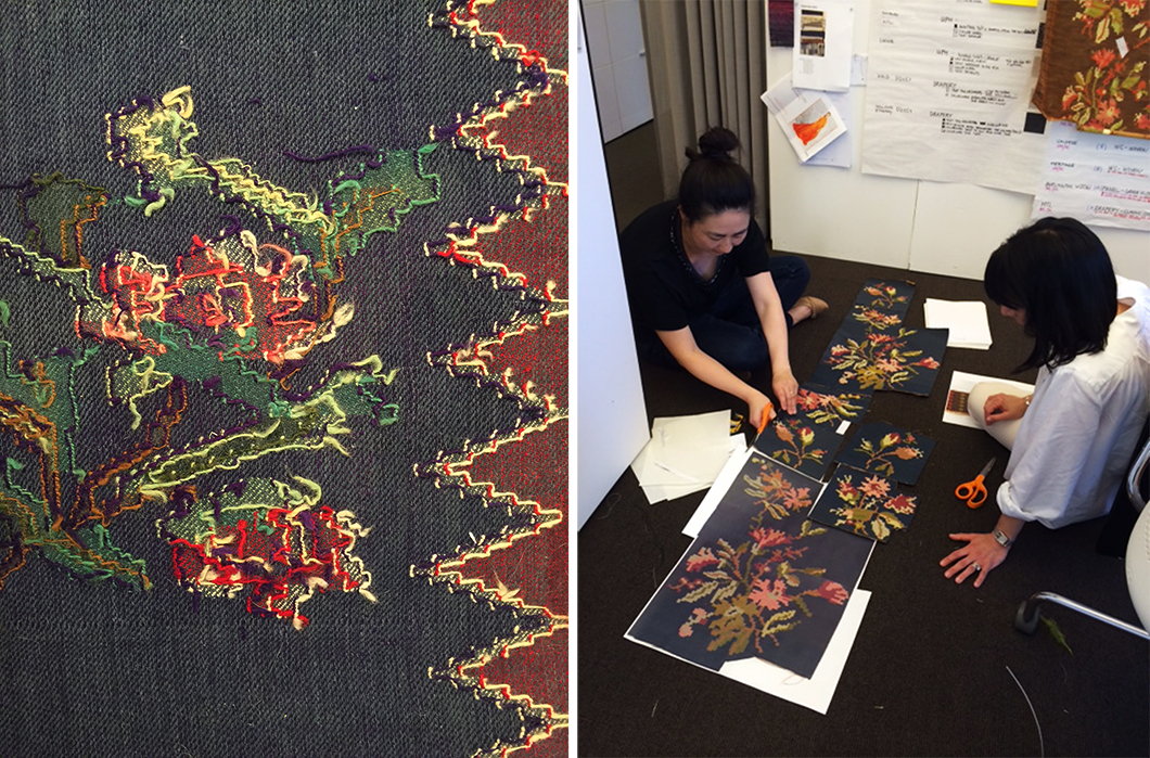
Process work for Andissa.
For Andissa, you take the rug’s older floral pattern and combine it with a more modern set of stripes. What prompted you to blend these patterns and, with them, timescales?
We first pulled out the various floral elements [of the original rug], modified them slightly, and then placed them in an all-over repeat, which was way too busy, way too traditional. So I started asking, what can we do to ‘modernize’ it? We ended up with the next round, [where] you’re giving it moments of space, but it’s still way too traditional. Then we tried smaller floral elements that form real stripes. By then I was getting nervous, saying, there’s no way!
So I was thinking, how do we take this idea and make it, if not ultimately truly modern, more of a transitional approach? This is where we ended up going—I drew the striped element out along with the floral aspect and then Mee Ok [Ryu, senior designer] placed it in the computer and that’s how we ended up where we are. So it’s sort of this [older] idea and also being respectful of where we are. I could never do a traditional idea like [the rug], nor would I want to. It’s not really in our DNA at Knoll; it wouldn’t feel right. You have to constantly work on something within a design until it feels right and it feels like it’s living in the right place.
The pixelated quality of the floral pattern also speaks a little bit to the modernization of the design.
Yes, when you look at how they wove it in the rug, you’re dealing with a plain weave, so it becomes very geometric even though it’s floral. You take that concept and you throw it into a modern loom to create different pixelated or geometric effects. What’s also interesting about Andissa is the various weave structures within the pattern, which make it really beautiful. Between the color, the weave, and the ottoman weave effect on the stripes versus the very subtly textured ground, you’re allowing the floral or stripe elements to look almost as if they’re floating on the surface. So it gives it a depth and dimension, the ability to focus on two different ideas—the material and then the overall pattern and color.
“You have to constantly work on something within a design until it feels right and it feels like it’s living in the right place.”
—Dorothy Cosonas

Left: Detail of the back of the heirloom rug that inspired the collection. Right: Dorothy Cosonas and Mee Ok Ryu at work.
How did you balance the character of the rug as a handmade, one-off object with the more technological, manufacturing-driven focus of KnollTextiles?
By choosing the right mill that can customize the machine. In weaving, you have warp and weft—normally it’s one warp, one weft. On this we did two warps, two wefts, fifteen colors—so you can manipulate weave structure and color placement. In one sense, that’s how you take it to another level. While you’re still working with a modern mill, we asked them to truly customize the weave. When we reorder, they have to take the loom that they wove this on, manipulate it, set it to only this pattern, so nothing else weaves this way at the mill.
Vatera was derived from the woven imperfections of the rug. Can you speak about the value of imperfection in designing textiles?
When you look at this rug, there’s a lot of subtle mistakes—they probably ran out of a yarn here, or one side’s a little bigger than the other. So there’s all of those imperfections. When I brought the rug in and we were looking at it, the back of the rug was really beautiful. You see all of the yarn colors that are even more saturated than they are on the face, probably because it was on a Greek island for many years in the sun, so the back is more concentrated on color. This is what we used to create Vatera.
But about imperfections, I think it just gives something its history and its personality. That’s what’s so wonderful about a handwoven idea, because it will never be [made by a] machine. The imperfections allow it to be that much more of a personal journey than something that’s a truly perfect idea.
“That’s what’s so wonderful about a handwoven idea, because it will never be [made by a] machine. The imperfections allow it to be that much more of a personal journey than something that’s a truly perfect idea.”
—Dorothy Cosonas

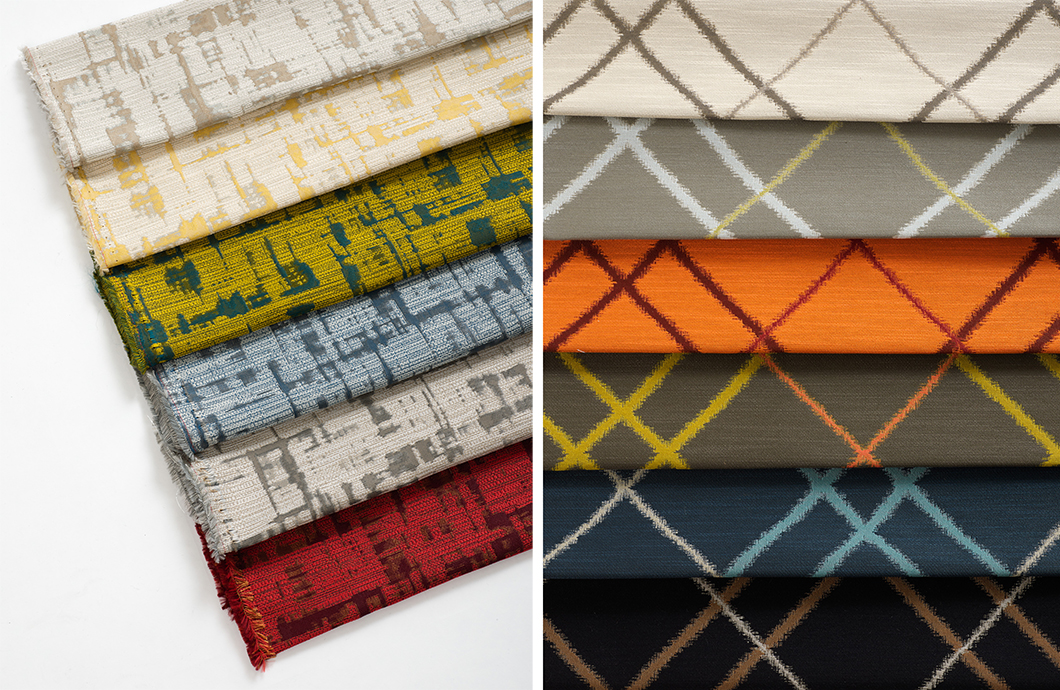
Left: The painterly effect of the Samos drapery. Right: The graphic pattern of the Vatera upholstery.
The Samos drapery involves a complicated layering of colors. How did you arrive at the method of production and the colors in the family?
When you’re talking about a drapery, you always have to think of it on a large scale, how would it read floor-to-ceiling. That’s how you first think about color for vertical use—is it overwhelming, is it soothing, is it neutral, is it dramatic? You think about all of that for a palette. With Samos, it’s a calmer idea, with warm and cool neutrals.
As far as the loom structure is concerned, it’s fairly complicated—a three-layer weave that gives it that painterly, handmade effect again. That was very deliberate, to work with the mill not necessarily to create a custom weave setup as much as work within their weave structures to understand how we could best get a painterly, watercolor effect. To create a pattern that’s busy yet calm.
Heirloom rugs like the one that inspired this collection are more than just beautiful objects, they’re infused with personal meaning and memory. Do you hope that KnollTextiles designs might have a similar kind of intimate value?
At the end of the day, I always say to students that you’re in the beauty business when you’re in the textile business. It’s just like clothing—you’re drawn to something because you say to yourself: “It’s beautiful, I love the colors, I love the pattern, I love the relationship of color, I think it’s going to look great on me.” The same goes with textiles for an interior, in my opinion. It has to speak to you. So, the thought for this collection—along with all the other collections we do at Knoll—is to draw someone in, [to] say yes, this is what speaks to my being of living within a space, whether it’s a corporate environment, hospitality, healthcare, or residential.
I’m still always nervous when I start a new collection; I can’t repeat anything we’ve done. We always have to be looking at each collection as: what’s going to bring the client to this, what’s going to get them excited about it coming from Knoll, does it speak the language of modern design, am I living up to our heritage? I still get really excited when I see any of my work out there. Gosh, someone chose us, someone chose my ideas, Knoll ideas, to put in their space. That’s what gives me the ultimate, “Okay, we’re doing it right.”
