Prior to the pioneering approach of Florence Knoll and the Knoll Planning Unit, executive offices in America were nearly all planned the same way.
Florence Knoll described this standard layout in her 1964 “Commercial Interiors” entry for the Encyclopedia Britannica: “In such an office there was always a diagonally-placed desk, with a table set parallel behind it, a few chairs scattered around the edge of the room, and a glassed in bookcase. The table behind the desk generally became an unsightly storage receptacle.”
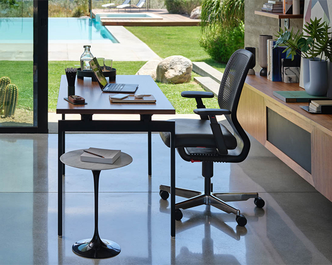
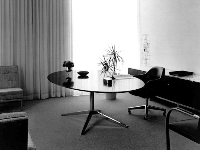
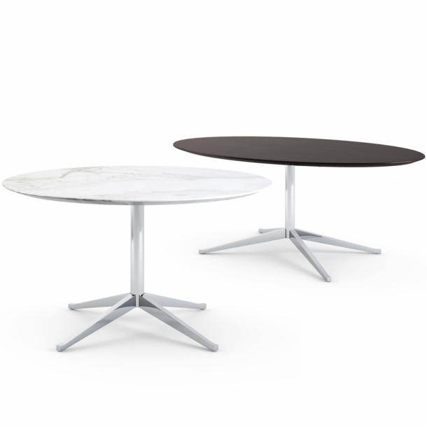
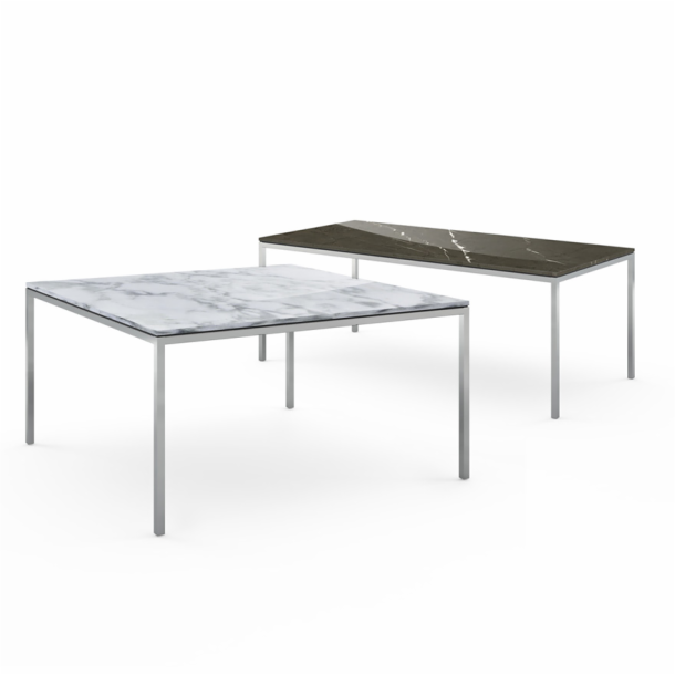
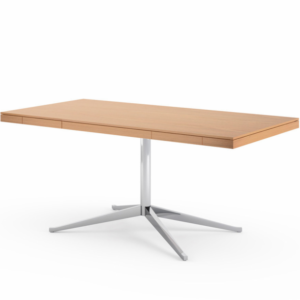
Seeking to create a space better suited to the executive’s primary function — communication — Florence reconsidered the illogical layout from an architectural perspective. She eliminated the imposing desk, replacing it with the more inviting table desk, placed parallel to the back wall. Storage was moved to behind the table in a low, matching credenza.
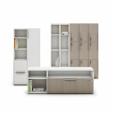
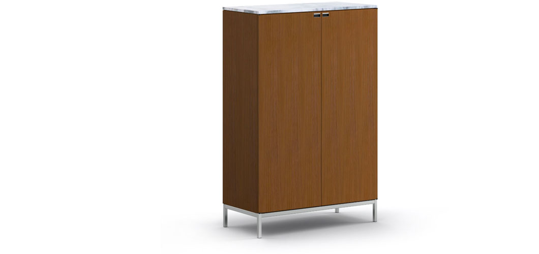
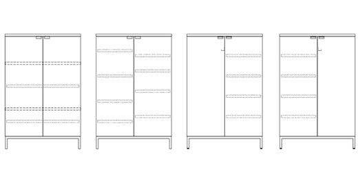
To execute this new layout, Florence introduced the 2544 Credenza in 1961. The elegant design exuded executive quality, and clearly exhibited Mies van der Rohe’s impact on Florence’s approach to design. Design historian Bobbye Tigerman notes that, “the furniture is architecture miniaturized…The structure of a large case balanced on thin peripheral columns recalls Mies’ Seagram Building.” Like Mies, Florence Knoll would endlessly refine each detail of a design in order to achieve simple, seemingly effortless beauty.
