Often, it is the first line of a story that captures the imagination of the public. What accounts for the enduring appeal of that first sentence is in the twofold nature of its promise: not only the beginning of the story, but the distillation of its essence.
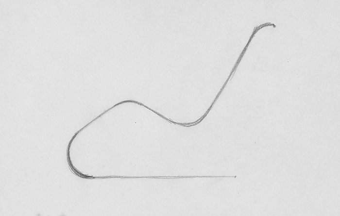
The sketch holds the same appeal for designers. Alan Heller of Heller Corporation, for instance, recalled his amazement at witnessing Massimo Vignelli draw—in a single, uninterrupted gesture—the design for the Vignelli Chair: “Within thirty-seven seconds he’d drawn absolutely everything. That drawing was 99% of the finished product.” At once the rough, crude distillation of an initial idea, when viewed in retrospect, the sketch appears to anticipate the product's fully formed realization.
Given the primacy of the sketch, we've dug into the Knoll Archives to recover the drafts that gave birth to five beloved designs, from Saarinen's Tulip Chair to the Bertoia Diamond Chair.

Sketch for MR Chaise by Ludwig Mies van der Rohe. Image courtesy of The Mies van der Rohe Archive at MoMA.
“I often throw things out I like very much, but when I have a better conviction, a clearer idea, I follow that clearer idea.”
—Mies van der Rohe
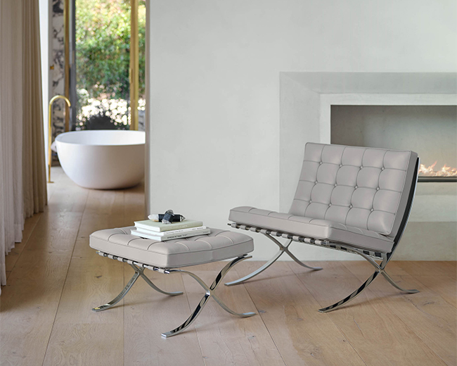
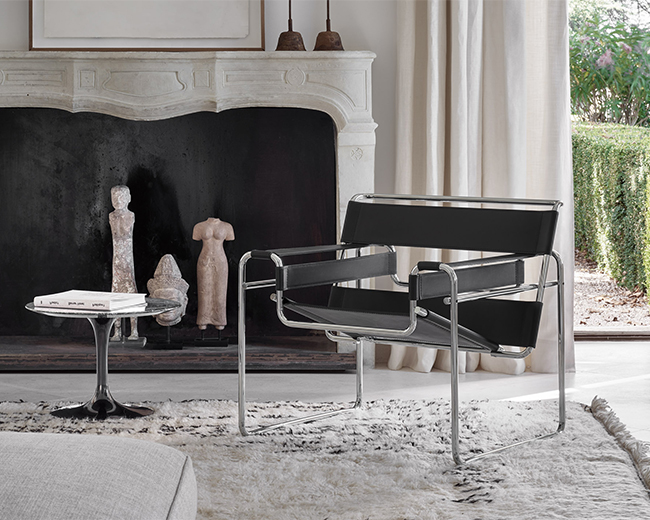
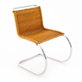
MR Collection by Ludwig Mies van der Rohe, ca. 1929 — The level of identification between the silhouettes of Mies' designs and their final form is, perhaps, unequaled in the annals of design. Mies created such strong graphic compositions that the most simple configurations of lines have become synonymous with his finalized products. "In every one of his designs, from skyscrapers to dining chairs," avers Peter Blake of the Tugendhat House, "Mies reduced each object to its essential elements, and then refined each detail to a point of almost breathtaking beauty and elegance."
Mies' sketches, archived in The Museum of Modern Art, are telling, revealing the designer's exhaustive process and innumerable considerations that testify to his well-documented penchant for perfectionism. "I often throw things out I like very much," Mies explained, "but when I have a better conviction, a clearer idea, I follow that clearer idea. I don't want to be interesting. I want to be good."
With designs like the MR Chaise having attained such iconic status, it can be easy to forget the amount of painstaking revision that went into Mies' work. "His solutions did not spring fully formed," contends design scholar Eric Larrabee, "but were worked out through a series of variations which he never tired of refining." While unmistakably regal in terms of scale and execution, through his work, Mies always aimed to achieve a level of presence and simplicity associated with more humble forms. "A brick," Mies once stated in a lecture, "that's really something. That's really a building."

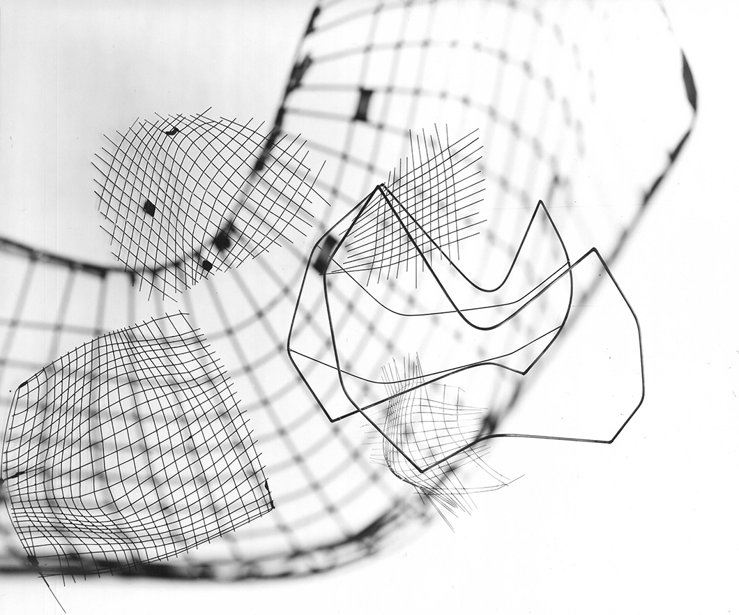
Photo-montage of sketches for the Wire Collection by Harry Bertoia. Photograph by Herbert Matter. Image from the Knoll Archives.
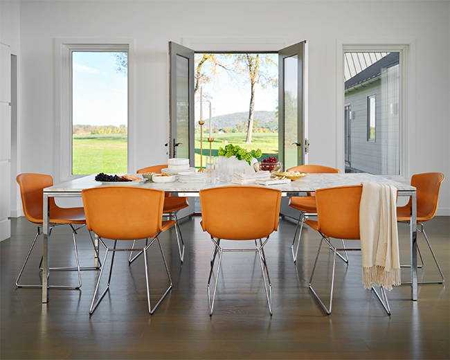
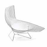
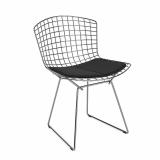
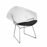
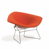
Wire Collection by Harry Bertoia, 1952 — A continuation of Harry Bertoia’s lifelong interest in the potential expression of a line, Bertoia’s wire furniture collection is as sculptural in three dimensions as it is graphic in two dimensions. An accomplished draftsman, Bertoia began by sketching a series of interwoven lines that reference the serial motifs seen in his jewelry and sculptural designs: “I began to think in terms of what I would like as a chair. It started very slowly…I came into rod or wire, whether bent of straight. I seemed to find myself at home . . . One was taking the shape of a side chair; another was beginning to extend to care of the head. This developed to the point where something could be held on to…You know, when you have something in front of you that can really physically be held, it becomes easier to make changes.”
Having finalized the designs, Bertoia turned to the plywood prototypes he’d helped design with Ray & Charles Eames to create the molds and braces still used to bend, mold and assemble the Bertoia Diamond Chair, Side Chair and Bird Chair. “When you don’t have much equipment,” Bertoia explained of his material selection, “you find that wire is a pretty convenient piece of material.”

“Furniture and interiors evolve in organic unity with the building, the thinking of the total concept is carried down to the smallest detail. Hence my interest in furniture.”
—Eero Saarinen
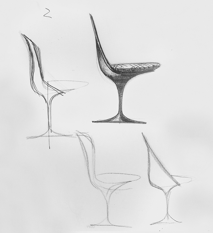
Sketches for the Tulip Chair by Eero Saarinen. Image form the Knoll Archives.
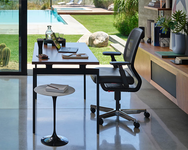
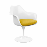
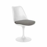
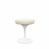
Pedestal Collection by Eero Saarinen, 1958 — As a lifelong friend of Florence Knoll, Eero Saarinen was among the first designers brought to Knoll from Shu’s alma mater, Cranbrook Academy of Art. At Knoll, Saarinen adapted his organic vision for modern architecture to suit the needs of contemporary furniture resulting in the Pedestal Collection, which was released in 1958. When asked to explain the connection between his architecture and his furniture, Saarinen replied, "Furniture and interiors evolve in organic unity with the building, the thinking of the total concept is carried down to the smallest detail. Hence my interest in furniture."
Equally inspired by nature as advances in industrial engineering, Saarinen’s Tulip Chair is as evocative of the flower for which its named as the spirit of progressive optimism that characterized the post-war period.

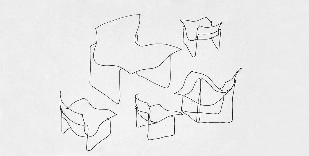
Sketch for the Handkerchief Chair by Lella & Massimo Vignelli. Image form the Knoll Archives.
Handkerchief Chair by Lella & Massimo Vignelli, 1983—Although a truculent modernist, Massimo Vignelli was not without a playful side, as evident in these whimisical sketches he created while working on the Handkerchief Chair. Inspired by the windblown contours of a handkerchief, the design took five years to transpose from paper to product, thanks to a lengthy investigation into the fabrication of compression-molded plastics needed to achieve the light, airy form. Still in production today, the Handkerchief Chair supports Massimo’s claim that, “If you do it right, it will last forever.”

“I wanted the chairs to come out of my own work, the shapes of my buildings.”
—Frank Gehry
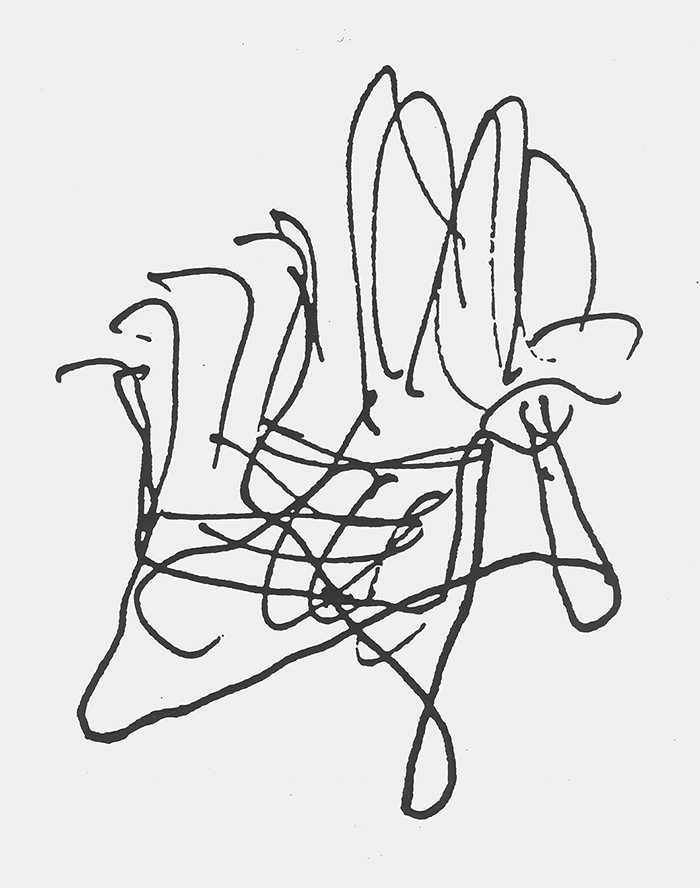
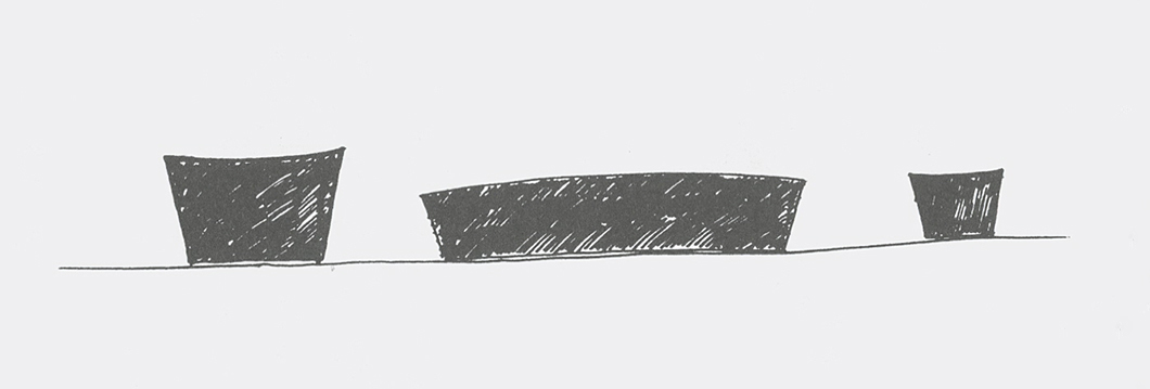
Sketch for the Bentwood Collection by Frank Gehry. Image from the Knoll Archives.
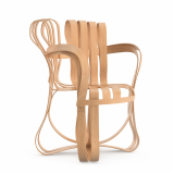
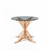
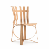
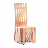
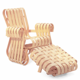
Bentwood Collection by Frank Gehry, 1990 — “Everything I’ve always done has been a reaction against [people’s] usual expectations,” Frank Gehry stated in an interview he gave for the debut of his furniture collection for Knoll, “I wanted the chairs to come out of my own work, the shapes of my buildings.” Indeed, Gehry’s sketches for his Bentwood Collection are as visually breathtaking as his most well-known buildings—the Guggenheim Museum Bilbao, Walt Disney Concert Hall and Dancing House.
While in keeping with the designer’s post-modern style, Gehry’s designs take on a long-held modernist concern, deriving form from function: “The difference in my chairs is that structure and the seat are formed of the same incredible lightweight slender wood strops which serve both functions.” In spite of their abstract appearance, the designs for Gehry's bentwood furniture take cues from the natural strength of bushel baskets, which the designer interacted with in his childhood. Accordingly, there’s an element of warmth and play in Gehry’s furniture creations.

Sketches for the Stone Collection by Maya Lin. Image from the Knoll Archives.
Stone Collection by Maya Lin, 1998 — Geometry and the natural world continue to provide Maya Lin with her two primary sources of inspiration. Beginning with her design for the Vietnam Memorial in 1982, Lin merged geometric minimalism with site-specific landscape art to create architecture with presence, forcing people to consider the physical dimension and psychological aspect of their surroundings.
With her collection for Knoll, Lin strove to create a gestalt experience on a different scale. Concerned with the power of a curve as opposed to the scar-like angularity of the Vietnam Memorial, Lin’s Coffee Table and Side Table evoke the beauty of a rounded hill: “At the heart of this furniture collection for Knoll is my love for the land, which can be traced back to my childhood in the rolling hills of southeastern Ohio. It goes back to a childhood fascination we all have — that moment when you discover that the earth is round…and you walk around trying to see that curve.”
All photographs are from the Knoll Archives unless otherwise noted.
