White Out
A white-washed interior by Richard Meier includes furniture by first-generation Modernists
After working for Marcel Breuer’s architectural firm, Richard Meier opened his own practice in 1963 where he developed his characteristic white-wash approach to architecture. Of his choice monochromatic color palette, Meier explains, “white is the most wonderful color because within it you can see all the colors of the rainbow. It is almost always transformed by light and that which is changing; the sky, the clouds, the sun, and the moon.” In 1969, Meier was dubbed one of the New York Five, a small coterie of architects (including Peter Eisenman, Michael Graves, Charles Gwathmey, and John Hejduk) whose commitment to pure form hearkened back to Le Corbusier’s theories of design.

Photograph by Scott Frances.
A great friend of Massimo and Lela Vignelli, Meier’s connections to Knoll are extensive. As a second-generation Modernist, Meier networked with a number of Knoll designers after he graduated from Cornell with plans to become an architect. Years later, in the 1980s, Meier approached Knoll with a series of designs he had been working on for the Guggenheim's reading room. After seeing the work, Knoll commissioned additional designs from Meier, none of which remain in production today. Although a highly accomplished architect for a number of years, it wasn't until 1997 that Meier was propelled to international fame with the opening of the Getty Center in Los Angeles.

Photograph by Scott Frances.
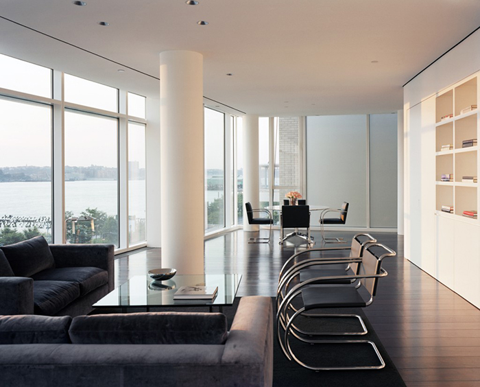
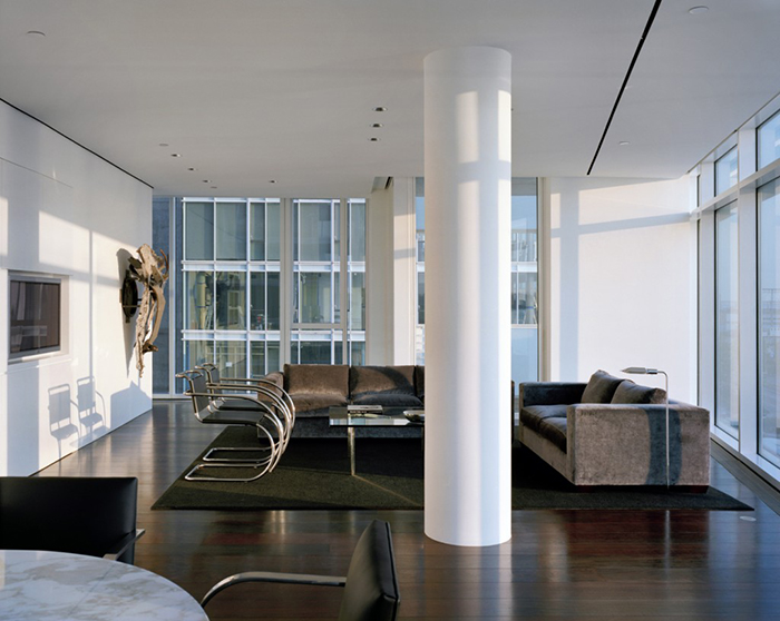
In the Kojaian Residence at Perry Street Condominiums, Meier’s Modernist influence is on full display. Primarily furnished with pieces designed by Mies van der Rohe, the apartment appears pristine. "The space requires little maintenance," explains a representative of Meier's firm, "affording the client extensive views and a respite from the bustle of New York City.”
The living room emulates the classic set-up of Mies van der Rohe's Barcelona Pavilion, only Meier has substituted the MR Armchairs for Mies' prefered Barcelona Chairs. The dining room table, by Florence Knoll, is surrounded by both versions of the Brno chair (i.e. the flat-bar and tubular variations). The subtle contrast is a desired effect, intended to engage a keen eye.

Photograph by Scott Frances.
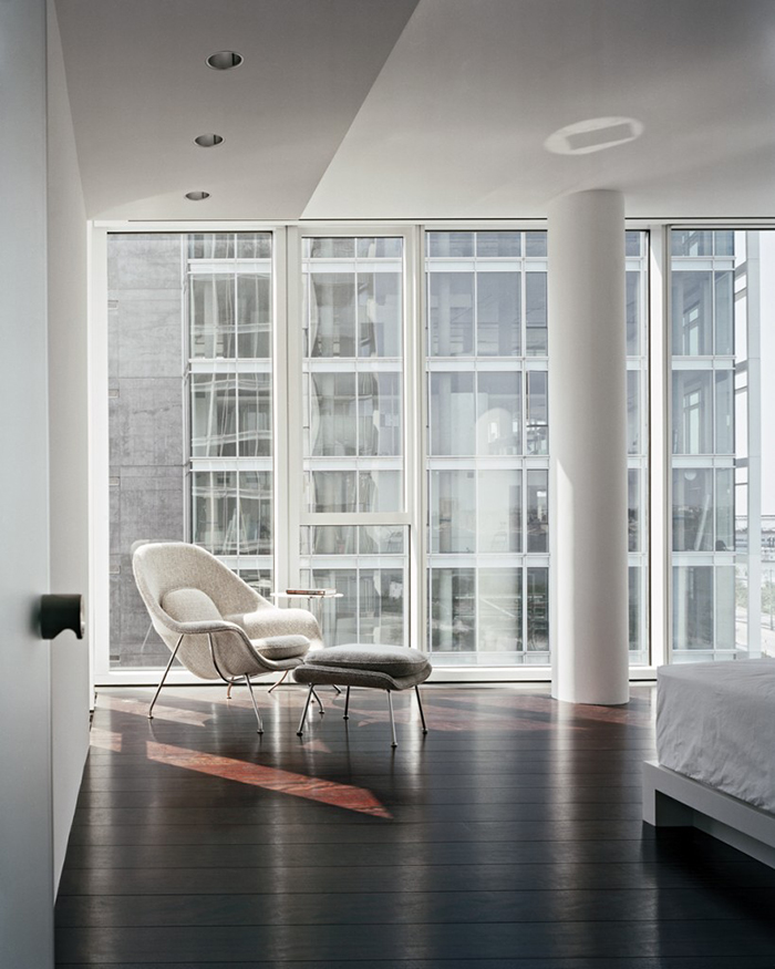
A soft-gray Saarinen Womb Chair soaks up the sun while overlooking the city.

Photograph by Scott Frances.
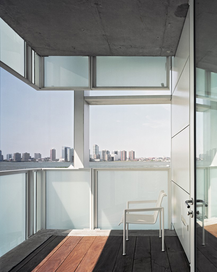
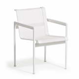
An armchair from Richard Shultz’s 1966 Collection is seamlessly incorporated within the design of the patio.
In addition to the furnishings, the home’s resident sought the counsel of Richard Meier & Partners in sourcing artwork for the space. A friend of Frank Stella’s, Meier chose one of the artist's early sculptures for the living room wall and the bedroom includes a sketch by fellow minimalist, Richard Serra.
Project Credits:
Design: Richard Meier & Partners
Photography: Scott Frances


