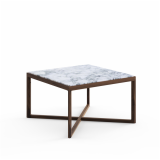
At Work with Marc Krusin
 At Work is an ongoing series of conversations with the people who design for today’s and tomorrow’s workplace.
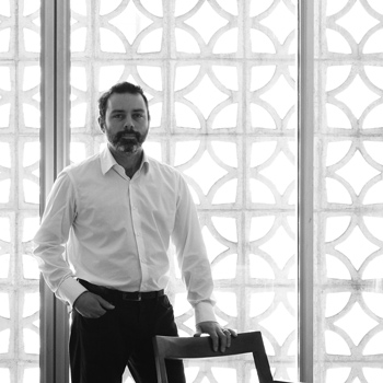
London-born designer Marc Krusin is known for his carefully considered furniture designs that, even when brand new, feel like instant classics. With a talent for designing elegantly proportioned, functional pieces that meet a real need in the workplace, Krusin has collaborated with Knoll since 2009. His portfolio includes the Krusin Collection of chairs and side tables, the Anchor™ storage system and, most recently, Pixel™, a suite of tables that debuted at NeoCon 2015, where it was awarded Best of NeoCon Gold. Here, he shares design lessons from his career in Italy, the road trip that jumpstarted Pixel’s design, and his approach to the creative process.
KNOLL INSPIRATION: Before moving back to London to start your own studio, you were in Milan for more than 13 years. You founded a young designers’ group and worked with Piero Lissoni. What did you learn in those years?
MARC KRUSIN: When you work for studios, you design, but you’re never totally aware of the full vision. You’re limited to the object and its shape and what you’ve been taught at college as a young designer. It isn’t until you have more responsibility—meeting clients and being accountable, fully, for the design and prototype of an object—that you start to understand that there’s a gigantic mechanism at play that is also very important. Without that awareness, it’s hard to actually accomplish anything in design.
Has your working style evolved since leaving Italy?
It’s a lot less about me. As a young designer—certainly for myself back then—there’s a tendency to want to shine out, to have your name plastered places. ‘What can people do for me? How much can they promote me?’ But now, it’s very different. It’s more, ‘What can I do for them? How can I be of help?’ If I know I can’t be of help, I feel very uncomfortable. I’d rather not do it.
In other conversations, you’ve said that you’re interested in pieces that endure by blending in and responding to the space they occupy. Have you always had this sensibility?
I think it’s always been there, it was just a case of recognizing it and exploring it. Working for Lissoni played a big part in that. One core thing that I loved about that studio is that you weren’t limited to a certain section of work. You’d very much take part in everything, if you wanted. I was involved in projects that went from graphic design all the way to architectural projects with furniture, and industrial design was in the middle of all of that. Because of the architectural background within Lissoni, the importance of space became ever more apparent. When I design, I don’t think about the specific space, because there never is one—the piece could fit into a number of spaces—but there is an awareness of the way an object is going to work within potential spaces.
Your furniture could be described as simple, but it's all about details: how joints resolve, how edges meet. Do you think that is related to your exposure to architecture at Lissoni?
It was the architectural experience, but more than that, it was the Italian experience. The attention to proportion and detail was absolutely part of my experience in Italy. There was incredible attention to the details of things, in everything in general, down to the stitching on clothing. In Italy, there is an awareness and a consciousness around this kind of thing that does not exist in other countries that I have experienced.

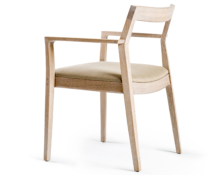
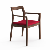
The Krusin Side Chair designed by Marc Krusin for Knoll.
How does this attention to detail play out when you design?
With the chairs I designed for Knoll, it was literally about taking a very standard or archetypal chair and tweaking it, perfecting these things: the detailing in a macro sense—the proportion and general detailing of an angle of the whole chair—and also in a micro sense—the proportion and detail of every corner, ever joint. There was no kind of mental strategy or analytical element to this. It just flows naturally. The more you let it flow, the more successful any design can become.
It’s a big group effort, this whole process. In the case of the chair, it was about working and reworking and modifying and tweaking, until you get to a point where you look at it and you say, ‘Okay, there’s nothing more that needs doing here.’ That was done in consensus with everyone working on the project, particularly [Director of Design at Knoll] Benjamin Pardo, who was extremely present at all the meetings and at the factory. We would take input from the guys at the factory about how they’d prefer to make something. There were two guys at the factory who were phenomenal. They’d put the chair together and pull it apart three times a day. It is ever more fundamental to work like that.
You also design a lot of systems. Anchor, which you designed for Knoll, is a system. Pixel also must behave as a kind of system. Is designing a system different than designing, say, a chair?
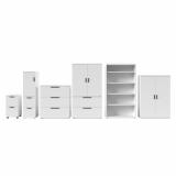
On Anchor, too, we took doors off and cut them down, added bits on, put a handle there, took it off, cut the handle, lengthened the handle, changed the shadow gaps. These were subtle variations compared to a chair, but it is still a similar process in that respect. What’s different is that the system is slightly more mathematical, slightly more architectural, more like a landscape. There is the intuitive flow, but there’s a mathematical side to it. The whole range has to work.
“I’m very excited about what appears to be a very new and very dynamic way of working right now, across the world.”

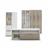
Anchor Credenzas at the Knoll offices in San Francisco.
Tell us about the research road trip that you planned when you set out to design Pixel.
We went places where that type of product had been used, and we also spent a lot of time with sales people and with architects who specify these kinds of tables. We wanted to hear what they think about when they are putting that product into a space. We also talked to a lot of people who actually use this kind of product about their needs. We went to a medical facility that had vast amounts of cable—so much cabling, in fact, that the system they were using couldn’t take it. They had cable trailing all over the place. So the problem of what to do with unforeseen amounts of cabling was very clear.
Another thing that I noticed is that there was a need for sturdiness. Some of these places, like the medical center and a military space, had huge machines on some of the table tops.
We also saw a variety of situations. The two I just mentioned were actually quite static spaces in terms of the furniture, but there were others that were incredibly mobile, where the space was chopped and changed around several times a day.
At the end of the trip, it became clear that the product had to do everything. It was a case of taking ‘everything,’ and seeing how that could translate to the logic of a system. What bits do what? How do they do it in the most efficient, concise and least complicated way? A huge amount of the work was actually organizing the broad requests into specifics.
When you were designing Pixel, you must have really had to consider the user. There are some mechanical aspects to the tables, which are signaled as actionable by using a red color.
The mechanisms are there because they have to be. The requests, as I said, weren’t specific. It was, ‘We need to do this, but we don’t know how to do it.’ The mechanisms were designed in to answer these requests, be they specific or nonspecific. The most difficult, of course, were the non-specific ones. For example, the flip door at the back of the C-Leg that reveals the cabling from the outside of the table, to my knowledge, even as a concept had never been done before. Yet it came from what the clients and people we interviewed were telling us about access to cables. It became apparent that it would be extremely useful.
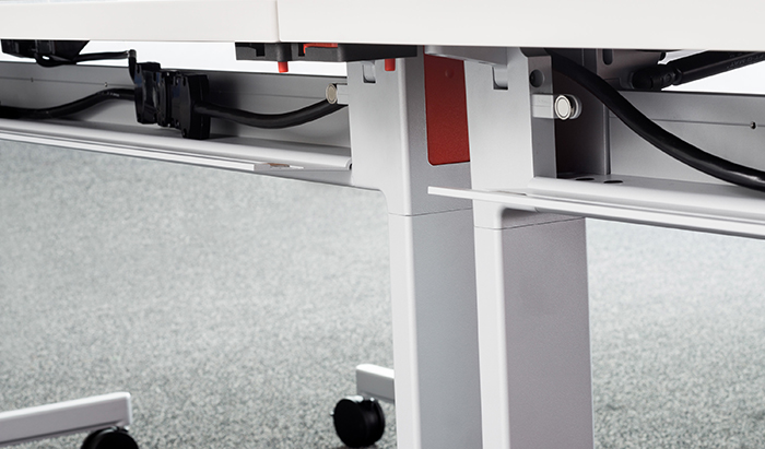
The cable access door of the Pixel™ C-Leg Table designed by Marc Krusin for Knoll.
And how did you make choices about material finishes?
The finishes reach across the breadth of the range—there are neutral paint colors and laminates for highly functional tables and then wood grains, veneers and polished aluminum as we move towards the executive end. It’s funny, I don’t have much more to say about the specific color, tone or laminate choices in the sense that these choices happen naturally. I guess it links to what I said earlier: there is no mental strategy. Sometimes you like the look of a particular tree and you don’t know why, you just do. You walk by and say, ‘Look at that tree, isn’t it beautiful?’ And someone says, ‘Why do you like it?’ and you might be lost. If you’re a hardcore intellectual, you might be able to write some passage, but there’s no real need to do that, because at the end of the day, it’s just a beautiful tree.
Pixel offers a range of pieces for multiple uses, from training tables that quickly stow away to a desk for an executive in a private office. What is it that unites this collection?
The visual language of the leg and supporting structure, above all. We began with the T- and C-legs, and in doing these, it became evident that this visual language of doing a leg could be adapted to other elements. By this I mean: the proportion and detail of the base of the leg where the base transitions upwards to the top using the same edge radius and corner radii.
I do love that the collection is so transversal. It goes from the simplest of desks right through to the executive office, and yet it follows through with the proportion of the legs and the detailing. It performs many functions in many environments. If I look at some of my favorite products in the world, I feel them to be slightly unsatisfactory if they haven’t been fully developed to be able to answer a whole bunch of questions.
So Pixel seems to fulfill what you said earlier about wanting to make lasting objects that work within a space.
On one hand, iconic objects are great. Knoll has and continues to make fantastic iconic objects. But in parallel to that, iconic objects need to exist within a space that’s visually continuous, let’s say. I think that systems products, particularly, create that harmonious backdrop for the more iconic objects to live in. Because of that, the more those systems can do, the easier it is to then create a harmonious space that can work in any environment. In this case we are also talking about the possibility of a “high-change” environment—maybe it changes daily, or even twice daily, but with that same system you can go all the way to the executive board room, or the very high end private office, without losing the visual language. And within that environment, you can add those iconic highlights.
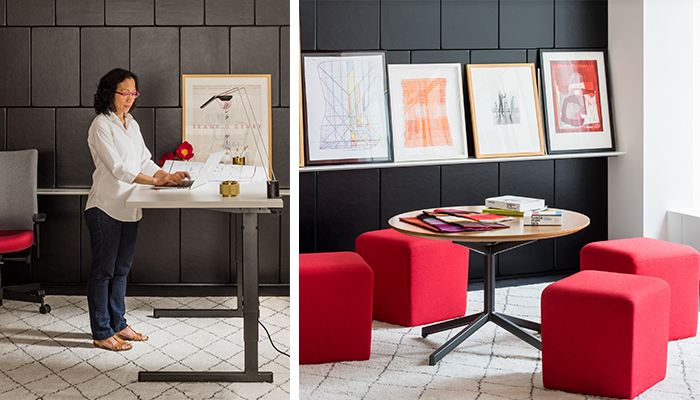
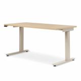
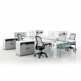
The Pixel™ suite of tables supports work in a range of contexts.
While designing, you've clearly thought a lot about today’s workplace. What is most on your mind about the way people work today?
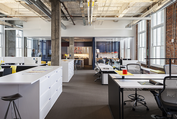
I’m very excited about what appears to be a very new and very dynamic way of working right now, across the world. Possibly not the entire world yet, but it appears to be the way things are going. It’s a way of working that’s very much about collaboration, doing things efficiently, dynamically—and together. It’s not about sitting in some dreary office and trying to work things out alone. So we’ve moved away from the traditional way of doing things, where there’s a rigid hierarchy of a boss in an office, and rigid company structure that can’t be touched or challenged. It was a very inefficient way of doing things, which led to a lot of limitations and lost opportunities. I’m extremely excited about the new ways of doing things, where people come together for specific projects or just one aspect of a project and then move on, perhaps coming back again at a later stage, all the time working dynamically and in a mobile way in different spaces and locations—hence the need for these open and collaborative environments.
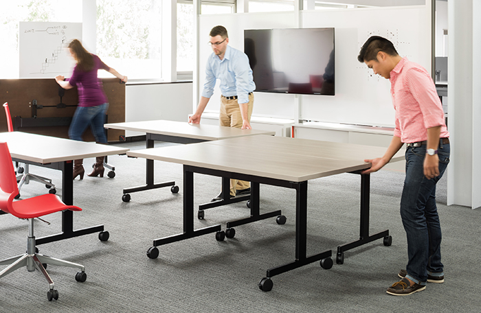
Easy to fold up and rearrange with just one hand, Pixel™ C-Leg Tables support dynamic work modes common in today's workplace.
Is there a designer who inspires you as you tackle these contemporary challenges?
I’m inspired by a whole bunch of people—for sure Piero Lissoni and Patricia Urquiola have been a massive inspiration. I learned an incredible amount from both of them about aesthetic sensibility, but also about how to respect and relate to people. Other than that, it tends to be specific work here and there. There are a phenomenal amount of people in the world who do a lot of great work. I think anybody who does things with integrity and love of what they’re doing can be an inspiration. It’s only when people do things halfheartedly without commitment when work is slightly disappointing.
That’s very true. Is there anything you’d like to add?
You asked me at the beginning how things changed during my career. The main answer to that would be that apart from there’s less me, I also stopped thinking at a certain point and made doing a lot more important. Thinking is vastly overrated. We place too much emphasis on it.
