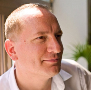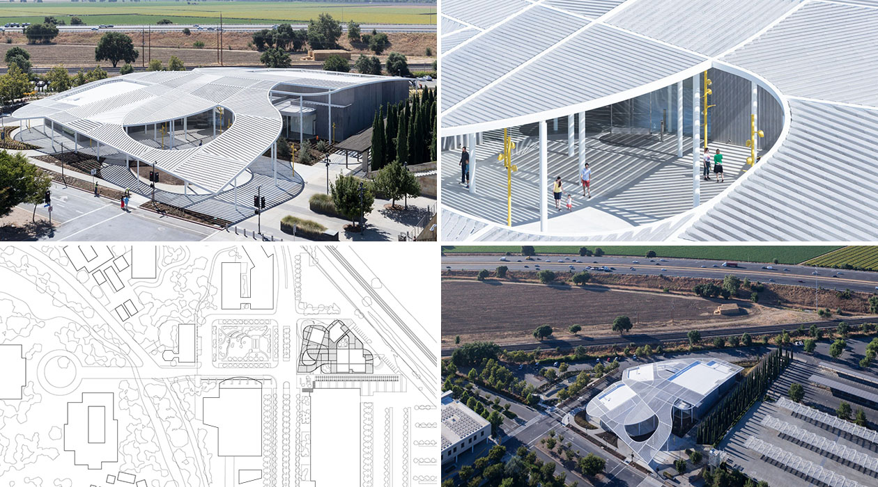
The Brooklyn-based architecture firm SO-IL has distinguished itself among the myriad of firms dedicated to modern architecture. With projects like the Jan Shrem and Maria Manetti Shrem Museum of Art, in Davis, California and the Kukje Gallery in Seoul, Korea, SO-IL’s commitment to innovation challenges the user to think about the purpose and functionality of a space. One of the masterminds behind it all is Florian Idenburg, pictured left, a founding partner of SO-IL and Associate Professor in Practice of Architecture at Harvard’s Graduate School of Design. He and his colleague Jing Liu co-founded SO-IL in 2008, which they currently lead together with Ilias Papageorgiou.
In early 2014, Knoll reached out to Harvard University’s Graduate School of Design (GSD) and offered to sponsor a three-part studio on the design of work environments. Idenburg was a clear choice to help lead the program. At the time, Idenburg and his team at SO-IL had already partnered with Knoll on a collection of workplace furniture that appeared as ambiguous in its functionality as its simplicity in materiality. His relationship with Benjamin Pardo, Knoll Director of Design, helped Idenburg bring more focus to the physicality of objects and the importance of matching the character of an object to a space.
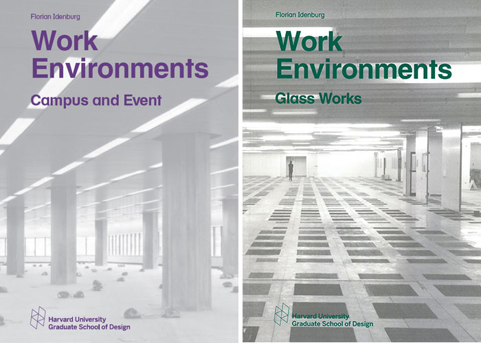
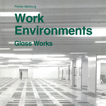
 Campus and Event and Glass Works were the first two Work Environments studios.
The strategic relationship between Idenburg and Knoll positioned him to lead the three-part Work Environments studio. With the completion of the third studio, Space Works, Knoll sat down with Idenburg to discuss his observations as a professor.
What were you doing before SO-IL, before you were into architecture?
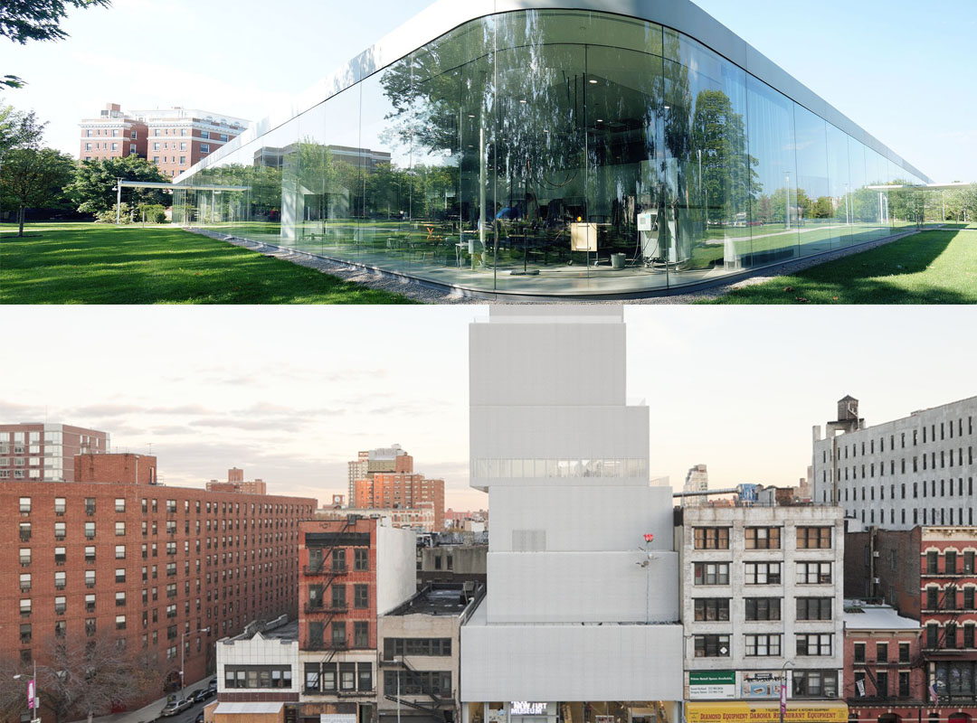
At 16, I decided to become an architect, so I’ve always, in one way or another, been in the architectural field. I am interested in making things that are accessible to a larger audience such as public and institutional buildings and really focusing in on how design interfaces with people in use and behavior. Before SO-IL, I was in Japan for eight years working at an architecture firm, SANAA. My work for the firm eventually brought me to the United States where I built two prominent museums: the New Museum of Contemporary Art and the Museum of Toledo in Ohio.
 Above: Glass Pavilion at the Toledo Museum of Art Below: the New Museum of Contemporary Art
Is there a correct way to pronounce SO-IL?
The short answer is no. Both Jing and I strongly believe that there are multiple ways of looking at something or pronouncing words. We feel that there is no singular “right” way of interpreting something, which is a belief we each developed from working in and traveling to many different countries. When we were coming up with a name, we wanted it to convey the same sort of openness and ambiguity that is communicated through our work.
The beauty of our firms’ name is that it can be understood in multiple ways. Interpretations range from the literal definition of soil meaning fertile ground to Notorious BIG’s lyrics - an early inspirational figure to me - by using the hyphen as a pause between the two syllables. My goal is to work hard to make bold statements and see how they land and provoke conversation around the purpose and definition of a space or object or even a word.
Can you talk about your experience thus far with teaching a three-part studio about the work environment?
It was incredibly revealing. We spend so much time looking at work enviornments, which within architectural schools, is not an area that people spend too much time considering. Thinking about these spaces is often left to interior designers as opposed to architects. Amidst the continuous conversation between students and professors, I noticed that people love talking about housing, private homes, museums and cultural buildings, but when the discussion revolves around offices, people become suspicious. I see it as unwise for institutions to not think about the workplace.
“For me, the three-part studio was a way to channel my own interest in office design and share that with a group of students.”
—Florian Idenburg
During the three-part studio, I discovered an incredible, unchartered history of prominent post-war architectural projects that were built for the work environment. I was fascinated by the fact that many corporate estates were built post war throughout the 60’s and 80’s but had very short lifespans. These beautiful works of architecture were used for 10 to 15 years before being abandoned. The irony lies in that there is quality design, tied to a single period of time, behind new corporate buildings that have the potential of becoming abandoned later down the road as the economy changes. There are opposing forces that design must mediate when you think about the slowness of architecture and the fastness of the economy. The other force you must consider is the pace of technology.
In the past, physical space organized relationships and hierarchies, but now technology has become that organizational force. There was a certain static status that came with the cubicle and corner office, which related organization with physical space. Now, because of technology, the workspace has become incredibly fluid. Physical positioning is now used less as a tool to organize structure and more as a tool to create an environment.
 An ambiguous workplace bench.
If I were to summarize the outcome of the three-part studio, I would say that there is a large swath of uncharted terrain within the discipline, one that institutions need to begin exploring. I think it’s vital for students’ short and long-term success to become aware of and familiar with the space in which we spend the majority of our time.
How have the students reacted to this new topic?
In general, the response from the student body has been very positive. That being said, the complexity of workplace architecture and design becomes very apparent as students often have trouble formulating a clear and direct answer to a given task. I think students are somewhat uncomfortable at first when asked to engage with the workplace. They’re at an age where there is quite some suspicion of anything that seems overly commercial or tied to the capitalist system. There is certainly hesitancy around why we would engage with these “bad” corporations. But through site-visits and interviews they had to conduct, they came to realize it is not as simple as good versus bad but that countless layers of complexity exist.
 The Jan Shrem and Maria Manetti Shrem Museum of Art, Davis, USA. Completed in 2016.
“This entire experience ends up being more of a reflection which helps students begin to contemplate where they want to be five, ten, fifteen years into the future.”
—Florian Idenburg
Visiting a range of offices through the course of the studio made students get a sense of just how many people occupy these spaces. The sheer quantity of people in an office is something you have to account for which, architecturally speaking, may be not as important when working on a residential project. Students also felt, amidst the different field trips, the reality of the economy and the system in which we live. In many ways architecture is greatly dependent on the economy. Having the students engage with this reality is incredibly valuable and prepares them for their future practice.
What do you see as some of the more disruptive transformations in today’s workplace?
Obviously, technology has drastically changed the functionality and purpose of the physical environment. There is less and less functionality in the physical because a lot of functionality has moved into our devices and into our technology. Consequently, there are fewer physical objects that need to exist in space to achieve the same level of functionality. It changes the need for filing cabinets and desk size, which already has begun to render a denser work environment.
What I’ve found more interesting is the psychology of the static hierarchies and how technology has essentially done away with it. Due to more people working freelance jobs or working in temporary spaces, this idea of the static hierarchy has been completely undone, which in turn greatly impacts the way you design an office space. This is not a loss for architecture but a liberation because the discipline no longer must accommodate for banal functions such as storing a whole stack of paper. This cultural shift opens doors for the physical to be a place for inspiration, insight, or focus. Suddenly the environment and atmosphere in a corporation becomes much more important with regards to the physical.
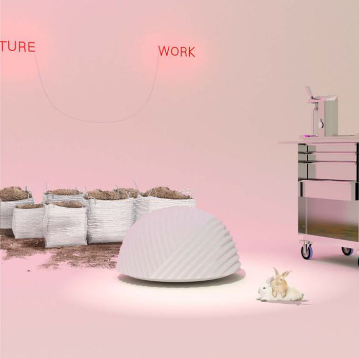
 An a-typical pouf.
The shift in purpose for the physical is something that architects need to think about. Many traditional architects were taught that form must always follow function. Now, that thinking must change because we are moving towards a world where physical functionality acts as more of a placeholder for functions within the growing virtual world. If form doesn’t follow function anymore because function has escaped into the virtual then what does form do? Suddenly architects are forced to think much more about the softer qualities of texture, atmosphere, and comfort rather than performance.
Another, not as imminent, disruptive transformation is automation – robotics taking over, a topic I discuss in an article in Metropolis Magazine. There may be a trend where labor and work will soon only be done by machines. What we are starting to see now is a growing trend where work is more like a lifestyle choice than a necessity. With this trend there seems to be a significant split growing where some spaces are purely automated producers of capital while the human workspace is much more of a club-like condition focusing more on establishing social capital. People are joining start-ups, incubators, or innovation labs, not necessarily to produce work but to establish a social network and gain a certain level of status. Ultimately, that raises the bigger question of how are people going to make money. Keep in mind this all theoretical of course. Regardless of the larger questions around the future of society, this idea of automation at least means that for designers, we don’t have to think about objects as being solely functional and performative anymore, but rather evocative of a different type of meaning that has to do with a social and relational atmosphere.
Can you tell me a little bit about SO-IL’s pieces with Knoll?
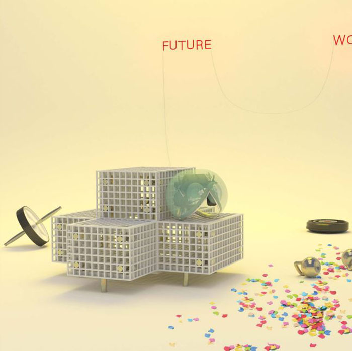
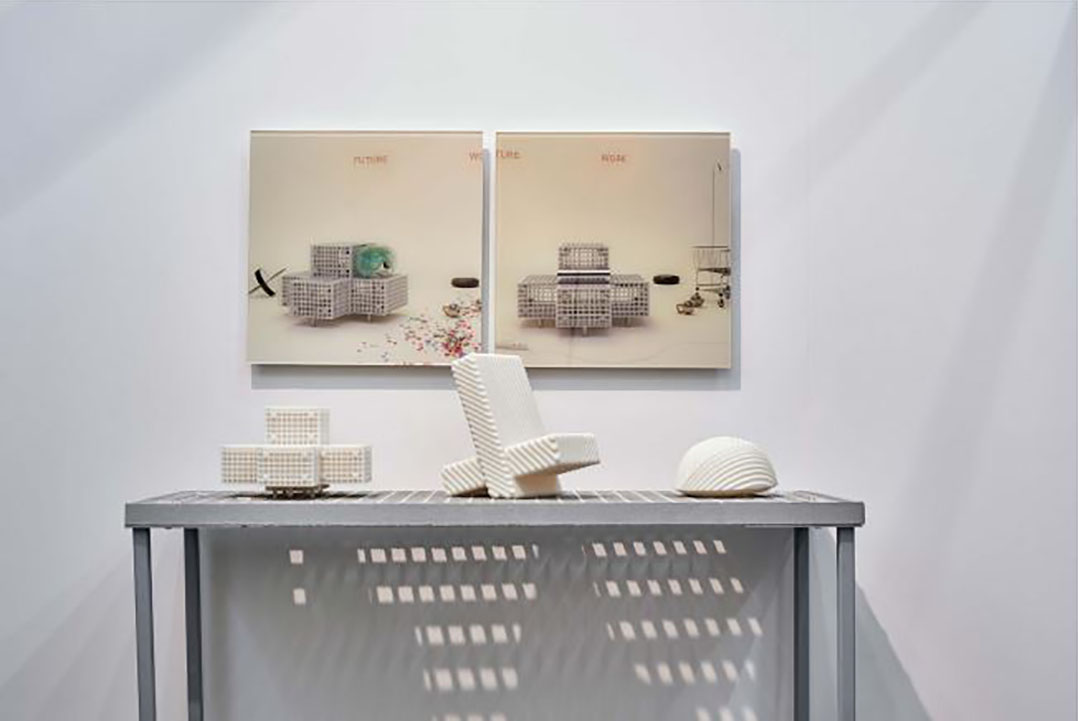
Basically, the works for Knoll require an interpretation from the user. The pieces, due to their obscurity, require some thought from the user regarding how to actually engage with the product. In some way, the objects immediately raise questions around social relationships. The works force you to confront the people around you. We designed them with the idea that nobody will be working on these pieces for more than 15-20 minutes.

Mock up of SO-IL's furniture system for Knoll.
The collection is made of three individual objects that are inherently nonprescriptive. The pieces can be used individually or grouped together to accommodate a larger group of people. We want to force users to be creative with their workspace. If something seems self-explanatory, you can feel like the odd one out if you don’t inherently understand how to use the product. However, if an object is vague and puzzling to everyone, knowing there is no clear or “correct” understanding of how to engage encourages each individual to formulate his or her own interpretation. This allows people to feel like they own a space by way of understanding it, which ultimately makes users more comfortable within their workspaces.
What have been the most successful workplace solutions?
What you can see is that people are super flexible and even willing to accept conditions that, in some cases, are inhumane. People are very accommodating, so when things are identified as “state of the art” because they are thought out at an incredibly detailed level, people have almost an adverse reaction – as if it’s too good to be true. I think the best spaces in some ways are the ones where people feel like they make it their own. The most inspiring space I have come across during the research was Tesla’s design studio, located in a vacated air hanger in Hawthorne, CA. Because it is new and Elon Musk is doing his best to make it perfect, it has all state of the art technology. But besides that, what was amazing was the big open, column free structure that facilitated the various functions of the design team.
These three studios confirm the need for architects to get more involved because I think we can really improve what our work environment can be. With regards to the office building and work space, I have a feeling that there is a lot of catching up to do. Concerns around air, space, and light need to begin foregrounding the conversations around designing and creating a new office spaces.
