Few people know the intricacies of print and color quite like Ruth Adler Schnee. Ever since her family moved from Frankfurt to Dusseldorf and then to Detroit in 1939, Ruth has been submerged in the world of design—in graphics, in architecture, and most importantly, in textiles. She graduated from the Rhode Isand School of Design and the Cranbrook Academy of Art and has worked alongside the biggest names in American modernism, all the while honing her signature style of geometric patterns and intuitive color palettes. In 1947, Ruth opened her first studio on Detroit's 12th Street, where she silkscreened textiles for a range of clients and competitions in partnership with her husband Edward Schnee. Ruth was recently named the Kresge Foundation's Eminent Artist for 2015, in recognition of a rich and multifaceted career.
At 93, the German émigré is as busy as ever. Her latest collaboration with KnollTextiles is a geometric upholstery called Nature Walk, available in six striking colorways. Nature Walk is part of the Outline Collection, a new set of upholsteries and wallcoverings that examines the interplay between linework and color fills. Ruth sat down with Knoll Inspiration and Dorothy Cosonas, Creative Director of KnollTextiles, to share a lifetime of memories, influences, and an unapologetic love of color.

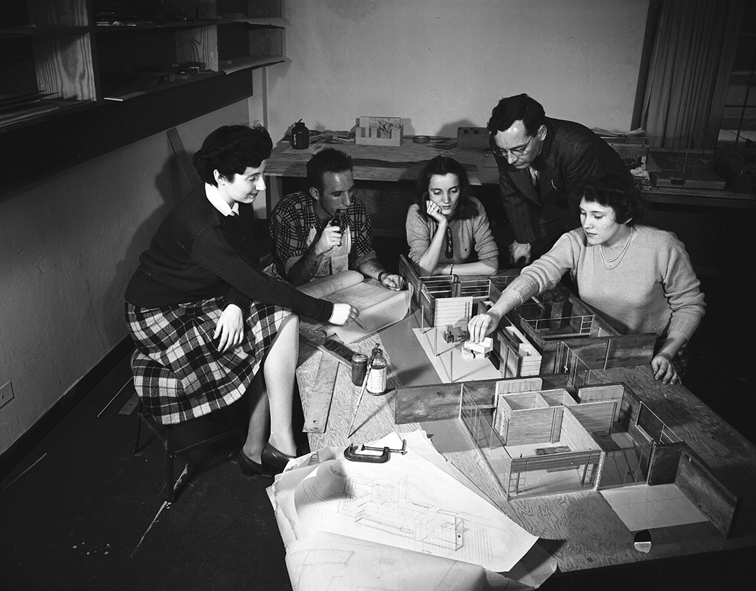
Ruth Adler with Cranbrook Academy of Art students, 1946. Harvey Croze, photographer. Image courtesy Cranbrook Archives.
Knoll Inspiration: Let’s go back to the beginning for a moment. You grew up amidst artists that your parents knew from the Bauhaus and your first job was with the designer Raymond Loewy in New York. Are there memories of these experiences that you bring to your work today?
Ruth: I grew up in Frankfurt and at age five, my family moved to Dusseldorf. My mother was a student of the Bauhaus—her picture is in the book Bauhaus Women; she’s the one with the cigar. We never agreed on anything, but she was an incredible influence, so I feel I owe her a lot. I met Paul Klee through my parents and he was also a great influence; we used to play in his studio with stabiles and mobiles.
Of course, you learn with every experience, there’s no question about it. But yes, [at Raymond Loewy,] we designed the Coca-Cola script, and I had Warren Platner with his drawing board on my left and Minoru Yamasaki with his drawing board on my right. We also designed the Shell Oil logo, and those yellow and red colors you see on every gas station, they’re my colors!
But Raymond Loewy did not want to hire women, and the only woman on the team was his publicity girl. I was really the first one that he hired because, at the time, I had won the Condé Nast Prix de Paris competition and it was right after the war in ’46 so they weren’t sending people to Europe. They got me a job at Lord & Taylor, in the antiques department. I lasted a day! So this is how I got to Raymond Loewy. But what did I learn at Raymond Loewy? I learnt to be tough, because New York is a tough place to exist.

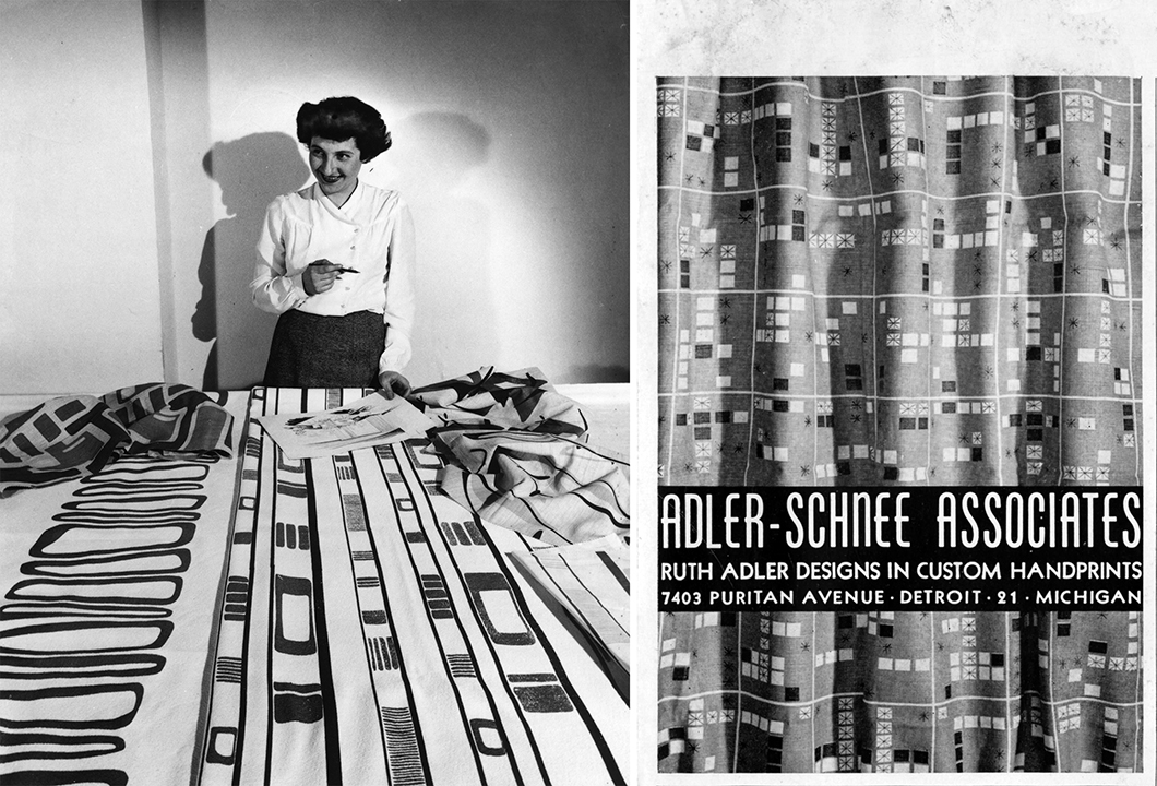
Left: Ruth Adler Schnee with “Slits and Slats,” 1947. Courtesy Cranbrook Archives, The Edward and Ruth Adler Schnee Papers. Right: Advertisement published in Interiors magazine for Adler-Schnee Associates, 1953. Courtesy Cranbrook Archives, The Edward and Ruth Adler Schnee Papers.
During your career, you’ve witnessed textile design gradually gain legitimacy in the design world. What has it been like to witness and play a part in this shift?
Ruth: Nobody hired women in architecture. Albert Kahn would not hire women, but Mr. Saarinen always said that if you want to start your career, you apply to competitions. And if your work is good, you get mentioned, and it just so happened that that’s what happened to me. The Chicago Tribune had a competition to design a house featuring all the gadgets that had been developed during the war that were now coming on the market. And I won that competition, but I couldn’t find fabrics for the house, so I designed my own fabrics in abstract shapes, in bold colors. Dorothy knows how much I love colors!
Dorothy Cosonas: Ruth is a purist when it comes to color.
Ruth: Shaw, Ness & Murphy in Chicago—are they still in business?—they saw the textile designs and said that’s exactly what they were looking for, because blinds and verticals hadn’t been on the market. They were designing automotive showrooms and needed a screening material that would not fade like a car’s. They set me up in the textile design business, and that’s where it all started.

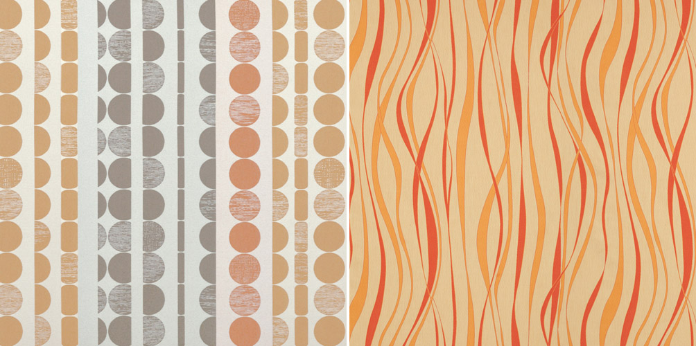
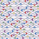
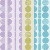
Left: Fission Chips by Ruth Adler Schnee for KnollTextiles. Right: Strata by Ruth Adler Schnee for KnollTextiles
You’ve said before that design must be functional and “provoke the intellect.” Does the collaboration with KnollTextiles meet this criteria?
Dorothy: What’s nice about Ruth’s work, being rooted in classic modernism, is that it agrees with our philosophy at KnollTextiles. So when you look at Ruth’s overall scope of work, whether it was from the '40s, '50s, or '60s, she’s always very consistent in her point of view—which is also our philosophy in terms of design, whether it’s furniture or textiles. When we first worked with Ruth a few years ago on Fission Chips and Strata, even though they were designed in the '50s, they were both timeless. Since they were originally linen draperies, we reinterpreted them as privacy curtains for the healthcare market.
“What’s nice about Ruth’s work, being rooted in classic modernism, is that it agrees with our philosophy at KnollTextiles.”
—Dorothy Cosonas
What’s also important when we work with guests is that the result speaks to the personality of the designer. If anyone knows Ruth’s work, what we want them to say is that it looks like a Ruth Schnee design. I know her well enough now to know that she gets quiet when she doesn’t like a color. Ruth has a unique philosophy of modernism and bold, clean, clear, bright color. At KnollTextiles, we started with her philosophy and then expanded the palette for a global audience.

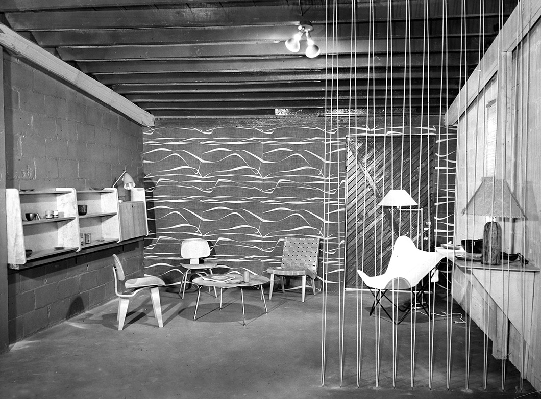
View of the Ruth Adler Design showroom on 12th street, 1949. Courtesy Cranbrook Archives, The Edward and Ruth Adler Schnee Papers.
Could you describe what you see as the relationship between textiles and architecture?
Ruth: It should be all one, as far as I’m concerned. There’s no border. That’s the only way I can express it. To come back to the color, I find that Americans are much more conservative. In Germany and in Europe, people accept brilliant color, but people are afraid of color in this country. But I’ve found if you show them how it works and why you’re doing it, they come around and they eventually love it.
The exhibition that I had in Venice [Ruth Adler Schnee: A Passion for Color at the 2011 Venice Biennale] was all about color, and then I came back here and color wasn’t selling. But I think people are just coming around. I think it’s also our duty to educate the public.

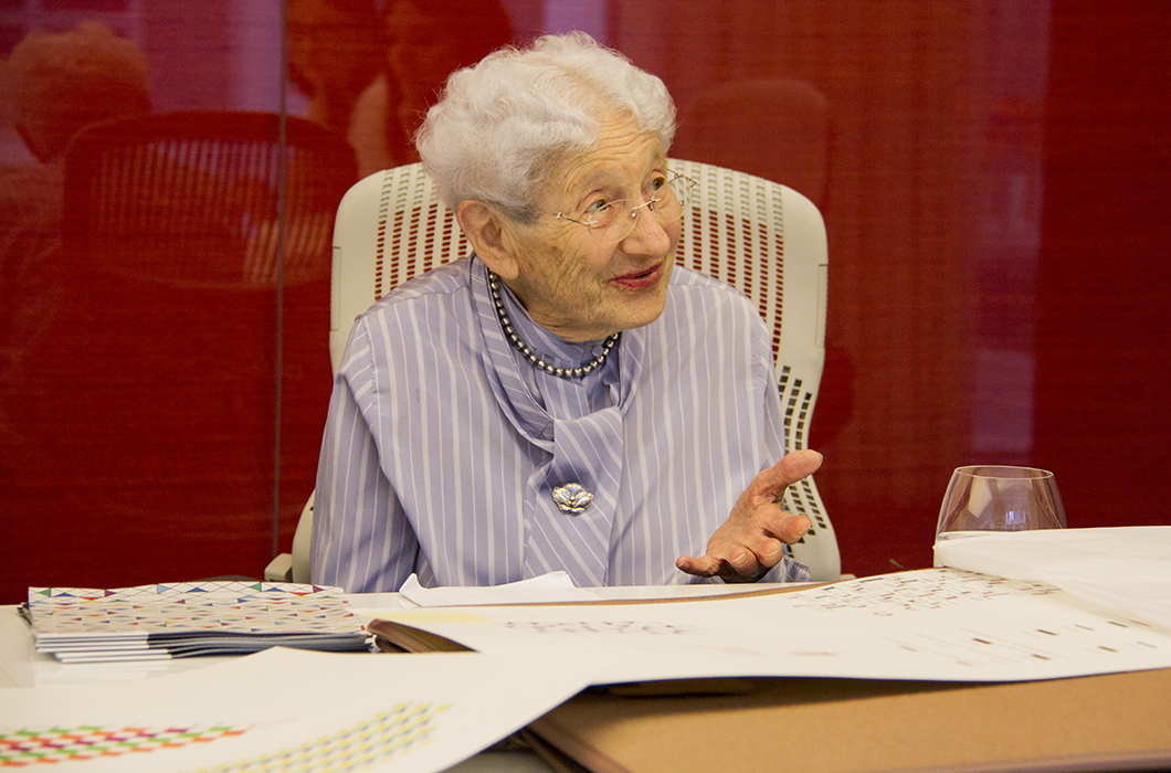
Ruth Adler Schnee at the Knoll New York Showroom, 2016.
You’re famous for your love of color. What factors do you consider when deciding on a color scheme? Is it a puzzle with only one possible outcome, or many?
Ruth: There’s not just one. I should say—I just pick what I like [laughs], that’s being honest with you. I have no theory about it, I just know when it’s right. And it has to sing, that’s the most important part for me. It has to sing.
“I have no theory about it, I just know when it’s right. And it has to sing, that’s the most important part for me. It has to sing.”
—Ruth Adler Schnee
You began your work in textiles by making hand-printed silkscreen designs. Is this still your preferred method? How do you begin designing a textile?
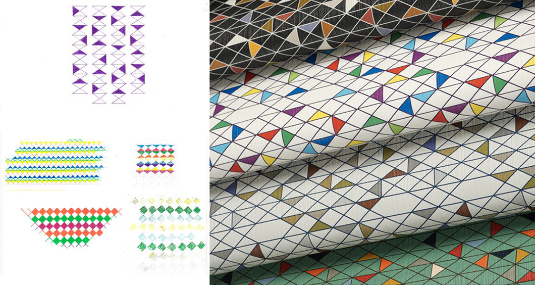
Ruth: We hand-printed many, many years ago with the silkscreen printing process. The way I design the new patterns: I do a lot of sketching from natural grasses—for instance, in Colorado in the wintertime, there’s a lot of dry grass that has wonderful shapes, branches and leaves and stones. I do a lot of sketching, and then I bring it into my studio and develop a textile design from that and make sure the repeats, both horizontal and vertical, work out. That’s really how I start the designs.

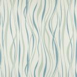
Left: Process work for Nature Walk. Right: Nature Walk in four of six available colorways, designed by Ruth Adler Schnee for the KnollTextiles Outline Collection.
Your previous designs for KnollTextiles, Fission Chips and Strata, have been inspired by elements in nature. Is nature a more frequent source of inspiration or do cities like Detroit and New York play an important part? What was the influence behind your latest collaboration with KnollTextiles, Nature Walk?
Dorothy: Remember Central Park South, all of those designs? She had done a collection [for Unika Vaev] based on New York. Nosegay and Central Park South. We worked on those in the early '90s, but they were also derived from previous work that Ruth had done, based on the architecture of the city.
Ruth: For Nature Walk, it was mostly the grasses and the dried blossoms—it’s very, very dry out west—the stones that were sticking up. That’s really what started that. The sky is unbelievable.
Can you tell us about the first time you met Hans Knoll?
Ruth: I had designed Fancy Free, which was a little pattern for the airline industry, because in those days, tourist class and first class were divided by an acrylic panel and they had decided to put my work, printed on a sheer batiste cotton, between two sheets of acrylic. Hans saw it and he came to Detroit just to buy that design. I had just gotten out of school; I didn’t realize you could charge money for your designs. So my dad had his attorney there! And when it came to [the question of] how much are you going to pay for the design, Hans said, we never pay for the design but the royalties will make up for it. And my dad said, we’re not giving away those designs without getting paid for them! And Hans went back home.

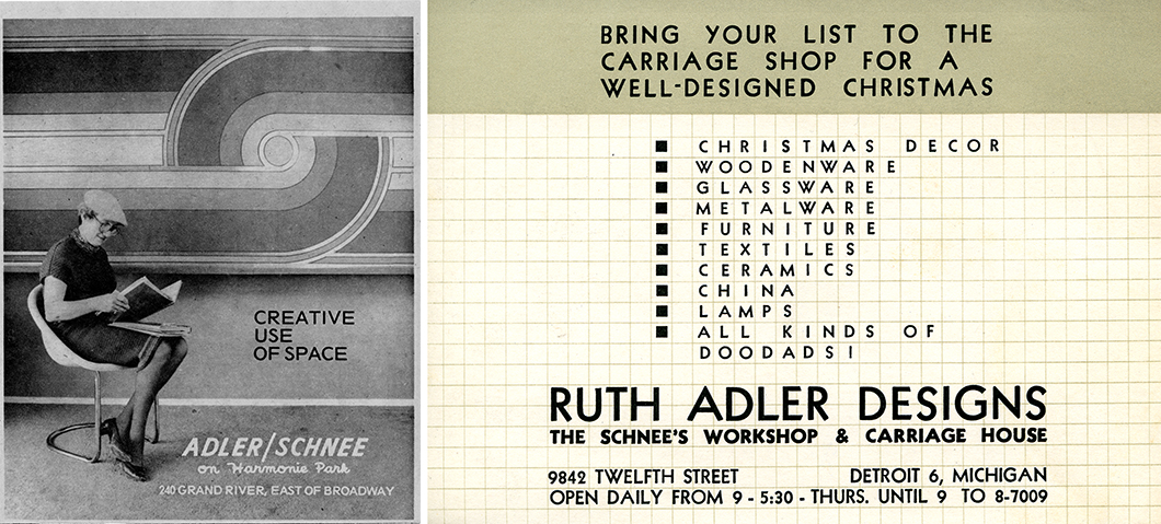
Left: Advertisement featuring Ruth Adler Schnee, 1974. Courtesy Cranbrook Archives, The Edward and Ruth Adler Schnee Papers. Right: Advertisement card for store on 12th street, 1954. Courtesy Cranbrook Archives, The Edward and Ruth Adler Schnee Papers.
And finally, what’s next?
Ruth: I’m involved right now in the restoration of an Alexander Girard house. That’s been an interesting project because he worked very closely with Eero Saarinen, and I had also worked with Girard in Columbus, Indiana. The Miller motor works are there, and the owner of the motor works, [J. Irwin Miller,] gave the city a foundation where he assured them he would pay for all architectural fees if they chose important contemporary architects [to design public buildings]. So in Columbus, we have not only Saarinen and Frank Lloyd Wright, but we have Paul Rudolph, all the architects, and it’s a wonderful place. I worked with Girard on the cityscape, the main drag through the city, we colored the old buildings.
I’m also working with the Grosse Point library, which Marcel Breuer designed. They are publishing material and I’ve been writing forwards on these books, which is a whole new career for me! No slowing down.
Anyway, it’s been an interesting career, and I’ve been very fortunate.
