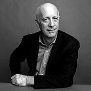
Paul Goldberger is a Pulitzer Prize-winning architectural critic who has held posts at Vanity Fair, The New Yorker and The New York Times. He is the author of a number of notable books, including Why Architecture Matters, Up From Zero and Building Up and Tearing Down.
For the past five years, Goldberger has been compiling his first-ever biography on one of the foremost architects of the time: Frank Gehry. A personal friend of Gehry’s, Goldberger has covered Gehry in a critical capacity for almost four decades, and surveys Gehry’s life and career from both angles, personal and professional, in his new, definitive biography.
Knoll Inspiration sat down with Goldberger to discuss his latest book, Building Art, and Gehry’s 1992 furniture collaboration with Knoll.

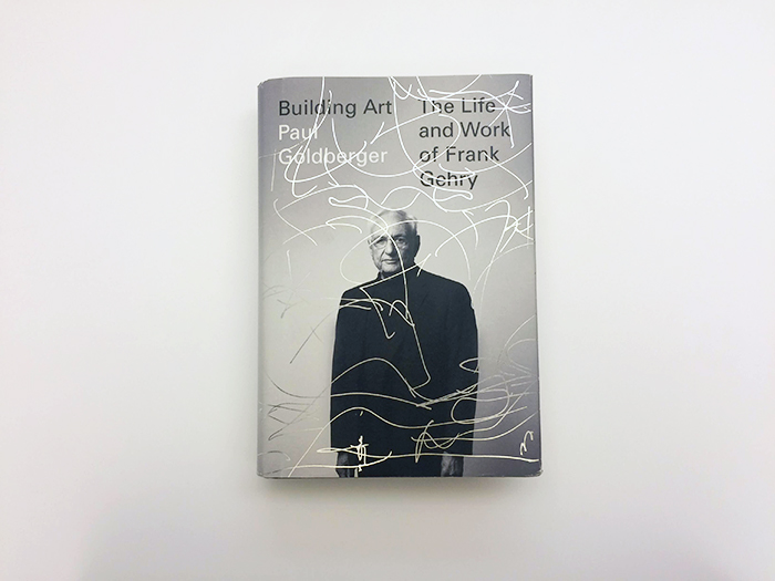
Building Art: The Life and Work of Frank Gehry by Paul Goldberger, 2015. Photograph courtesy of Knopf.
KNOLL INSPIRATION: Can you briefly describe what motivates you as an architectural critic?
Paul Goldberger: I’ve been very lucky to write about what I love. A writer I respect once described the critic as one who “recounts adventures among masterpieces.” I’ve always loved that.
That is not to say that the critic does not also have the obligation to discuss things that are not masterpieces and explain why they do not reach the standards one aspires to. But communicating one’s enthusiasm and encouraging others to experience it is, for me at least, a very important motivation.
I’m always wary of letting criticism float too close to a missionary identity. Nevertheless, there is a little bit of that: you want to bring other people into the fold. I love architecture, and I love to share and communicate my love.

“Gehry is a lens you can look through a lot of different cultural factors of our time.”
—Paul Goldberger
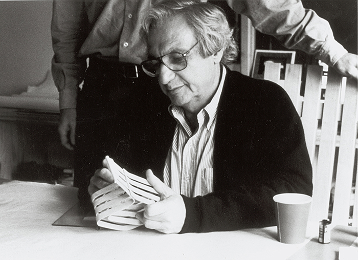
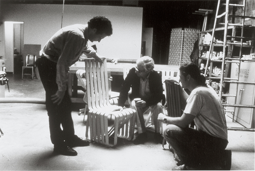
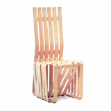
Frank Gehry working on a model for his High Sticking™ Chair in 1991. Photograph from the Knoll Archive.
You’ve covered Frank Gehry’s work for almost four decades, beginning with your piece “Studied Slapdash” for The New York Times Magazine in 1976. What made you decide to write his biography—why Gehry?
I’ve known Gehry for a while and have been intrigued by both him and his work. It seemed like an interesting way to get into a lot of broader issues that connect architecture to the culture. It was not really just because of him. The other motivation was a desire to do a different kind of writing that would nevertheless make use of a lifetime of writing about architecture. I had never written about someone’s life, so doing that gave me a chance to do something different.
Gehry is a lens you can look through a lot of different cultural factors of our time—particularly, the huge surge of interest in architecture among the general public. That is due to Gehry. What does it mean? What’s the relationship between popularity and the avant-garde? These are the questions his work raises, and that’s really what led me to do it.
I have never believed about writing about architecture in a vacuum. While form and aesthetics are essential, I’ve always wanted them to be in a social and cultural context, not to mention a political and economic context. So, writing from the standpoint of biography is just a way of expanding the idea of context, and providing even more context.

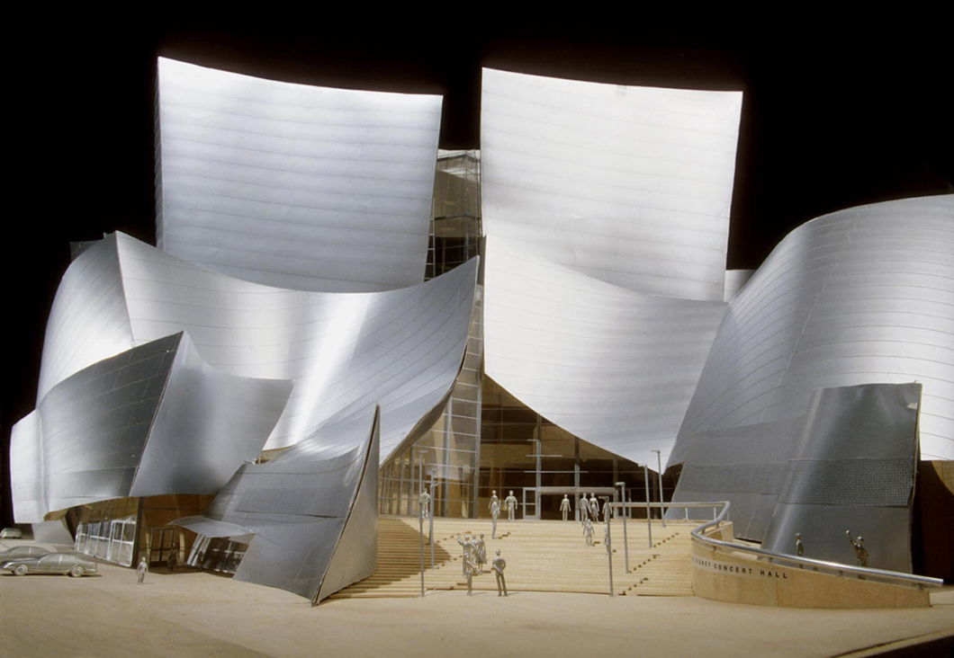
Model for Walt Disney Concert Hall by Frank Gehry. Image courtesy of Gehry Partners.
You’re careful to set Gehry apart from many of the architectural traditions he’s been associated with: Modernism, Postmodernism and “Starchitecture” (a term, you point out, Gehry loathes). Instead, you present him as something of a perennial outsider, one who found a greater sense of community with Los Angeles’ artists—Ed Ruscha, James Turrell and John Altoon—than with the city’s architectural scene in the 1960s. How does art relate to Gehry’s approach to design?
Gehry very much came out of the world of art in Los Angeles in the 1960s, much more than the world of architecture. His friends, his colleagues—the people who he hung out with, learned from and traded ideas with—were mostly artists, not fellow architects. Some of that was due to his outsider’s instinct. Artists, I think, are by nature more outside [society], and Los Angeles artists were especially so, because they were in Los Angeles and not New York, which in the ‘60s, far more even than now, was the one and only center of the art world.
He had in common with that group, in particular, a sense of interest in ordinary stuff: improvising with cheap, common objects and seeing potential beauty in much of the ugliness that was around them.
The public realm of Los Angeles was not a very pretty place. To the extent that there was any ambitious architecture, most of it was in the realm of private houses, which was invisible to the public. The streets were either suburban or sprawling, filled with gas stations and strip malls—stuff that was generally considered pretty ugly, and indeed was. To see a potential beauty in this chaotic, cacophonous mess was something that many of the artists saw and that Frank Gehry saw.
To be fair, he was not alone. Charles Moore, an architect who was of his generation, saw and wrote very convincingly about this, but Moore’s own work didn’t exert influence in quite the same way that Gehry’s did. Gehry, because of his sensibility—which was somewhat instinctive, somewhat honed by his artist friends—saw it in a more formal way.
This is apparent in his comments about tract houses. When a lot of these housing developments were going up in the suburbs, Gehry saw the frames as quite beautiful. He took the idea of a two-by-four balloon framing and tried to make an architectural element out of this, which he did most powerfully in his own house, and many other places as well.

“The drawings become a very powerful way of seeing into his thinking, of seeing into his consciousness [...] They are a language very much his own, and they give us a window into both the lyricism and complexity of his work.”
—Paul Goldberger
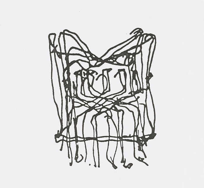
Frank Gehry's sketch for the Cross Check™ Chair, 1990. Image from the Knoll Archive.
Of Gehry’s sketch and ideation process, you wrote, “His line drawings, which can appear as casual as doodles, almost always contain the essential idea of a project.” While in no way a paper architect, there is a primacy to Gehry’s sketches, perhaps because Gehry’s buildings are so inventive and challenging to build. What importance do you ascribe this part of Gehry’s design process, what Gehry calls “play”?
That’s a really good question. For Gehry, the drawings become a very powerful way of seeing into his thinking, of seeing into his consciousness. I’m tempted to quote the great line of Freud's about dreams being “the royal road to the unconscious.” I’m not sure that we would say that of Gehry’s drawings, but they certainly are "the royal road" to his design thinking as it is evolving. They are a language very much his own, and they give us a window into both the lyricism and complexity of his work. They’re working something out, but they are not picture-like in the way a rendering is.
The cover of the book, by Peter Mendelsund, is part of a drawing for Walt Disney Concert Hall, and it doesn’t not look like Walt Disney Concert Hall in the way a photograph would, but there are ideas that are visible here and we can see how he was thinking.

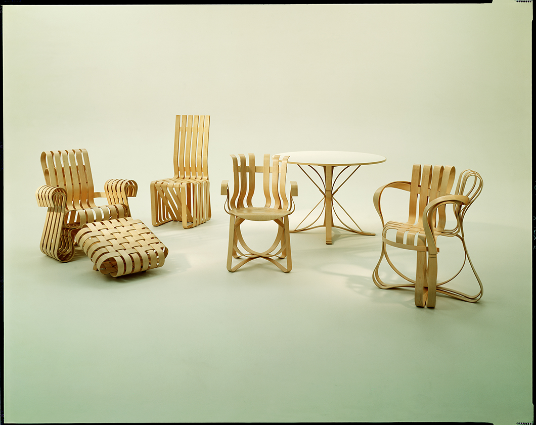
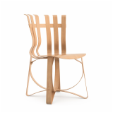
The Bentwood Collection by Frank Gehry for Knoll, 1992. Photograph from the Knoll Archive.
Gehry has always been drawn to unusual materials: chain-link fencing, corrugated metal, titanium, cardboard, maple wood and warped glass, to name a few. How do these material interests fit into Gehry’s approach to design?
Gehry is an architect with an enormous interest with materials, without being driven, primarily, by materiality. He is interested in new materials and the ways in which old materials can be pushed in new ways.
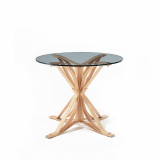
Surely the Knoll chairs are a very good example of that, in which maple wood is bent to a very, very beautiful end, within the tradition of Thonet, and Eames in between. The key thing for Gehry was not doing something absolutely new with the material that no one had ever done before. Instead, it was doing something creative that yielded a product that was not the same as anything that had existed before.
The collection is somewhat more form-driven, even image-driven. I wonder if we can say the same thing about Easy Edges, which was more avant-garde in its materiality and very much at the cutting-edge. But the Knoll chairs are more beautiful and are proving to a have a staying power as classic objects that’s not the case with the Easy Edges.

“In Bilbao, all the stars were in alignment. It was the perfect site, the perfect client, [and] the perfect moment in Gehry’s career.”
—Paul Goldberger
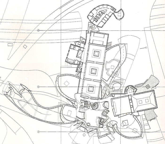
Frank Gehry's plan for the Bilbao Guggenheim. Image courtesy of Gehry Partners.
Bilbao Guggenheim is presented as the fulcrum of Gehry’s architectural career, and also the project that brought him international fame. Can you expound on the importance of this project as a suitable middle point for surveying Gehry’s work?
Many of the ideas of Bilbao, especially the sort of free-flowing form, were ideas he’d been working on for a while, most significantly at the Vitra Design Museum of 1989, which was limited by the technology of that period. There was also the American Center in Paris and the Weisman Museum in Paris, where Gehry was pushing to create a kind of fluid, flowing form that would nevertheless respond correctly to the real, functional program.
All of this came together most fully in Bilbao, where all the stars were in alignment. It was the perfect site, the perfect client, the perfect moment in Gehry’s career and the technology was there. Bilbao was the first full-scale major building that would have not been possible without CATIA [the software, adopted by architects from the aerospace industry, that Gehry's firm refined].
The titanium price also dropped, which was another moment of luck in that project. Although, I think of that as less important only because had he built the building in stainless steel, it would not have been all that different. It added to the attention the building got, and enriched it in certain ways, and there’s no question that it is better for the titanium, but if that had not happened the other successes would not have been prevented by it.

Frank Gehry at work on the High Sticking™ Chair for Knoll in 1991. Photograph from the Knoll Archive.
There is a section in your book where you talk about Gehry’s stop-start relationship with Alvar Aalto—he first met the Finnish architect before he had aspirations of becoming one himself. During their reunion in 1972 (the same year as Easy Edges), you point out that Gehry failed to see “Alvar Aalto was a model of the architect who had designed modern furniture that had become highly successful at no cost to his reputation as an architect.” Why did Gehry initially see furniture design as a potential source of conflict?
It’s a great story because it tells you so much about Gehry’s strengths and weaknesses. What I find also fascinating, which I didn’t dwell on in the book, was how relatively easy it was for a pretty unknown designer to break into the mainstream. The fact that it was a big deal at Bloomingdales... Could you do that today? I don’t think so. I don’t know that it was all that common back then, but I think it would be nearly impossible today.
He admits it was a mistake, it was driven by fear. He felt mistakenly ambivalent about success—that’s to put it almost too simplistically. He has always been incredibly driven, but there was, nevertheless, a certain amount of conflict and ambivalence. He feared that his success as furniture designer would turn him into a kind of manufactured celebrity with very little control over his own life and almost no ability to establish his reputation as an independent architect.

“Everything about the design was informed by the presumption that once Gehry and Knoll agreed that it was right, it was going to be a very long-term product.”
—Paul Goldberger
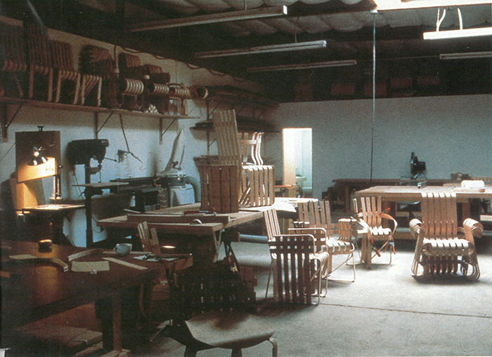
Frank Gehry working on the Bentwood Collection for Knoll in 1991. Photograph from the Knoll Archive.
What, if anything, did Gehry learn from Easy Edges before embarking on his second furniture collection with Knoll, several decades later? How do they differ?
Easy Edges always had a certain funkiness to it, and that was its selling point: it was cheap and funky. I wouldn’t describe the Bentwood Collection with either of those adjectives.
It tells you something very important about Gehry that the Bentwood Collection is refined while bespeaking a kind of casualness. It is not refined in a Miesian way, but in a generous, easy-going way. Anyone who works in manufacturing knows that it only works because it is as precise as a Miesian piece and there is nothing truly casual about it, in spite of its air. That, in a way, is metaphorical of Gehry’s architecture.
That’s one tremendous difference between the two. The other is that Gehry grew up in terms of his attitude about furniture’s role within the larger picture of his career. He knew by the time work on the Bentwood Collection began that he had established himself as an architect and that he could no longer fear his career as a furniture design could squeeze his career as an architect. So, he could afford to turn to furniture as a pure pursuit. As with every architect, it was a form of brand extension—the collection would make him more known and extend his name—but he had much more control over it. It would clearly be a secondary pursuit.
Knoll has a history of investing in classic projects. Most Knoll products are long-term, permanent products. Adding to that inventory made it a different kind of experience for Gehry than the start-up collection. Everything about the design was informed by the presumption that once Gehry and Knoll agreed that it was right, it was going to be a very long-term product. The hope was it would enter the same ranks as previous pieces.

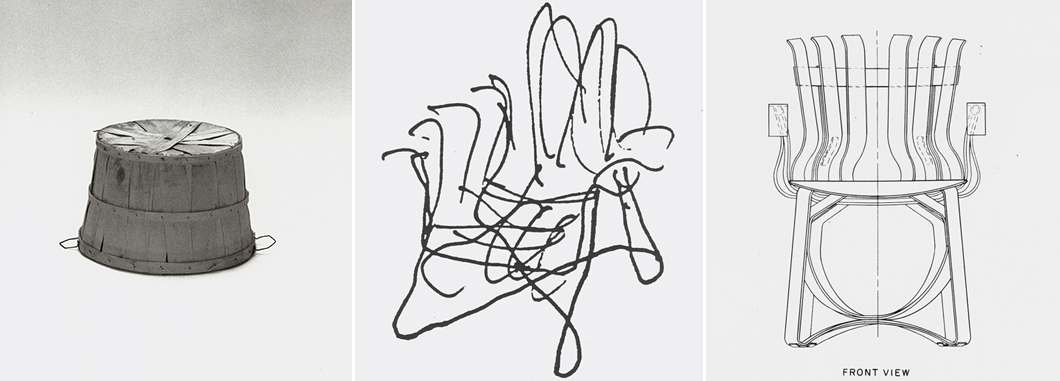
The evolution of the Bentwood Collection by Frank Gehry for Knoll, 1992. Images from the Knoll Archive.
The Bentwood Collection was inspired by the strength of wooden bushel baskets. All the pieces in the collection are formed from layers of a single material, steam-bent maple wood, joined together by industrial adhesive. Gehry said, “I wanted the chair to come out of my own work, the shapes of my buildings.” What formal interests does the collection share with Gehry’s buildings of that period?
What I think is equally important to Gehry [as an architect and designer], is that the flowing nature of the form captivate you. You don’t want to look at his work and have your primary thought be, “Gosh, how did he do that?” If you think that way, you’re not thinking about the chair or building as an experience to sit in or look at. In furniture and architecture both, Gehry is an experiential designer. What's important is how you feel, not what questions does this raise in your mind. If it’s about how he did it, it’s no longer about the furniture or building. It’s about a trick. I don’t think Gehry is interested in tricks.

“Gehry is an experiential designer. What's important is how you feel, not what questions does [his work] raise in your mind. If it’s about how he did it, it’s no longer about the furniture or building. It’s about a trick. I don’t think Gehry is interested in tricks.”
—Paul Goldberger
Original advertisement for the Bentwood Collection by Frank Gehry for Knoll, 1992. Image from the Knoll Archive.
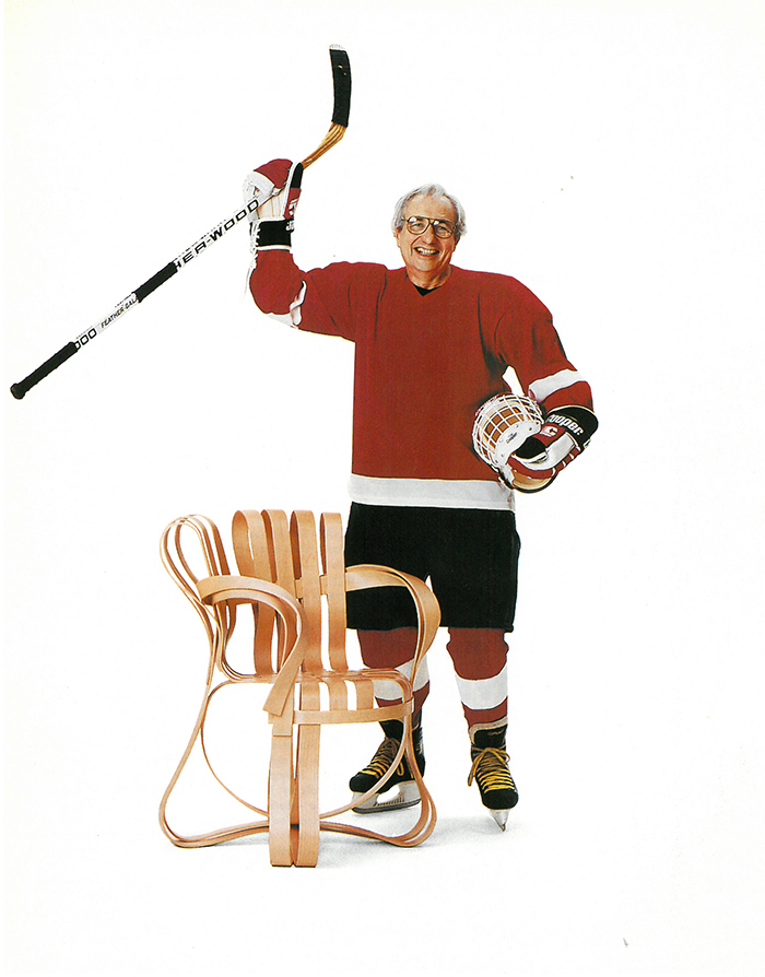
Can you retell the story of how Gehry’s collaboration with Knoll came about? Hockey played a role, didn’t it? [Gehry named the chairs and tables: Cross Check, Hat Trick, Power Play, Face Off and High Sticking.]
Gehry has always loved hockey. He grew up in Northern Canada, which is where he started playing, and it was an obsession for a while. Later in life, he not only played in adult leagues, but he hung around hockey players—in his office, there are a number of photographs and jerseys hung on the wall, signed and so forth. After a lifetime of living in Hollywood and knowing many people in the entertainment business, he was not awed by them, he was awed by hockey players.
A Knoll furniture consultant, Maureen Chartraw, was married to a hockey player and she got the two parties into talks. She was an important connector, and encouraged [the collaboration] to happen. I think partly in tribute to that, because the collection was connected to this love of his, Gehry tied his formal interest to the whole idea of let us pretend these are all hockey sticks.

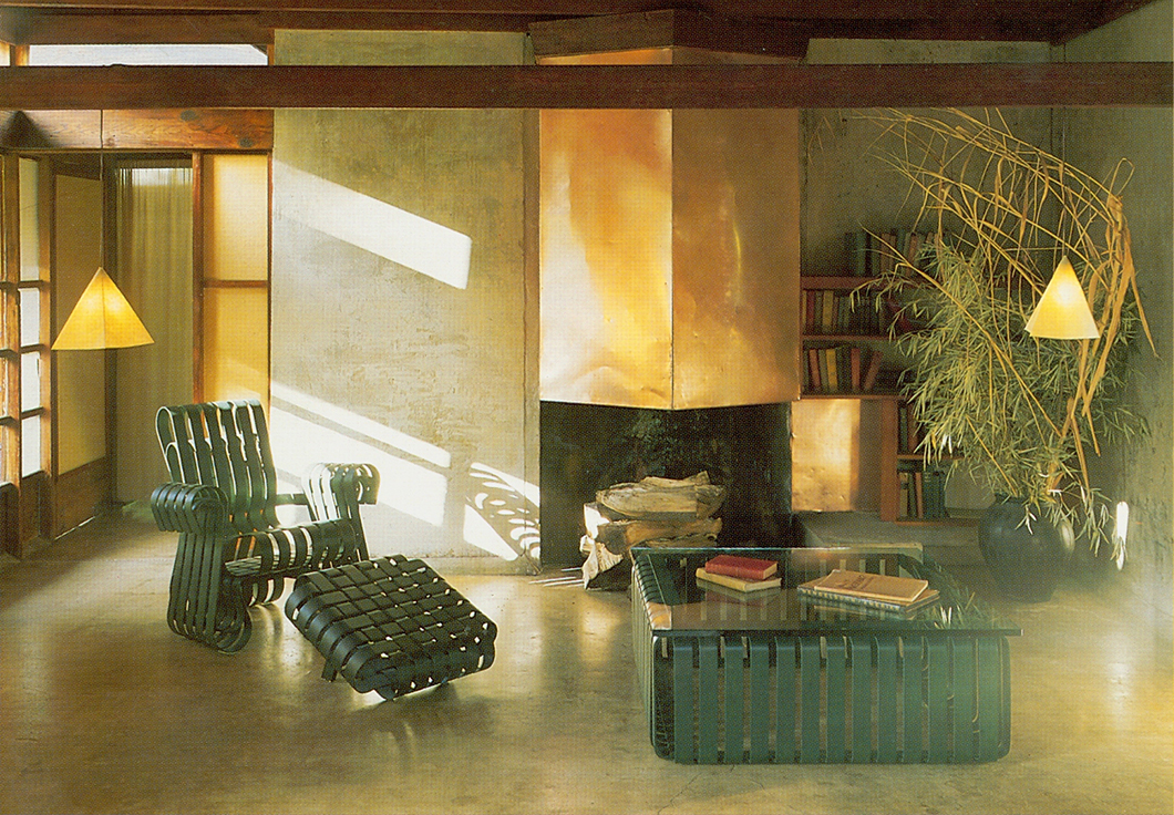
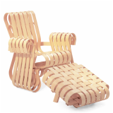
The Power Play™ Chair and Ottoman by Frank Gehry for Knoll, 1992. Photograph from the Knoll Archive.
Many people are familiar with the exterior envelope of Gehry’s buildings, but you don’t spend much time in the book talking about Gehry’s crafting of interior environments. Would you care to comment on how Gehry approaches this dimension of his buildings? What are his concerns?
Gehry is, perhaps uncharacteristically, flexible and forgiving when it comes to residential interiors. Ron Davis’ house is a good example. It was designed for an artist, and consisted of big loft with a painting studio. Gehry said that he didn’t mind a certain amount of clutter since he expects other people’s things to play a role in the house, which is a very anti-modernist stance. He’s the opposite of Mies, in that sense.
His own home, too, is an amalgam of stuff, much of it furniture. There is also a lot of art that hangs on the walls. But it’s a little messy, because Gehry’s not obsessed with purity.
What he doesn’t like is houses in which people have brought in a decorator to try to make it conventional. He doesn’t want the Gehryness of [his houses] covered up, but he does believe that it can be expressed through a much wider range of things inside it than his own [direct contributions]. He does not want to design a private interior down to the last toothpick, unlike a Miesian interior which is a more pure, fully thought-through thing. He wants his aesthetic to be more forgiving.

“I think [Gehry] would be very happy to have his own work described with that phrase: adventuresome fluidity and lyrical form enabled by the latest technology of the time.”
—Paul Goldberger
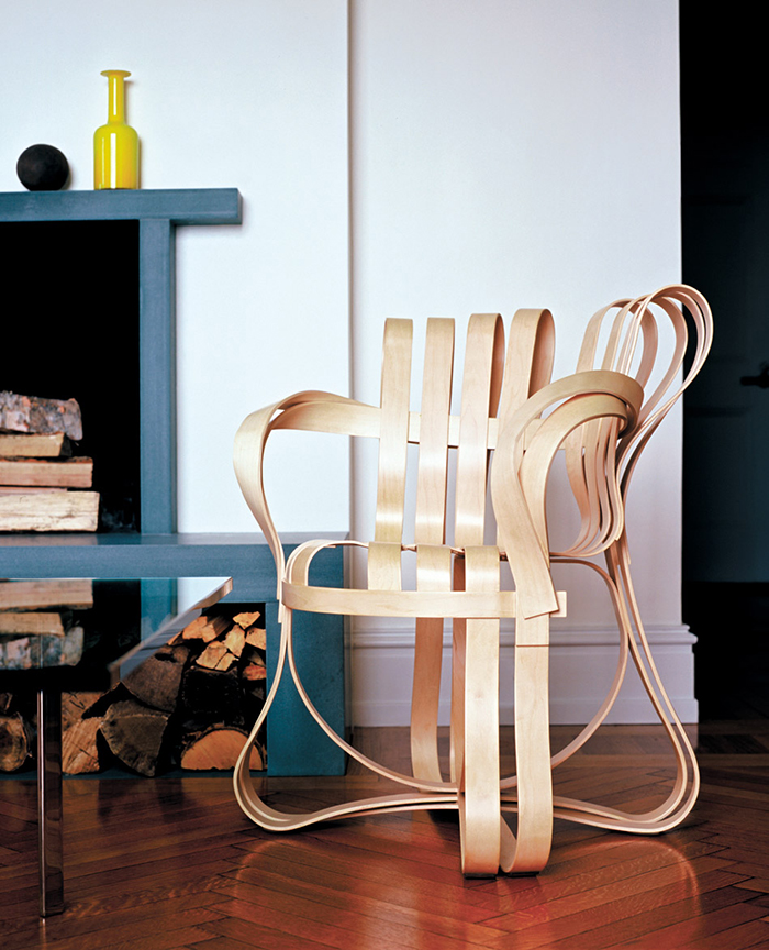
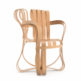
Cross Check™ Chair by Frank Gehry for Knoll, 1992. Photograph from the Knoll Archive.
One of the misconceptions about Gehry that you address is that his buildings represent a break with tradition. Contrarily, you posit that Gehry is trying to re-imbue contemporary architecture with a dynamism and emotional energy he identified in older structures, like the Chartres Cathedral. You contend, “He wanted to find a way to preserve what might be called traditional architectural values [but] not by using traditional architectural forms.” How do you see Gehry’s designs in relation to tradition?
Europe was a whole new world that he had not learned about [in architectural school] and never experienced. What he saw in Europe was a degree of adventuresome fluidity and lyrical form that was enabled by the latest technology of the time. I think he would be very happy to have his own work described with that phrase.
While he was overwhelmed by Chartres, he was particularly moved by Romanesque cathedrals. It was the roundedness of them, the fact that they did not deny their own heaviness and sense of weight, while [remaining] enormously rich and complex. Gothic cathedrals have always had an aspiration to lightness which is not as motivating to him as making the less light object nevertheless perform in a lyrical way.

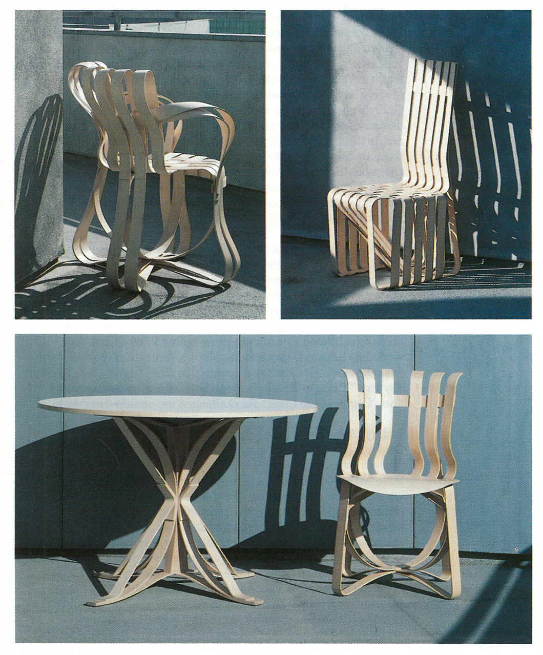
The Bentwood Collection by Frank Gehry for Knoll, 1992. Photographs from the Knoll Archive.
Finally, what do you hope the casual reader will take away from Building Art?
For a book that is intended for the general reader as well as the specialist, it’s a fair question to ask. I would hope that general reader would take away a couple of things. First, that creativity is difficult, even under the best of circumstances. Genius also requires work, and frequent failure.
Gehry, in particular, is an architect driven by problem solving. He is not an arbitrary maker of crazy shapes, which I think is the great misreading of him. That is so far from the truth, so I hope the book would help correct that misconception.
For purchasing information on Building Art visit Knopf.
All images are courtesy from the Knoll Archive unless otherwise noted.
