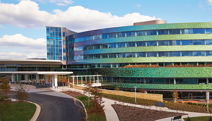
For Mercy Health - West Hospital, consolidating two dark and dated Cincinnati-area hospitals into a new facility marked the dawn of a new way of providing healthcare and the launch of a new brand. Under the guidance of architectural firms Champlin Architecture and AECOM, Mercy Health - West Hospital partnered with Knoll for furniture solutions to support its updated means of patient care while meeting new aesthetic standards and providing long-term flexibility.
Drivers
Create an Environment that Fosters Healing
Views of nature and daylight are shown to promote healing, so architects integrated the outdoors and natural light wherever possible. Abundant windows and skylights introduce nature, sunlight and a sense of openness throughout the interior, according to Larry Bagby, Director of Facility and Construction Planning for Mercy Health - West Hospital.
To maintain visual continuity and uphold the healing experience, it was vital floor plans and furnishings render a similar transparency.
Support New Methods of Delivering Improved Care
Replacing a closed, dark, angular space with an open, curved building bathed in natural light would signal both an aesthetic and cultural shift for Mercy Health.
The new facility would also introduce an enhanced care delivery process designed to provide an improved patient experience. Caregivers would be brought closer to the patients’ bedside, according to Stephanie Meade, Chief Nursing Officer for Mercy Health - West Hospital, and electronic charting would streamline communication and improve accuracy. A focus on team efforts, collaboration and information-sharing among caregivers across disciplines would further advance the level of care.
Allow for Future Flexibility
Frequent advancements in technology, research and patient care can thwart planning efforts in the rapidly changing healthcare industry. Because of the complexities and expense of renovation, administrators were adamant that the new environment allow for quick and easy changes with minimal inconvenience.
“We wanted flexibility that would provide space for people to move freely, yet be adaptable, so in a week, a month or a decade, we didn’t have to start over with the design,” said Mercy Health’s Bagby.
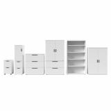
Yet when it came to furnishings, Mercy Health leadership was unwilling to compromise on design at the expense of flexibility. “We loved the upscale feeling that custom millwork provided at our former facility,” said Mike Stephens, President and West Market Leader for Mercy Health - West Hospital. “We wanted to re-create the beauty of built-in wood cabinetry in a format that allowed us to easily make accommodations so we could avoid the ad hoc additions that detract from its overall look.”

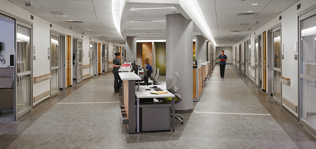
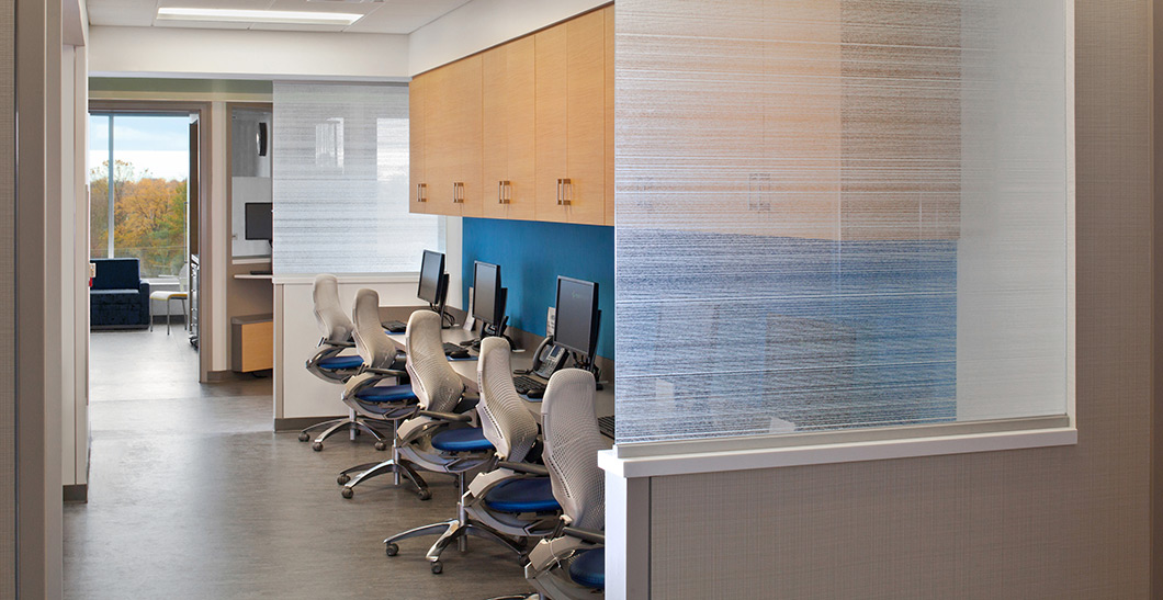
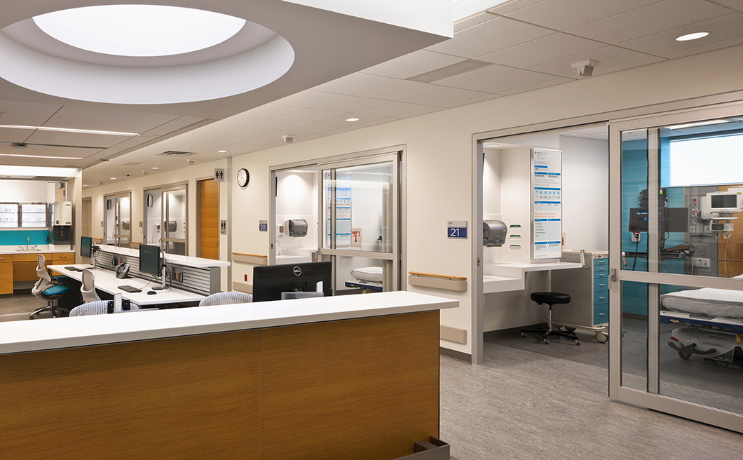
To maintain transparency and continuity with the exterior, Mercy West-Hospital interiors feature numerous wide open spaces and an easy-to-navigate layout. Featured: AutoStrada Service Wall, Dividends Horizons, Reff Profiles, Series 2 Mobile Pedestals, Generation by Knoll Work Chairs
Deliver an Adaptable, Safe, High Performance Environment
As a critical care facility open round-the-clock, Mercy Health had performance requirements particular to a healthcare institution. Furnishings needed to be exceptionally durable and easily cleanable, as well as accommodate a variety of sizes of users that change over multiple shifts per day. “Furniture needs to be strong enough to support a 200-pound anesthesiologist and then be easily adjusted back,” noted Mercy Health’s Bagby.
Additionally, with the substantial technology component the electronic record-keeping required, it was vital that power cords and data cables be concealed safely and neatly, according to project interior designer Kristie Pudlock of Champlin Architecture.
Tactics
Open Environment to Let Light Flow
The building’s curved design and absence of a curtain wall served as the ideal foundation for the bright and open environment Mercy Health leaders envisioned. A 15-foot floor-to-ceiling clearance achieved open sightlines and a sense of volume and accessibility, explained Mercy Health’s Bagby.
Liberal use of skylights and oversize windows harness the abundant natural light that streams into public spaces and some work areas. Private patient rooms line the perimeter, allowing unobstructed outdoor views through large windows, while supply rooms and utility rooms are clustered in the interior. To maintain transparency and continuity with the exterior, interiors feature numerous wide open spaces, visible waiting areas (rather than enclosed or hidden away), and an easy-to-navigate layout.

Mercy’s new facility introduces an enhanced care delivery process designed to bring caregivers closer to patients’ bedside. Open furniture systems and wide, unobstructed spaces provide clear sight lines that improve visibility and communication between caregivers, patients, families and visitors. Featured: AutoStrada Service Wall, Dividends Horizons, Reff Profiles, Series 2 Mobile Pedestals, Generation by Knoll Work Chairs
Centralized and Decentralized Work Areas
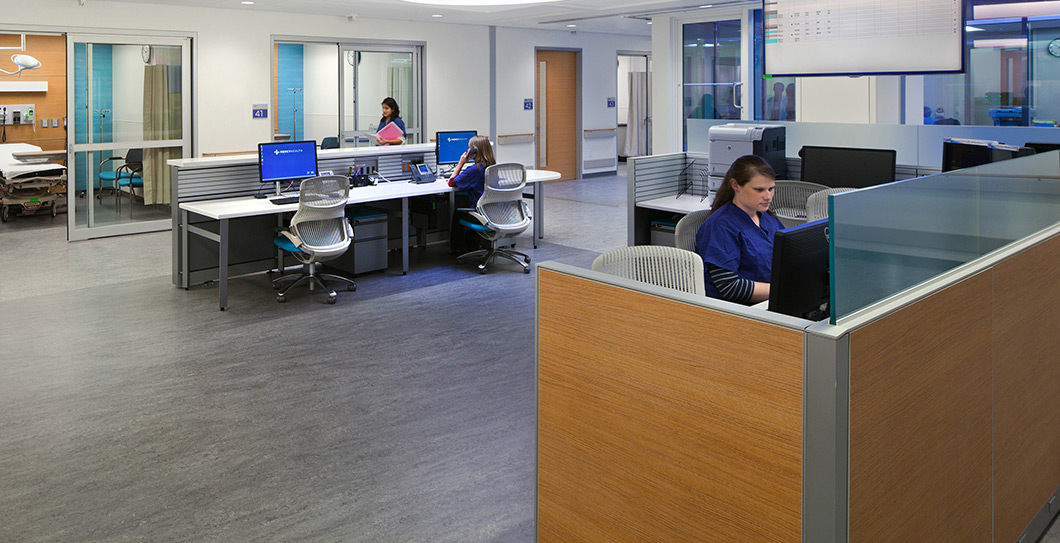
Rather than traditional, enclosed nurse’s stations and private offices, designers articulated a series of centralized and decentralized team work areas to support collaborative activities, bring multiple disciplines together, improve the patient experience and enhance operational efficiency.
To carve out the necessary space to maintain the sense of openness in the interior, team workstations utilize a smaller footprint – reducing space per caregiver from 60 to 48 inches – in a compact layout that provides much greater mobility, according to designer Pudlock.
Team spaces were built to be efficient, helping staff stay organized through shift changes with quick communication, but accessible enough as to not to isolate, according to Mercy Health’s Stephens. Open on two sides, stations maintain a sense of availability and maximize sight lines without sacrificing privacy and quiet at night.
Furniture System for Openness, Flexibility
When considering furniture options, designers assessed Mercy Health’s patient care goals, programming and functional needs, as well as the aesthetic appeal its re-vamped branding message commanded.
“We evaluated the pros and cons relative to flexibility, depreciation, value, aesthetics and capability to house technology, and determined that modular furniture was the best solution,” recalled Champlin’s Pudlock.
“We wanted a very simple, streamlined design with a modern sensibility,” she continued. It also needed to complement the architectural elements designed to boost staff and patient well-being found throughout the new space.
“Knoll had the cleanest lines and a design that related to the exterior and interior design of the building,” said Champlin’s Pudlock. “It wasn’t too fussy or too futuristic.”
In addition to meeting visual standards, planners valued the numerous efficiencies the Knoll furniture solution provided. “First, it easily accommodates changes in workflow, equipment or departmental growth with minimal disruption to staff and patients. Second, it has a slightly smaller footprint, which fit the scaled-down workspaces. Third, it neatly houses wiring and cables,” Champlin’s Pudlock explained.
Acknowledging that a modular system was a definite aesthetic shift from the more traditional settings found elsewhere in its system, the Mercy Health team appreciated that the Knoll product solution expressed a permanence and visual appeal that they previously felt was only available in millwork, recalled Carol Crane, Vice President Healthcare and Higher Education for Knoll.
However, changes to custom millwork can be expensive and highly disruptive, Crane explained. “A furniture system like Mercy Health chose can easily accommodate changes in technology, workflow or adjustments for comfort of caregivers. Modifications can be done cost-effectively onsite in minutes,” she added.
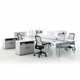
With its various interchangeable components, modular furniture also affords versatility within the actual workstations, related Mercy Health’s Bagby. “It allows for various heights of partitions and glass panels to help with audible privacy. It easily accommodates both individual and shared workstations for two or four people. It works freestanding or connected within open or closed workstations and private offices.”
Streamlined Furniture that Integrates Storage, Technology, Accessories
“We evaluated the pros and cons relative to flexibility, depreciation, value, aesthetics and capability to house technology, and determined that modular furniture was the best solution.”
—Kristie Pudlock, Interior
Designer, Champlin Architecture
Mercy Health’s new approach to providing care called for electronic record-keeping, necessitating a computer in each patient room, as well as workstations outside of every two rooms and in team workspaces.
To provide connectivity, Knoll AutoStrada service wall, an easily customized spine wall, was specified to neatly house electrical, phone and network cabling, as well as provide an infrastructure for future technology upgrades. It was also sturdy enough to support a protective guardrail that Knoll engineered to do double duty as a footrest.
“Not only did the spine wall’s rectilinear form and 5.5 inch thickness look structurally capable, it also easily provided the necessary stability to support the rail,” recalled Chris Keller of RJE Business Interiors, the Knoll furniture dealer on the project.
Though less storage was required with the migration to electronic record-keeping, tighter space requirements demanded furniture be highly efficient as well, so dual-purpose furnishings were incorporated where possible. Mobile pedestals provide storage as well as spare seating; worksurfaces integrate lateral filing storage; built-in organizers neatly stow desktop accouterments and supplies.

Open-style workspace layouts with low partitions and glass privacy panels maintain the transparency and openness that is a signature element of the newly rebranded Mercy Health - West Hospital. Featured: Generation by Knoll Work Chairs
Customized Finishes to Enhance the Brand, Staff Comfort
Prior to finalizing the design of the team workstations, Mercy Health facility planners provided a two-week period in which care providers could “test drive” mockup workstations. The information collected during the trial was used to make refinements to the Knoll furniture solution to meet user functional requirements.
“We made tweaks and adjustments in response to the feedback we received from staff,” recalled Janette Campbell, Knoll Sales Representative, “and ultimately came back with a solution that provided for all their needs.”
“For example, the service wall had a combination footrest and guard rail to protect the front of the station from gurneys, carts, and other mobile equipment,” Campbell explained.
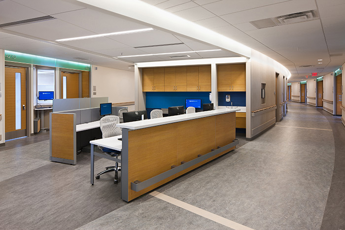
“Knoll was very accommodating when it came time to put the custom finishes in place,” Pudlock acknowledged. “For example, the horizontal grain laminate on the front face of the nurse’s station was not a standard finish, but very much part of the architectural language. Knoll was able to match the panel to the cabinetry and doors in a seamless manner.”
It’s the Little Things that Make a Difference
The mockup phase also provided an opportunity to test elements that contribute to individual comfort and productivity. “We had critical care staff try various cup holders, monitor arms, and the like to discover their preferences,” said designer Pudlock. “The foot rail was a particular staff satisfier for people who are on their feet most of the day.”
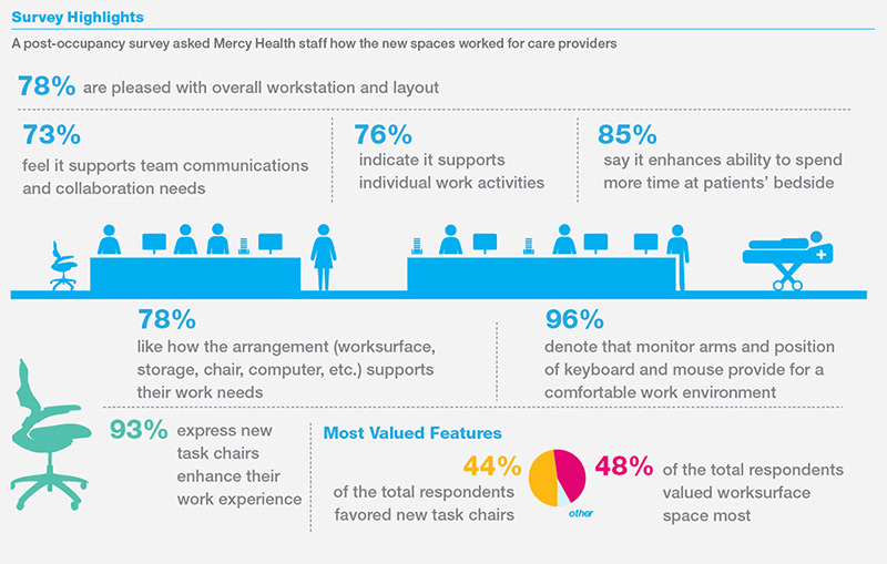
Easily adjusted elements won raves as well. “The monitor arms can be used sitting or standing on either side of the station,” said Mercy Health’s Stephens. “They can be raised, lowered and swiveled easily to accommodate different people. It’s a really well-appreciated design treatment,” he said. Indeed. A post-occupancy survey revealed that 96% of users felt ergonomic elements including monitor arms and position of keyboard and mouse added to their comfort while working on the computer.
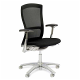
The Knoll Generation chair was the “hands down winner” for seating comfort, recalled Knoll dealer Chris Keller, and eventually specified throughout workspaces in the hospital. Though not part of the official ballot, the chair generated waves of unsolicited positive feedback in both the mockup stage as well as the post-occupancy survey, where it ranked as one of the top two most valued workstation features. Some 92% of users felt the chair provided a comfortable environment that enhanced their work experience, while the design team also liked the chair’s easy adjustability, cleanability and warranty.
But it was the Knoll wall-based line of space-saving organizational accessories that won over multiple users. “The staff can design their own workspace because it’s configurable,” said chief nursing officer Meade. “Things like pencil holders and paper trays are integrated in the back wall, giving us more space to work.” By minimizing desktop clutter, the accessories uphold the hospital’s branding mandate for an orderly environment.

Centralized team workstations are highly functional, supporting the new electronic record-keeping that allows caregivers to document on the unit where they provide services. Users overwhelmingly agree, with 93% of post-occupancy survey respondents reporting they feel the furniture supports the use of technology. Featured: Sapper Monitor Arms and KnollExtra Orchestra Collection
Outcomes
Improved Efficiency and Expanded Collaboration across Disciplines
The centralized team workstation layout greatly improved teamwork and interdisciplinary planning. Nurses have closer interaction with physicians, caseworkers and therapists, facilitating care decisions, providing greater efficiency and an improved patient experience, related Mercy Health’s Meade.
“In the past, caregivers might have had to go to another area - such as physical therapy - to chart. This allows all caregivers to document on the unit where they provide services. Greater visibility and sightlines have improved patient’s perception of communication with nurses and doctors,” she added.
Spaces that Enhance the Care Delivery Process
Mercy Health’s strategy of a design-based approach to enhance the delivery care process shows every sign of meeting its objective of improved patient care. Some 85% of respondents to the post-occupancy survey felt the overall workstation and layout enhanced their ability to spend more time at the patients’ bedside.
Finely Integrated Technology and Flexible Furniture Ease Future Adaptability
A combination of three inter-related Knoll systems provides broad adaptability options as medicine and technology change. From post-installation minor tweaks, to reconfiguring several years down the road, the kit of parts allows future additions to seamlessly blend into the “family.”
Users overwhelmingly agree, with 92% of post-occupancy survey respondents reporting that team workstations support the current use of technology. With the easily updated spine wall at the core of the system, management anticipates smooth updates when the time comes to upgrade technology.

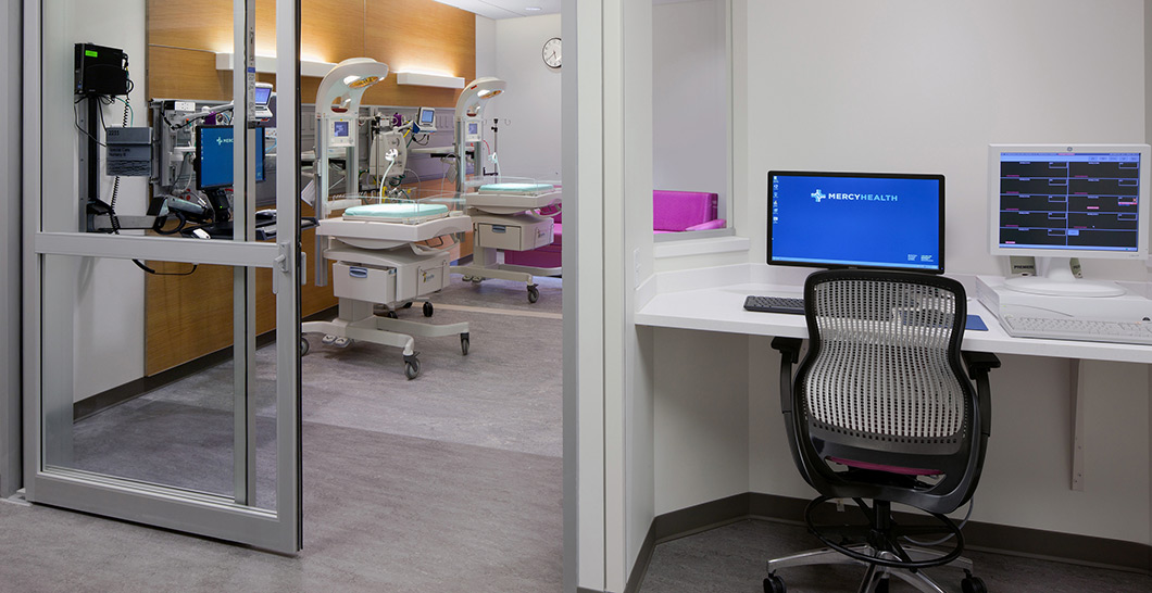
Mercy’s new approach to providing care called for electronic record-keeping, necessitating a computer in each patient room, as well as workstations outside of every two rooms and in team workspaces. Featured: ReGeneration by Knoll Work Chairs
Embracing the New Brand and New Way of Providing Care
The Knoll streamlined furniture solution – with neatly integrated storage, technology and clutter control – exemplifies the clean-lined, modern aesthetic the planning team sought for their new brand.
“Mercy was looking for product that could perform to function, first and foremost, as well as enhance the branding effort by adding color and vibrancy,” said RJE’s Keller. “The charge from the top was for clean, timeless pieces that fit in with the design of building and we met that objective.”
Management agrees. “The staff wants to come here, it’s a fulfilling environment, we’re benefiting people, it’s a place where physicians want to practice,” said Mercy Health’s Stephens. “We feel we’ve met our goal.”
“It’s just night and day with the previous facility,” he continued. “Our former spaces were dated, old, and had to be retrofit and adapted to be more functional. Now we have space that is designed around the way we provide care to our patients and families. The bonus is that the flexibility is built in so we can adjust it easily to meet future needs.”
And the staff agrees, with nearly 80% expressing contentment with the overall open-style team workstation and efficiently planned furniture layout in the post-occupancy study, finding it supports both their team-based needs (73% noted) as well as their individual work activities (76% designated).
“We were thrilled that Knoll could translate our vision without barriers or making amends,” said Mercy Health’s Stephens.
A healthy win for all.

The Knoll furniture solution presented the elegance of custom millwork with the flexibility and efficiency of modular systems in an open layout to enhance communication and patient care. Featured: AutoStrada Service Wall, Dividends Horizons, Reff Profiles, Generation by Knoll Work Chairs
• • •
Mercy Health - West Hospital
Awards
• Healthcare Design Magazine: 2014 Design Showhouse, Honorable Mention
• Healthcare Interior Design Competition: Best of Category Award, Community / Academic/ Teaching Hospitals, 2014
• Modern Healthcare Magazine: Citation / Unbuilt Work, Annual Design Awards, 2012
• ENR Midwest Awards: Best Project of the Year, 2014, Best Project - Healthcare, 2014
• Ohio ASLA Design Awards: Merit Award (Green Roof)
• Brick in Architecture Awards: Best in Class, Healthcare, 2014
• Society of American Registered Architects: Award of Excellence - National Design Awards
• Association of Licensed Architects: Merit Award
• IIDA Northland Chapter: FAB Award - Healthcare
Client Profile
A premier healthcare provider with more than 100 network locations, Mercy Health has served Greater Cincinnati neighborhoods for more than 160 years. With a staff of 8,000 employees and physicians, Mercy Health is affiliated with more than 1,500 physicians who represent a wide array of medical and surgical specialties. At the heart of Mercy Health services are six awardwinning hospitals, including West Hospital, which comprises maternity care, a cancer center, a heart center with open-heart surgery, a nationally recognized orthopedic program, and a women’s health center.
Project Team
Knoll, Inc.: Knoll, Indianapolis and Minneapolis
Knoll Furniture Dealer: RJE Business Interiors, Cincinnati
Architect of Record: Champlin Architecture, Cincinnati
Design Architect: AECOM with Mic Johnson, FAIA, lead designer, Minneapolis
Construction Manager: Turner Construction Company
Download "Mercy Health-West Hospital Case Study" to Read the Full Paper
