-
Living
Living Room
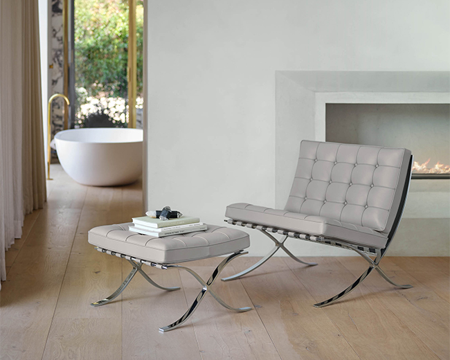
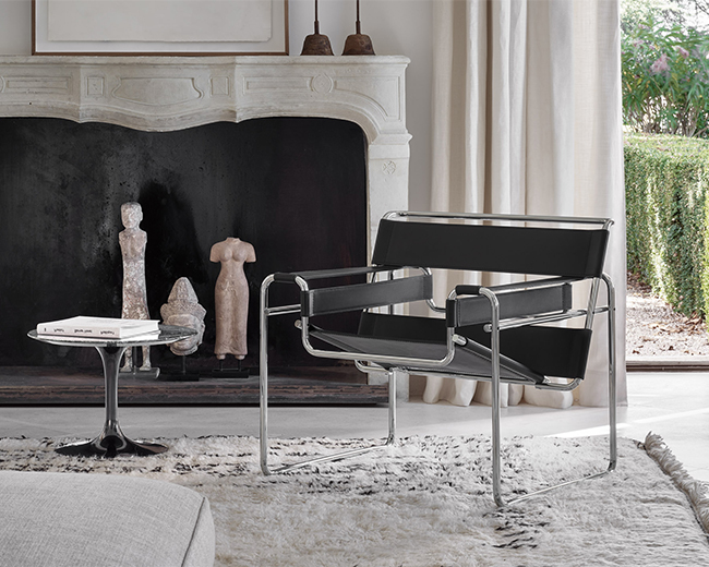
Living Room LookbookClassic or contemporary, bring everyone together with modern living room furniture.
-
Dining
Dining Room
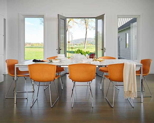
Dining Room LookbookBring style and sophistication to the table. Pair iconic modern dining tables with signature side chairs.
-
Work from Home
Work from Home
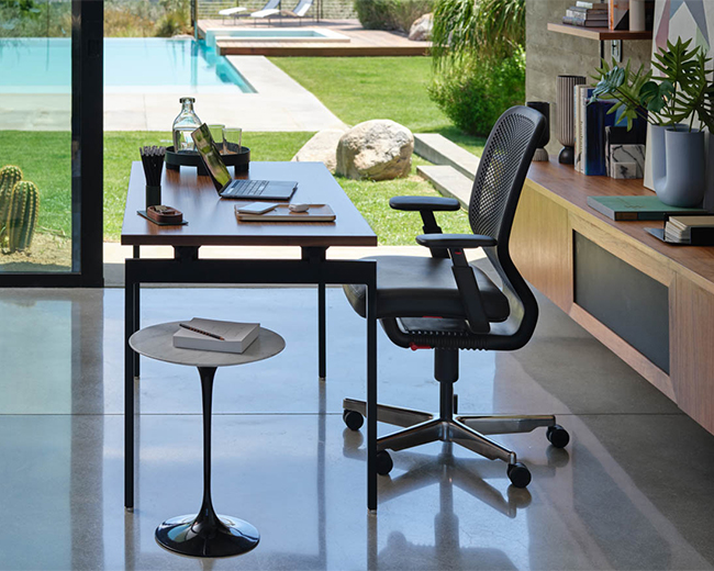
Work from Home InspirationModern Comfort that Works.
An affordable range of desks, chairs and accessories for working and learning at home. Most products ship free in 1–3 days. -
Outdoor
-
Collections
Collections
Since 1938, Knoll has been recognized for creating modern furniture that inspires, evolves, and endures. Steeped in the history of modernism, our vision is carried forward today by the most talented contemporary designers.
-
In Stock
In Stock
Discover classic and contemporary solutions for living, dining, and more with in-stock designs available in 1–2 weeks or as quickly as 1–3 days.
-
Inspiration
Inspiration
Discover how Knoll furniture comes together to create inspired modern interiors throughout the home.
Stories
Design Together
-
Products
Products
We believe well-designed objects deliver efficiency, joy and satisfaction to the people who use them.
-
Collections
Collections
Whether you are a commercial, educational, healthcare or government organization, we can help you achieve your workplace goals with an unmatched collection of products across a constellation of brands.
-
Resources
Resources
Resources and tools for architects, designers and facilities professionals.
Designer Resources
Product Information
Showrooms & More
-
Planning
Planning
We match your needs with research-supported tools, techniques, and insights we've developed over eight decades, applying our holistic understanding of the interplay between people, architecture and furniture, and the experiences they create.
Workplace Perspective
-
Discover
Discover
Learn how we use modern design to connect people to their work, their lives, their world.
