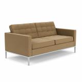
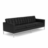
Florence Knoll Bassett was Knoll’s universal arbiter of taste. According to Murray Rothenberg, an early Knoll designer who worked directly for Shu, as Florence (neé Schust) was known by her co-workers, “Everything was controlled by Mrs. Knoll, everything that the public saw—letterhead, business cards, stationery, graphics—it doesn’t matter. She saw it, she approved it.” Until Robert Cadwallader’s appointment as Director of Marketing in 1967, the company’s marketing department was, essentially, a one-woman show.

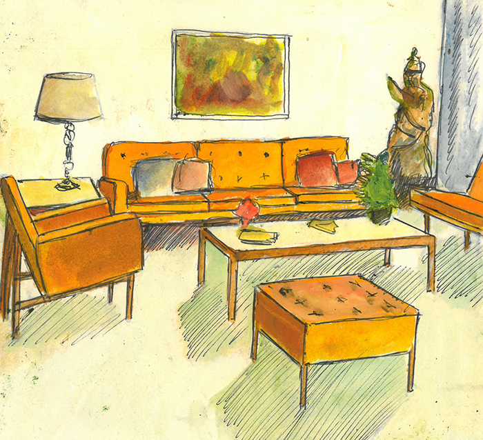
Initial sketch for a Knoll advertisement by Florence Knoll. Image from the Knoll Archive.
Among her many responsibilities, Shu collaborated with Herbert Matter, the company’s second graphic designer and photographer, to produce publicity and advertising materials. Although Matter was behind the lens, Shu exerted an equal influence through the rearrangement of furniture, styling of shoots and fastidious note-taking. “We worked beautifully together,” says Shu of her time with Matter, “we were doing something new.” Florence would design the room’s setting, or “vignette,” and Matter would create the stylized graphic composition. Every detail was manipulated to communicate something specific, and Shu made sure that each element fit within the holistic message.

Contact sheet for a Knoll advertisement by Herbert Matter. Image from the Knoll Archive.
In this endeavor, Shu’s prior training as an architect under Ludwig Mies van der Rohe became an essential hallmark of her approach. Before the ascendance of Knoll, architects and "interior decorators," as they were called, operated as separate entities with divergent aims. To achieve a truly modern building, architects were forced to “design their own interiors down to lighting fixtures and doorknobs.” This was because “‘interior decorators’ of the time, had no knowledge of modern architecture—or, if they had, they were generally out of sympathy with it.” Shu tasked herself with bringing the two disciplines together through the formation of the Knoll Planning Unit, a novel enterprise that brought the rigor and discipline of architecture into the planning and mapping of interior space.

“I designed the architectural spaces that were needed to make the room work, things like the walls, or the sofas.”
—Florence Knoll
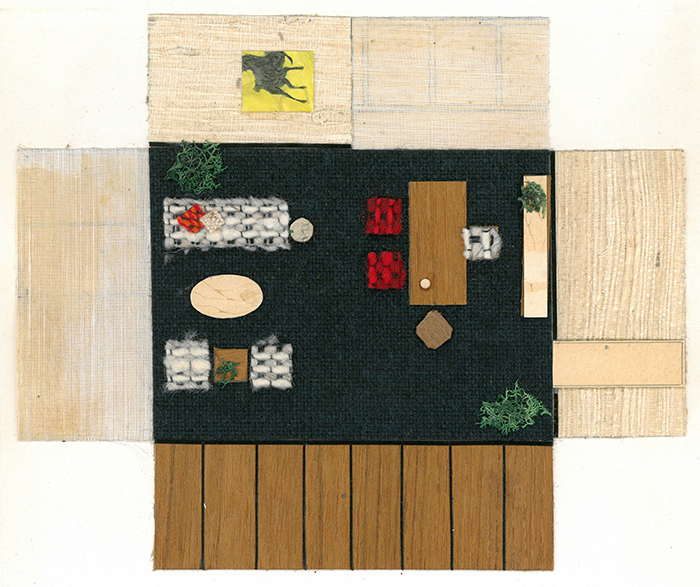
"Paste-up" by Florence Knoll for a Planning Unit project. Image from the Knoll Archive.
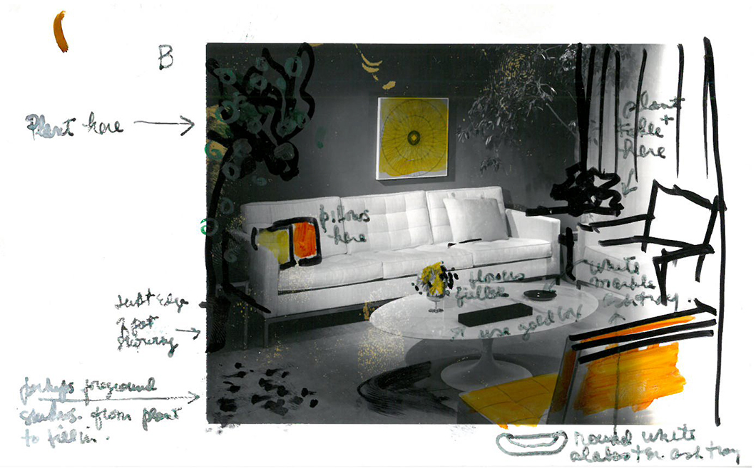
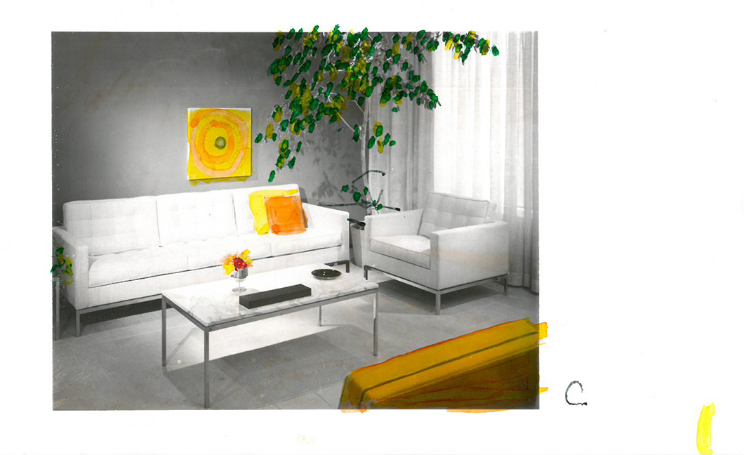
This approach extended to the presentation and staging of Knoll furniture in product photography. Adapting her “paste-up” method—whereby fabrics, color samples and furniture were arranged to represent the full textural and dimensional range of the finished interior—Shu would color, sketch and edit directly on photographic contact sheets. Such paste-ups and photographic models enabled Shu to coordinate furniture and accessories in relation to the scale and nature of the architectural space. After several iterations, these drafts would be given to clients, photographers and associates to make sure that the end result appear “letter perfect.”

'B' contact sheet, edited by Florence Knoll, for a Knoll advertisement by Herbert Matter. Image from the Knoll Archive.
As one Knoll employee, Bob Longwell, remembers, Shu’s eye was famously critical when it came time to review: “She’d say, ‘Well, I think we should change that radius a little bit. It just doesn’t fit in with this aspect. There’s just something not right about it,’” before adding, “‘instead of being a quarter of an inch, it ought to be a three-eighth-inch radius.’” Longwell concludes, “She had that ability, to critique [something], to tear it apart and put it back together.”

'C' contact sheet, edited by Florence Knoll, for a Knoll advertisement by Herbert Matter. Image from the Knoll Archive.
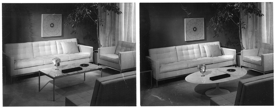
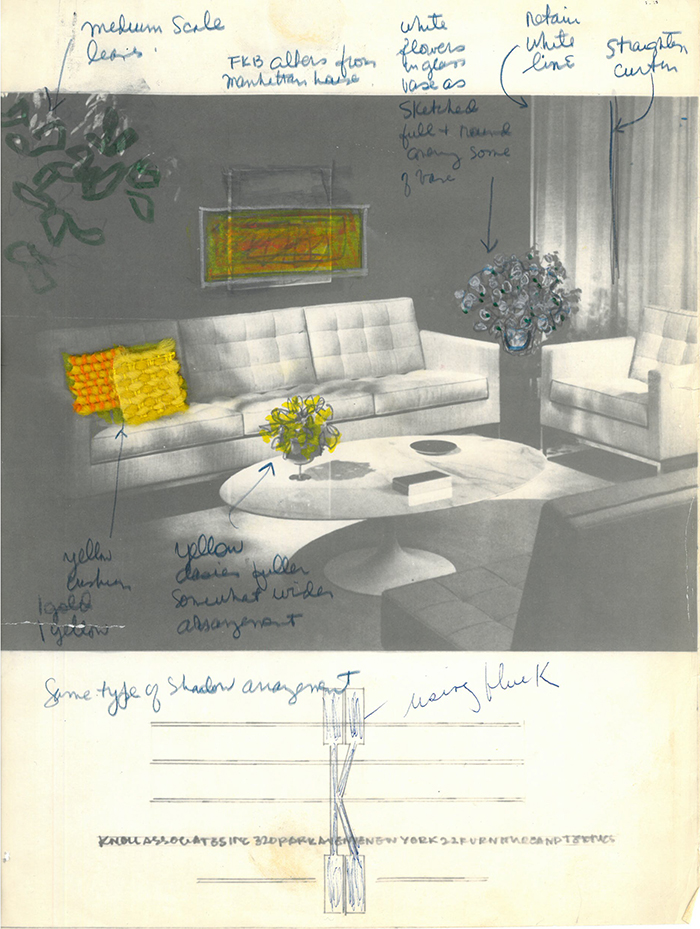
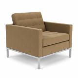
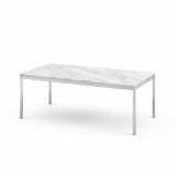
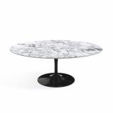
An equal level of discernment is evident in this compelling series of edited prints. Shu pursued two possible iterations: one with the more rectilinear Florence Knoll Coffee Table, her own design, and the other using a Saarinen Coffee Table—the latter won out. Shu is known to have favored designs by other designers in instances that called for figurative rather than architecturally derived forms, which she thought of as "meat-and-potato" pieces. “I designed the architectural spaces that were needed to make the room work, things like the walls, or the sofas,” Shu states. “The chairs, sculptural, I left for people like Bertoia and Saarinen.” The importance of this distinction harks back to her time at Cranbrook, where she learned about figure-ground relationships. “It was Cranbrook that taught Florence Knoll about the lyrical figure in space,” affirms Michael McCoy, a designer and educator.

“She had that ability, to critique [something], to tear it apart and put it back together. She was something else.”
—Bob Longwell
Final draft of the Knoll advertisement by Herbert Matter, edited by Florence Knoll. Image from the Knoll Archive.
Additional details that betray Shu's hand include the placement of the ashtrays, the scale of the foliage and the coordination of colors and fabrics. She even contributed her own artwork, Josef Albers' Homage to a Square. None of this amounted to decoration, however. "I am not a decorator," Shu is known to have said, "the only place I decorate is my own house." Instead, this painstaking process of revision brought about the harmonization of a modern interior space with the building's exterior.
"She was something else," concludes Longwell.
