Herbert Matter once said, “If you love something, the work will be just fine.” But in the case of his own extensive oeuvre, “just fine” may have been something of an understatement. No single label can encompass all that Herbert Matter was: a photographer, filmmaker, graphic designer, but above all, an artist of the most gifted sort. Of his protean abilities, John T. Hill, a student of Matter, explained, “I don’t care if you gave him a film camera, a still camera, or a pair of scissors and some paper. He was an artist.” “He was just straight-forward great,” Massimo Vignelli said of his immediate predecessor at Knoll. As Knoll’s chief graphic design consultant for two decades during its most formative years, 1946-1966, Herbert Matter did more than shape the company’s public image, he shaped its underlying identity.
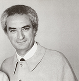
Portrait of Herbert Matter. Image from the Knoll Archive.
“If you love something, the work will be just fine.”
—Herbert Matter
Born in 1907 in the small Swiss village of Engelberg, Herbert Matter initially intended to become a painter. Early exposure to one Europe’s greatest medieval graphic art collections, however, led him to enroll at the École des Beaux-Arts in Geneva. The lure of modernism eventually brought him to Paris, where transferred to the Academie de l’Art Moderne to study graphic design. There, under the tutelage of modernists Fernand Léger and Amédée Ozenfant, Matter kept an eye on the developments in the post-war avant-garde movements, particularly those of Dada, Surrealism and Constructivism. The latter, in particular, would come to have a profound influence on Matter’s pioneering approach to photomontage. Design scholar Steven Heller writes, “Matter was inspired by the work of El Lissitzky and Man Ray, [and] intrigued by photograms, as well as the magic of collage.”
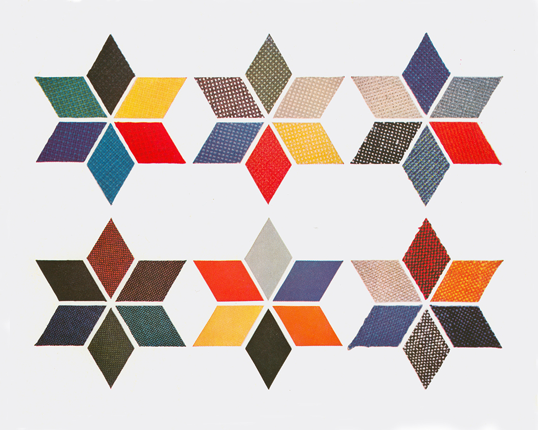
An example of a collage for KnollTextiles by Herbert Matter. Image from the Knoll Archive.
Upon graduating, Matter worked with briefly as an assistant to Le Corbusier and the typographer Adolphe Mouron Cassandre, before landing a position at the famous typeface foundry Deberny et Peignot, where he learned the nuances of typography. Shortly thereafter, the onset of the Great Depression and its entailing dearth of commercial opportunities forced Matter to seek out government contracts. Surprisingly, it was here that Matter first began to produce work that would bring him to the attention of an international audience.
“With Matter, most of the things went diagonally into the deepest space, more like the films of that time.”
—Sheila L. de Bretteville
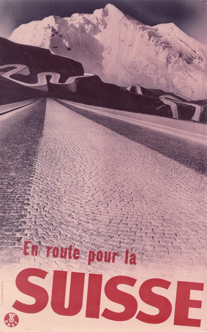
“En route pour la suisse,” by Herbert Matter. Image from the Knoll Archive.
On account of the worldwide economic downturn, Switzerland poured money into advertising its tourism industry, and Matter was given free-reign to invent a compelling graphics program to attract international skiers. According to Heller, Matter’s graphics from this period “follow a design [paradigm] that is rooted in the early 1930s, where the close cropped, ‘heroic head’ is at the forefront of the poster.” Also characteristic of these early works, Matter made dramatic use of the diagonal, which former student, Sheila L. de Bretteville—now the Director of Graduate Studies in Graphic Design at the Yale University School of Art—sees as rooted in developments in film. She explains: “with Matter, most of the things went diagonally into the deepest space, more like the films of that time."
After the Swiss tourism posters entered circulation, in 1936, Matter took up an offer for roundtrip passage to the United States as payment for some work he had done for a Swiss ballet troupe. In spite of speaking no English, upon arrival Matter secured a job at the fashion magazine Harper’s Bazaar. The magazine’s art director, fellow-visionary Alexey Brodovitch, had been collecting Matter’s Swiss travel posters (two of which, supposedly, hung in his office during their interview). More magazine contract work followed—first for Vogue, then Art & Architecture—before Matter finally arrived at Knoll in 1946. Matter’s timing could not have been more impeccable—it was then that, according to Knoll designer Richard Schultz, “everything started to move.”
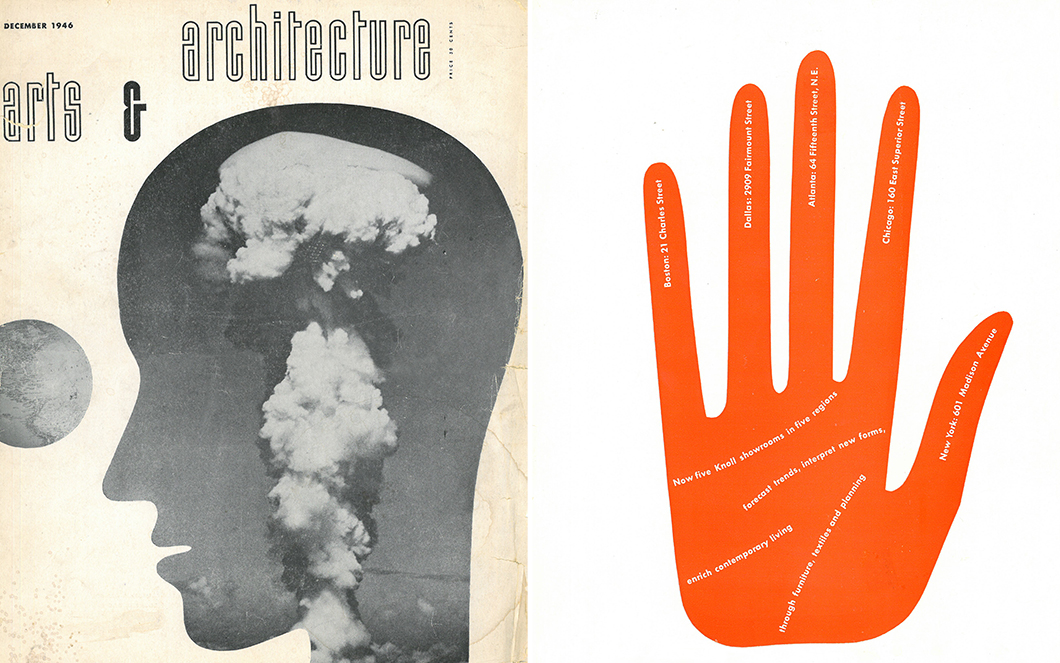
Left: Cover for Arts & Architecture by Herbert Matter, 1946. Image from the Knoll Archive.
Right: Advertisement for Knoll by Herbert Matter, 1948. Image from the Knoll Archive.
In the wake of WWII, Knoll had a renewed focus. With his new wife Florence Knoll now at the helm, Hans Knoll let go of his first designer, Jens Risom. Looking to push off against its past work, the company was in need of a new, bold graphics program and Florence was determined to find the right captain to steer the ship. "I had seen some of Herbert Matter's work and decided that was what I wanted,” Florence Knoll recalled in an interview from 1977. “[So,] I flew out to California." Years after the fact, design writer Eric Larabee, author of Knoll Design, wrote of their creative partnership. “[Matter] gave Knoll a graphic personality which closely matched the overall sense of consistent style Shu was trying to achieve.” Florence agreed: “We worked wonderfully together.”
“I had seen some of Herbert Matter’s work and decided that was what I wanted.[So,] I flew out to California.”
—Florence Knoll
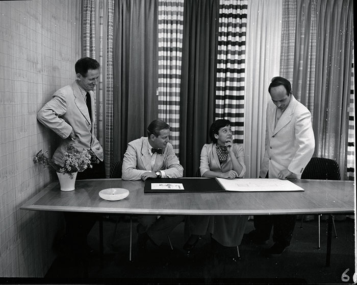
From left to right: Herbert Matter, Hans Knoll, Florence Knoll, and Harry Bertoia. Image from the Knoll Archive.
Matter’s initial assignment consisted of reconceiving the Knoll logo. Informed by his training at Deberny et Peignot, he came up with the now-iconic elongated slab serif logo. He intended for the trademark to function graphically in the company’s publications, so versatility was of paramount importance. Economy of means lead him to the simplified “K.” Matter explained: “First I developed the trademark. It was the full word; the K was later. That’s the way it started. And from that to the big K. I really did a tremendous amount of work starting the catalogue, and through that came simplification. First Knoll repeated and later the K alone.”
Examples of Herbert Matter's redesign of the Knoll identity. Images from the Knoll Archive.
“I remember that that’s where I took the first pictures—the photographs. It was mostly wood furniture.”
—Herbert Matter
Afterwards, Matter assisted Florence in reconfiguring Knoll’s New York showroom, located on 601 Madison Avenue. “I remember that that’s where I took the first pictures,” he said, before remarking that “it was mostly wood furniture.” For his part, Matter created the interwoven string installation and inventive textile display seen in the background, translating some of his graphic proclivities into three dimensions.
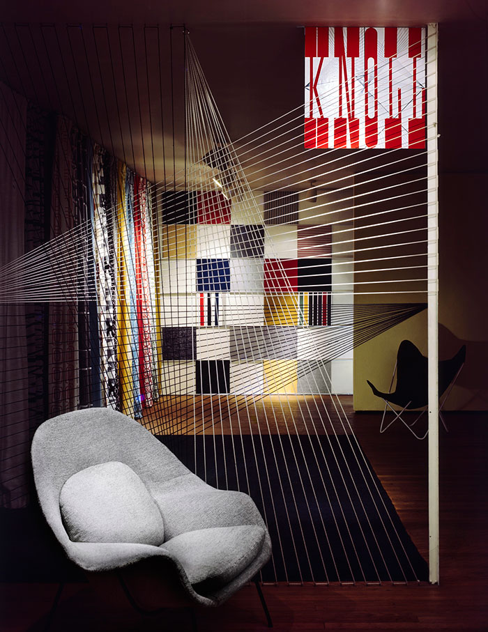
Knoll New York Showroom at 601 Madison Avenue, c. 1947. Photography by Robert Damora. Image from the Knoll Archive.
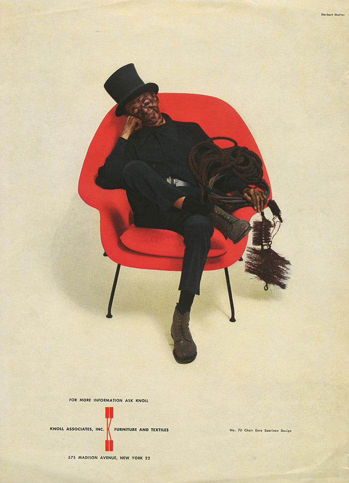
In lieu of “economy,” the company’s original selling platform, Shu wanted to recast Knoll as being at the vanguard of a new aesthetic movement: modernism. Shu decided that The New Yorker would provide a suitable arena for public opinion, and allotted a portion of the company’s marketing budget toward those pages. “Then I started to do the ads,” Matter remembered, “whatever was most needed—what Hans wanted to present first, I did.” In 1947, what Hans wanted was to sell Eero Saarinen’s recently completed Womb Chair.
“The best of Matter’s ads have a way of sticking in the mind.”
—Eric Larrabee
“Chimney Sweep” advertisement for Eero Saarinen's Womb Chair. Photography by Herbert Matter. Image from the Knoll Archive.
The first of Matter’s advertisements, the Chimney Sweep, was a contentious one. Depicting a soot-ridden worker seated in a plush red Saarinen Womb Chair, the image was intended both to appeal to a broad base and to advertise the fabric’s durability. Esther Haraszty, in charge of the newly-formed KnollTextiles department, claimed the idea was hers, although Matter said he had arrived at the idea at a railroad station in Basel. (Larrabee notes that given the informality of the office, both explanations are plausible.) Furthermore, Shu, who had originally championed Matter to Hans, hated the work, as she felt it to be undignified. Hans, on the other hand, loved it. Shu ultimately capitulated and the advertisement went on to run in The New Yorker for thirteen successive years. Explaining its success, Larrabee concluded, “The best of Matter’s ads have a way of sticking in the mind.”
“It has that timeless, unerring quality one recognizes instinctively. It speaks to all tongues, with one tongue. It is uncomplicated, to the point, familiar, and yet unexpected. Something brought to light, an image, a surprise, an analogy. It is believable, as it is unbelievable.”
—Paul Rand
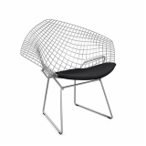
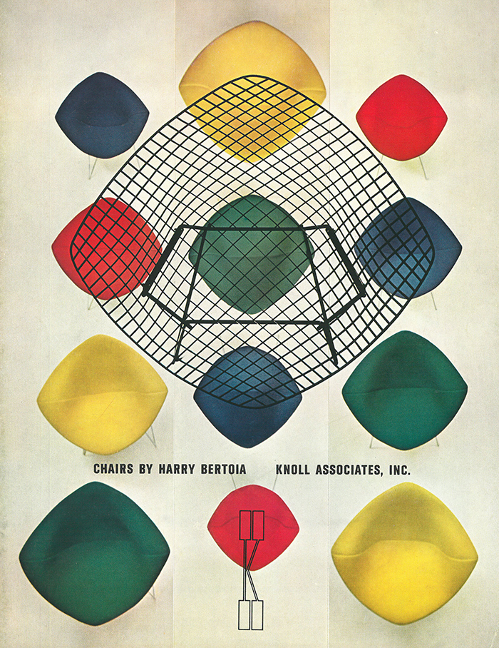
Herbert Matter graphic advertising the Bertoia Diamond Chair by Harry Bertoia. Photography by Herbert Matter. Image from the Knoll Archive.
At the time, the company’s small size afforded Matter an unparalleled degree of creative freedom. “I [would] start to take pictures for a catalogue, [and] whatever we liked from the pictures we used for the ads, too,” Matter explained. Fond of a hands-on, highly-manipulative approach to image-making, Matter saw his Rolleiflex camera as a means of salvaging both documentary and imaginative source material to work with. These arresting images would be overlaid with others, and then combined with equally dramatic typefaces to make a powerful composite image unlike anything the public had been exposed to prior. “To watch him was unbelievable,” Esther Haraszty remembered, “cutting things out and putting them together and experimenting.”
“To watch him was unbelievable—cutting things out and putting them together and experimenting.”
—Eszter Haraszty
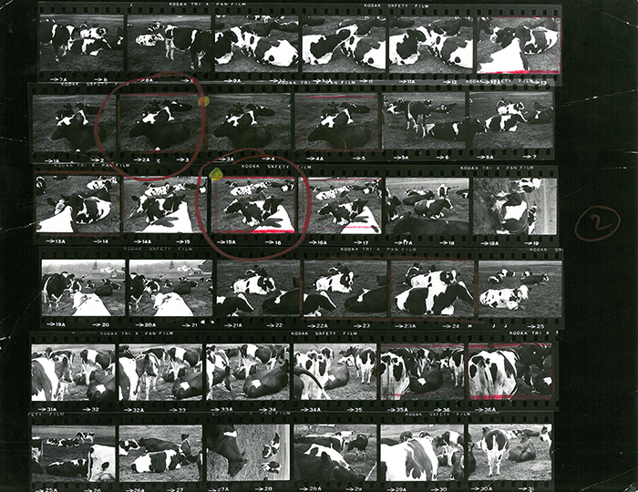
A contact sheet Matter produced while working at Knoll. Photography by Herbert Matter. Image from the Knoll Archive.
Matter’s method was one of near-total control. A darkroom perfectionist, he pioneered many techniques now standard in the industry, such as overprinting—where an image extends beyond the visual portion of the frame—while demonstrating the potential applications of others, such as negative retouching, cropping, enlarging and light drawing. Yet, as his Kodak contact sheets reveal, Matter would exhaust numerous rolls of film before settling on a base image to work with.
After this initial period of productivity, Matter remained with the company for another eighteen years, until 1966, when he left to work on a self-published book about his friend the sculptor Alberto Giacometti. (He also directed a movie on the sculpture of his friend and neighbor, Alexander Calder, for the Museum of Modern Art.) During his tenure at Knoll, Matter created countless compelling graphics for KnollStudio and KnollTextiles, many of which appear as fresh today as they did when they were first published. Fellow graphic designer Paul Rand celebrated the timeless quality of Matter’s work in his “poem” written for the 1977 Yale Exhibition catalogue commemorating his career:
Herbert Matter is a magician.
To satisfy the needs of industry, that's what you have to be.
Industry is a tough taskmaster.
Art is tougher.
Industry plus Art, almost impossible.
Some artists have done the impossible.
Herbert Matter, for example.
His work of '32 could have been done in '72 or even '82.
It has that timeless, unerring quality one recognizes instinctively.
It speaks to all tongues, with one tongue.
It is uncomplicated, to the point, familiar, and yet unexpected.
Something brought to light, an image, a surprise, an analogy.
It is believable, as it is unbelievable.
It always has an idea, the one you almost thought of.
It may be formal or anecdotal, full of sentiment, but not sentimental.
It is commercial; it is contemplative.
It enhances the quality of life.
It is Art.
—Paul Rand