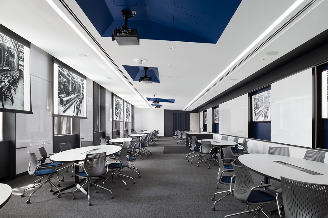
 When the University of Pennsylvania School of Engineering and Applied Sciences set out to renovate its library stacks, the project involved a complete rethinking of its interior in order to realign the space with a more contemporary pedagogy. Renovated by Brooklyn-based architecture practice Studio Modh to facilitate an active learning environment for large groups of students, the Forman Active Learning Classroom uses simple but highly effective design strategies that result in a room built to last.
Drivers
Introducing New Functionality While Celebrating the Original Architecture
The classroom sits within the historic Towne Building on UPenn’s engineering campus, lined on one wall by large windows that overlook the stately red-brick Hayden Hall, the university’s original dental school. Since generous amounts of daylight flood the classroom through its windows, the designers made sure their interventions would completely maintain the dimensions of the openings.
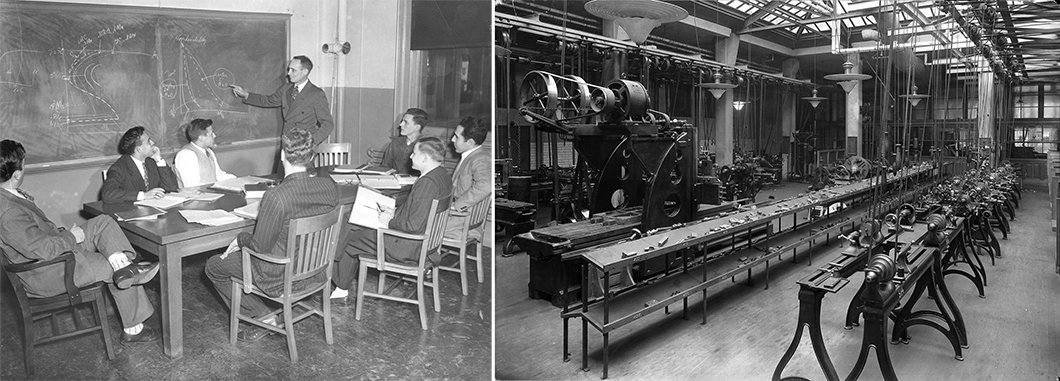
The classical vernacular of the building is also evident in its marble wainscoting and long corridors. While the existing space of the Forman Active Learning classroom had been previously divided into segments, the architects restored it to its original undifferentiated form. The unfragmented space echoes the original engineering workshops of the early twentieth century, continues the open atmosphere of the adjacent corridor, and ties the new project to the history of the site.

The ceiling of the classroom is subtly sloped to amplify the effect of natural light. Extendable projector screens are subtly integrated into the ceiling, available for use when needed without always blocking the existing windows.
Fostering a Culture of Active Learning
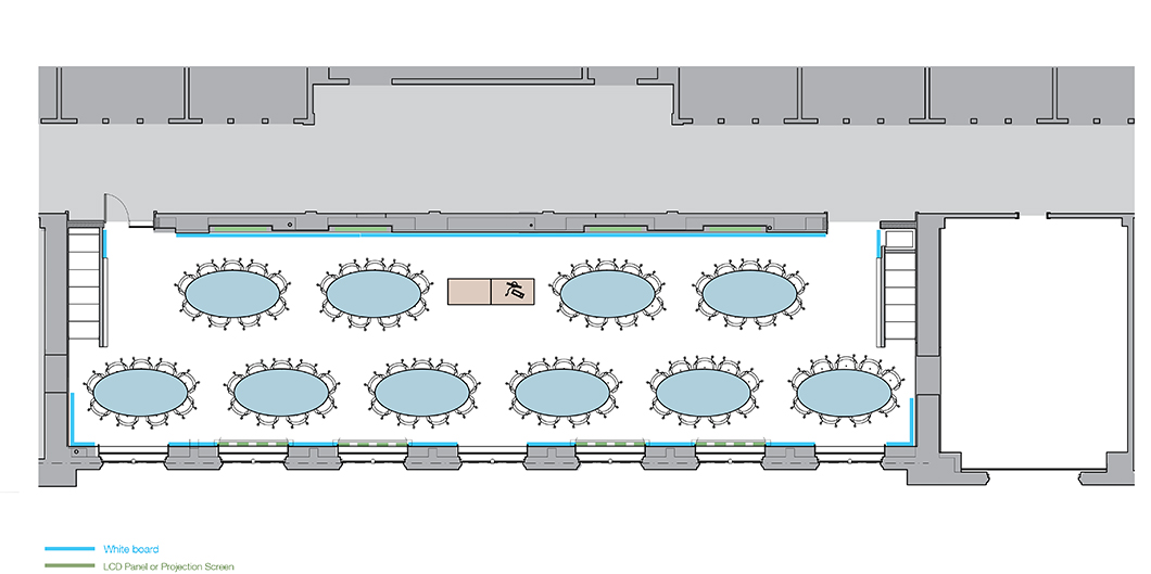
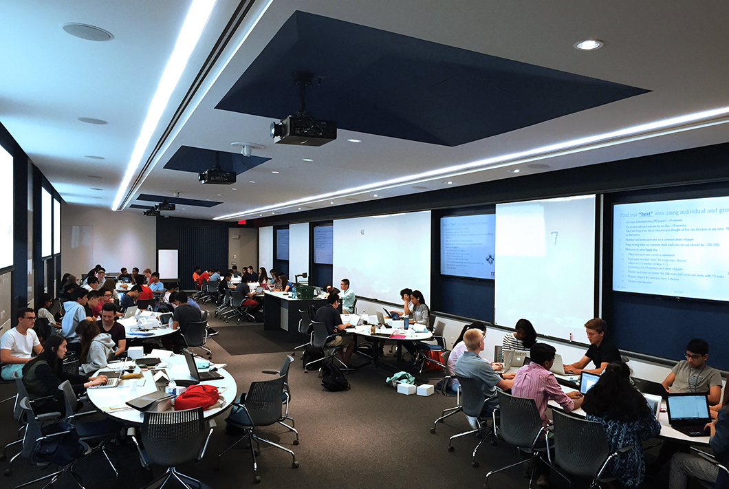
“Finding the ‘unobserved artifact’ of a space enables the design to amplify an inherent forgotten or under‐utilized strength,” noted Brooklyn-based architecture firm Studio Modh. The design thus uses the simple dimensions of the original space to create an environment of Active Learning, its vastness allowing for a special configuration of tables that can each seat nine people.
Funded by Richard D. Forman, a managing partner at the Health Venture Group and an alumnus of the Penn Engineering School, the room seeks to revise notions of the traditional lecture hall or schoolroom. “The traditional classroom layout is outdated,” Forman said. “The Active Learning Classroom is envisioned to be a dynamic and engaging technology-enabled classroom; it moves away from the traditional lecture and lab model towards a collaborative teaching environment.”
Active Learning promotes deep engagement with learning materials and involves group activities and in-class dialogue, an atmosphere reminiscent of a banquet hall. “A key element of Active Learning is that students work in groups of three, situated at larger tables of six or nine for larger problem‐solving,” the architects explain. “This numerical distribution is one that has been carefully studied so as to maximize social interaction, enhance learning, and encourage problem solving.”
Not Just a Classroom
Despite the specific pedagogical goals set forth by the engineering school, the designers were determined to create a space that could be utilized for a range of programs outside daily class time. “A big challenge is not allowing specificity of the task to overwhelm the ability to create a good interior,” said Philip Ryan of Studio Modh. “Other Active Learning classrooms I visited, you walk in and say, ‘Oh, it’s a class.’ We wanted to create a space with latent use that could be used in a more open, complicated way.”
Part of the task of designing the classroom was making sure it was not limited to its definition. “Early on, the group emphasized the need to create a space that would not feel like an ‘empty classroom’ when not in use,” the architects noted. “Instead, the group sought to create a dignified space that would encourage informal student use as well as enable the school to hold large scale events and meetings. Thus, flexibility without losing sight of dignity was important.”

The architects envisioned their design as a return to a historic workshop model, where instruction is an intimate group-based experience but takes place within a vast, inspiring space.
Tactics
Furniture Follows Function
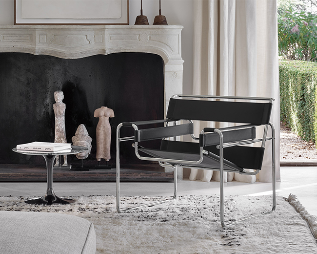
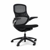
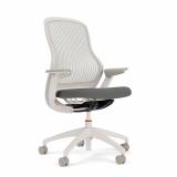
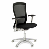
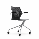
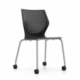
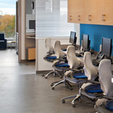
The architects chose select products from Knoll for their universality, timelessness, and quality construction. MultiGeneration by Knoll® chairs were chosen for the classroom for their “ergonomic, understandable” appearance, a design with “nothing superfluous.” The sleek form of the chair suitably addressed the challenges that resulted from the long, narrow dimensions of the space.
“The MultiGeneration chairs were the ideal balance of quality, clarity, and comfort,” the architects said. “The chrome legs added a subtle degree of refinement and the color palette fit within the developing gray, white, and navy aesthetic that the team was arriving at for other materials.”
“In design, details matter, and this is especially true in Active Learning classrooms, where shape and scale affect the kinds of collaborations that students will have,” they elaborated. “If you can see your partner in your peripheral vision, you’re more likely to engage with them and collaborate. A round table shape is thought to create more distance because of its width.”
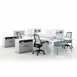
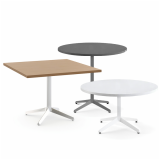
For the worksurfaces, Studio Modh worked with Knoll to create custom Dividends Horizon® tables with elliptical table tops after conducting several studies of sightlines and body language. The special leg configuration of the tables allows the chairs to move around freely while preventing “knee bumping”—a subtle but critical factor in the design of an Active Learning environment, in which students must frequently maneuver around tables during group activities.
Tailored Technology, Directed Daylight
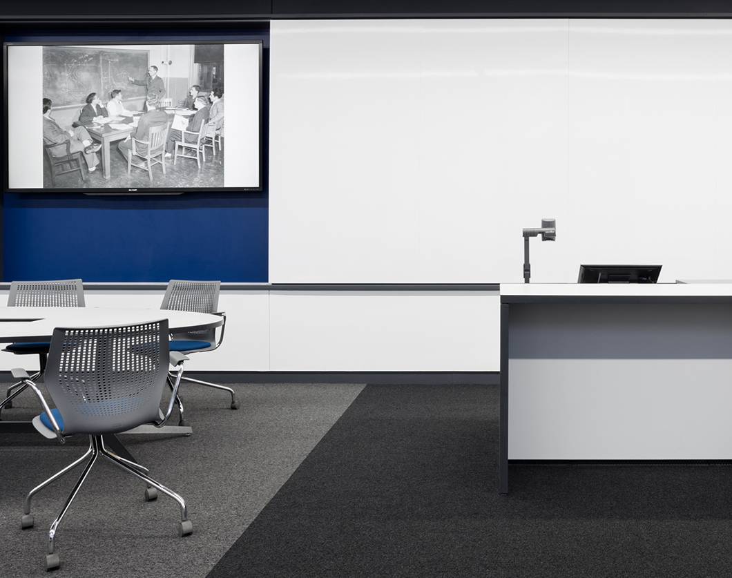
After the layout and dimensions of the tables were settled upon, the architects extrapolated the remaining design decisions. LCD televisions, projectors, and screens were positioned to optimize the sightlines of students sitting at desks. Fitted into “active walls,” they can be removed or hidden from view when not in use. “We used custom trays and recessed the televisions into the wall so that technology wasn’t part of the aesthetic unless it was needed—all adding to the versatility of the space,” noted Ryan.
As most of the infrastructure was integrated into the ceiling, Studio Modh worked to quieten the visual impact of the technological elements, through choices in color, material, and placement. “Lighting, sensors, cameras, and speakers were carefully managed and organized to ensure they did not impede the visual clarity of the large pitched ceiling plane,” the architects noted. “This plane also reflected indirect light into the tables furthest from the windows.”

Mobility and Material
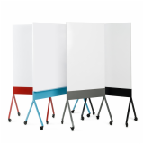
Studio Modh chose Scribe® mobile markerboards to include in the classroom as complements to the 1200 square feet of magnetized whiteboard wall space. Since one end of the room is dominated by large windows, Scribe became the perfect fit, in its flexibility and mobility. While the color palette and aesthetics of Scribe match the muted tones and blue accents of the space, they can also be easily stored out of sight, in specially-sized closets at either end of the room.

Amidst the collaborative tables, a work-table height “super-podium” sits at the center of the room, allowing students to approach and engage with the instructor in a more informal manner.
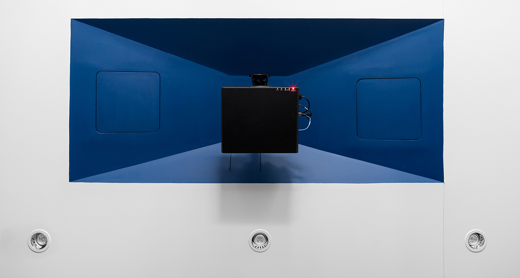
Scribe was just one means of creating a dynamic interplay of three-dimensional and flat surfaces within the room. Considering colors and textures, the architects selected a “quiet but durable” set of materials that continues the minimal elegance of the marble dados at the classroom’s entrance. The ceiling is comprised of an acoustic plaster, punctured at regular intervals by deep blue recesses for the hanging projectors. The walls similarly alternate between white glass boards, televisions screens, and painted sheet rock. The stone tiles at the entrances of the classroom ease students’ transition into the busy corridor, while the two-toned finishes of the Dividends Horizon table tops round out the palette of the entire room.

Large, varied, sculptural recesses collect the required access doors for the infrastructure, reduce the visual impact of projectors, and interrupt the formal cadence of the room established by the large south facing windows.
Outcomes
Smooth SAILing With Heightened Student Engagement
“We really try to shape the space around the particular needs of the client,” Ryan explained to Knoll. In this case, the specific requirements of UPenn’s SAIL (Structured, Active, In-Class Learning Program) initiative determined not only the architecture of the room, but its furniture and technology as well.
The result is an immersive environment that is undeniably conducive to engaged, participatory work, an answer to the clients’ philosophy of learning-by-doing. The thoughtful design of the classroom has made it a frequently used space of instruction and learning for professors and students alike, uniquely suited to accommodate small clusters in classes with sizeable enrollment numbers.
The Active Learning environment has proved so successful that the university has initiated the construction of a second classroom, with potentially more in the years to come.

When the classroom is in use, its tables come alive with the sound and movement of students tackling tasks. The space allows groups to work intimately while remaining alert to instructional material provided by technology inbuilt into the surrounding walls. Scribe® mobile markerboards are similarly used to encourage participatory learning, but can be stored in a closet when not in use.
A Second Life After Hours
The bespoke nature of the design did not preclude it from transcending its status as a classroom. The decision to restore the space to its original dimensions makes it an ideal venue for lecture, panels, and events that take place in the evening, wherein Knoll MultiGeneration chairs can be easily rearranged as seating for audiences. Similarly, the robust technological amenities of the room permit its use for multimedia presentations and screenings. Even when not booked for special events, the space is often buzzing with students in informal study groups, using the afterglow of active learning to tackle their reading and problem sets together.
In Dialogue with a Historic Building Envelope
Studio Modh was careful about retaining the integrity of the neoclassical engineering building while simultaneously introducing unprecedented functionality to the classroom. When new technology was inserted, the designers invoked effective aesthetic flourishes: “projectors, required to be exposed and suspended from the ceiling, are visually absorbed within sculptural dark forms.”
The juxtaposition continues with the keen selection of Knoll design, each product injecting a distinct modernity to the room, while echoing the palette and sophistication of the original space. “Furniture is in conversation with the architecture,” Ryan said. “No less and no more.”
• • •
Project Team
Knoll: Knoll, Inc., Philadelphia
Knoll Dealer: Corporate Facilities, Inc.
Architectural and Design Firm: Studio Modh
Photography: Devon Banks
