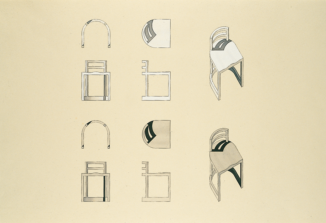
In the 1970s, the modernist architect Richard Meier designed a chair for the Guggenheim Museum in New York. Meant for the small reading room tucked just off the rotunda of Frank Lloyd Wright’s spectacular design, the chair was itself a curved composition of lines in space, a succinct reduction of Meier’s own architectural work.
Seeing promise in his design, Meier brought the chair to Knoll to see if it could be taken further. The company accepted, and the resulting collection formed, as Vice President of Design Jeffrey Osborne described it, a “whole vocabulary of furniture around the chair.”

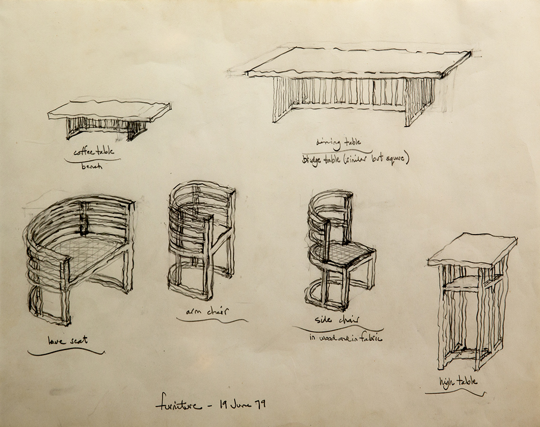
Drawing for a chair in the Richard Meier Collection. Image from the Knoll Archive.
Introduced in 1982, the Meier Collection is in many ways analogous to the formalist brand of modern architecture championed by the designer. By then, Meier was already one of New York’s most acclaimed architects, famous for the expressive clarity of his designs and an unapologetic love of the color white.
In a review of the collection just after its release, architectural critic Paul Goldberger debated the legacy of modernism within the realm of furniture design: “It is difficult for the designer of furniture working today to know how to treat the modernist tradition,” he wrote. “Should he view it as a great epoch of the past, noble in its way but clearly over? Or should he think of it as a developing esthetic, its era of shocking newness ended but its potential still not fully realized?”

Axonometric drawing for the Richard Meier Collection. Courtesy Richard Meier & Partners archive.
In the case of the Meier Collection, the epoch of modernism was firmly deemed still alive. And yet, by combining the woodwork of traditional American craftsmen with his own contemporary style, Meier came up with a collection that spoke of the past, present and future all at once. And having designed built-in pieces as part of his larger architectural commissions, Meier’s previous work in furniture was always a clear extension of the modern architecture that his tables and chairs were meant to sit within.
Furniture has always been an integral part of each space I design. I see it as yet another means by which the space can be shaped and manipulated.”
—Richard Meier

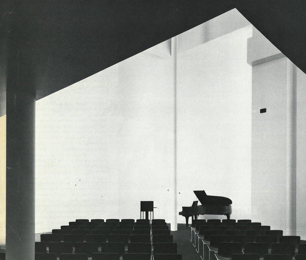
Richard Meier's chapel in the Hartford Seminary. Courtesy Richard Meier & Partners archive.
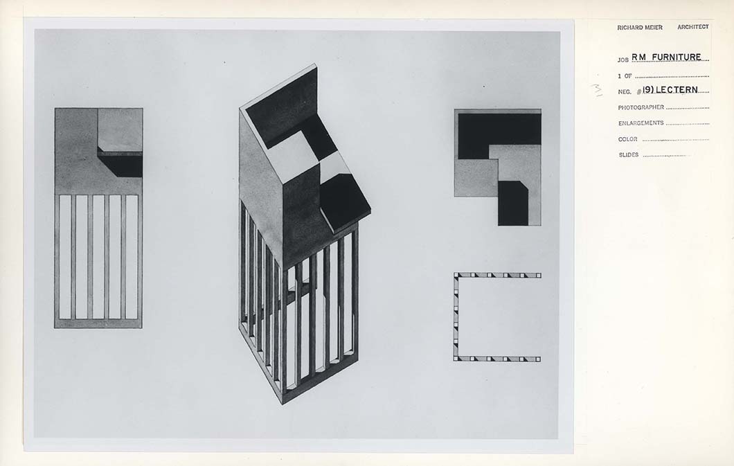
“Furniture has always been an integral part of each space I design,” he explained. “I see it as yet another means by which the space can be shaped and manipulated.” For his 1972 design of the Hartford Seminary, for instance, Meier included a bespoke lectern for the chapel, comprised of the same cubist shapes and graphic lines that would also characterize his furniture collection for Knoll.

Lectern by Richard Meier. Courtesy Richard Meier & Partners archive.
Speaking about his chair for the Aye Simon Reading Room, Meier noted: “In many ways the chair developed in the manner of a work of architecture. The simple idea of the chair emerged from a double cube, one on top of the other. The bottom, from the seat downwards, is carved out of the lower cube; an upward extension, the curve of the arms, is formed from the implied upper cube.”
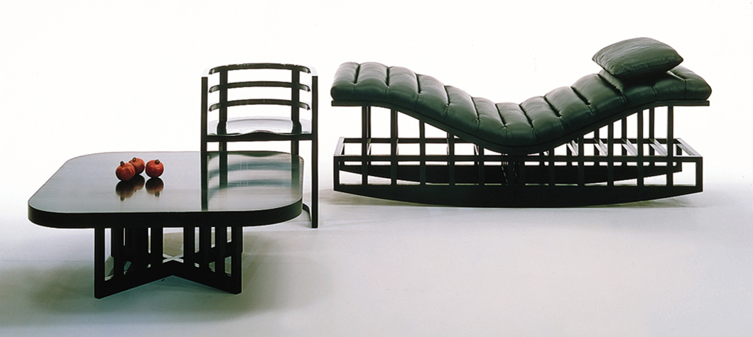
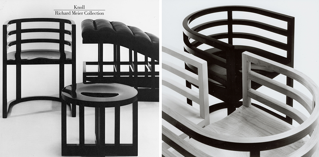
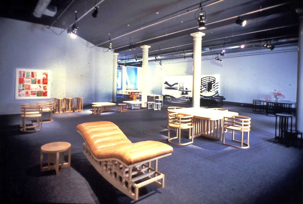
The architect began to adjust the proportions and dimensions of his original design in order to separate it from its use as a reading chair and allow it to assume “a more universal application.” The result was an undeniably beautiful series of furniture that included side chairs, a rocking chaise lounge, and a several tables—each piece the result of Meier’s hallmark knack for structure, logic, order and grace. The designs were constructed from solid maple and were either left natural or meticulously lacquered in black or white.
In many ways the chair developed in the manner of a work of architecture. The simple idea of the chair emerged from a double cube, one on top of the other.”
—Richard Meier

Early sketch for the Richard Meier Collection. Courtesy Richard Meier & Partners archive.
The collection only served to bolster Meier’s reputation as a pure modernist, an architect that stuck to his roots and opted out of the prevailing architectural fads. “In my product designs, as in my architecture, I adhere to a modernist vocabulary, focusing on proportion, scale, and the manipulation of basic, strong geometry,” he said. “Working on the design of furniture and objects for daily life I am conscious of participating in a tradition of designing for what might be considered a complete lifestyle.”
As Goldberger noted in his review, the Richard Meier Collection bore clear traces of Frank Lloyd Wright and Charles Rennie Mackintosh, albeit “crisper and more disciplined” in its use of vertical slats and horizontal tiers as supports. “Meier's furniture is beautiful in a way that seems to sum up the different aspirations of the modern movement, from Wright's emphasis on materials to Mackintosh's sense of proportion and scale to the International style's air of cool self-assurance,” Goldberger concluded.

Brochure for the Richard Meier Collection. Image from the Knoll Archive.
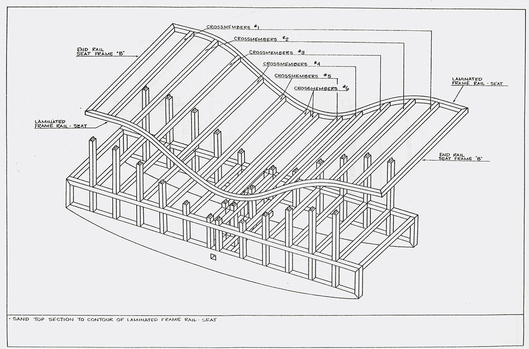
The chaise lounge, in particular drew praise for its undulating structure and elegant finish, an exemplar of “quality of construction and pure design.” Big enough to fit two people on its upholstered seat, the symmetrical chaise could be used in any direction, and its base formed an intricate wooden grid that was perhaps made it the apotheosis of the entire collection.

Technical drawing for the rocking chaise. Courtesy Richard Meier & Partners archive.
But despite its clean lines and composed forms, the Richard Meier Collection—and its development—was not as seamless as it may have appeared. Sharing the irony of many modernist architectural projects, the collection, for all its outward simplicity, was the result of a more complicated manufacturing setup. Unlike other furniture from Knoll at the time, Meier’s designs were not fabricated at the company’s own factory, but at the shop of a local woodworker about one hundred miles away.
Outsourced to the small workshop of John Martin, a skilled craftsman from Ephrata, Lancaster County, the designs required experiments in more traditional methods of woodworking. “The Meier furniture was odd enough to raise local eyebrows, but Martin’s been in business for 20 years here, he’s well established and highly regarded,” reported John Kelsey in a 1983 article for Fine Woodworking magazine. “He’s very happy to be working with Knoll, for the job has allowed his shop to grow in ability as well as in size.”

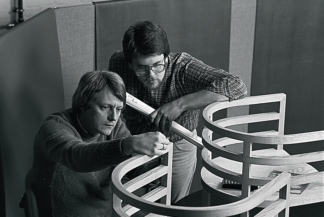
Knoll associates working on the Richard Meier Collection. Image from the Knoll Archive.
Initially, the chairs were to be constructed in a process called steambending, part of the “grand tradition of bentwood chairs”—but this was eventually considered too imprecise and expensive. The final process of putting together the chairs nevertheless involved painstakingly slow handwork. Using a bending jig, Martin would glue together the many horseshoe parts that made up a chair, with each part consisting of up to 17 layers of thick maple veneer.
Martin’s expertise in the methods required to produce Meier’s slick designs made it the favored location for fabrication, as opposed to the Knoll factory in East Greenville, where compromises would have had to be made in order to produce the designs in such small quantities. At the time of its release, the Richard Meier Collection was not available for general purchase, but only through designers or decorators.

The Richard Meier Collection at the Knoll showroom, 1982. Courtesy Richard Meier & Partners archive.
"Working with Knoll has been a wonderful experience," Meier said, recalling the design collaboration with Jeff Osborne and the design development team. "I had made prototypes of my custom furniture before, but found the change from that to manufacturing for sales to be enormous. Knoll has been conscientious from the start about preserving my design aesthetic. The necessary changes never affected design ideas—just manufacturing properties, or developing new ways for finishing or construction. Knoll is very careful to preserve the traditions of fine furniture craftsmanship. Every connection is a mortise and tenon, one of the most precise ways of joining wood furniture."
Knoll is very careful to preserve the traditions of fine furniture craftsmanship. Every connection is a mortise and tenon, one of the most precise ways of joining wood furniture.”
—Richard Meier

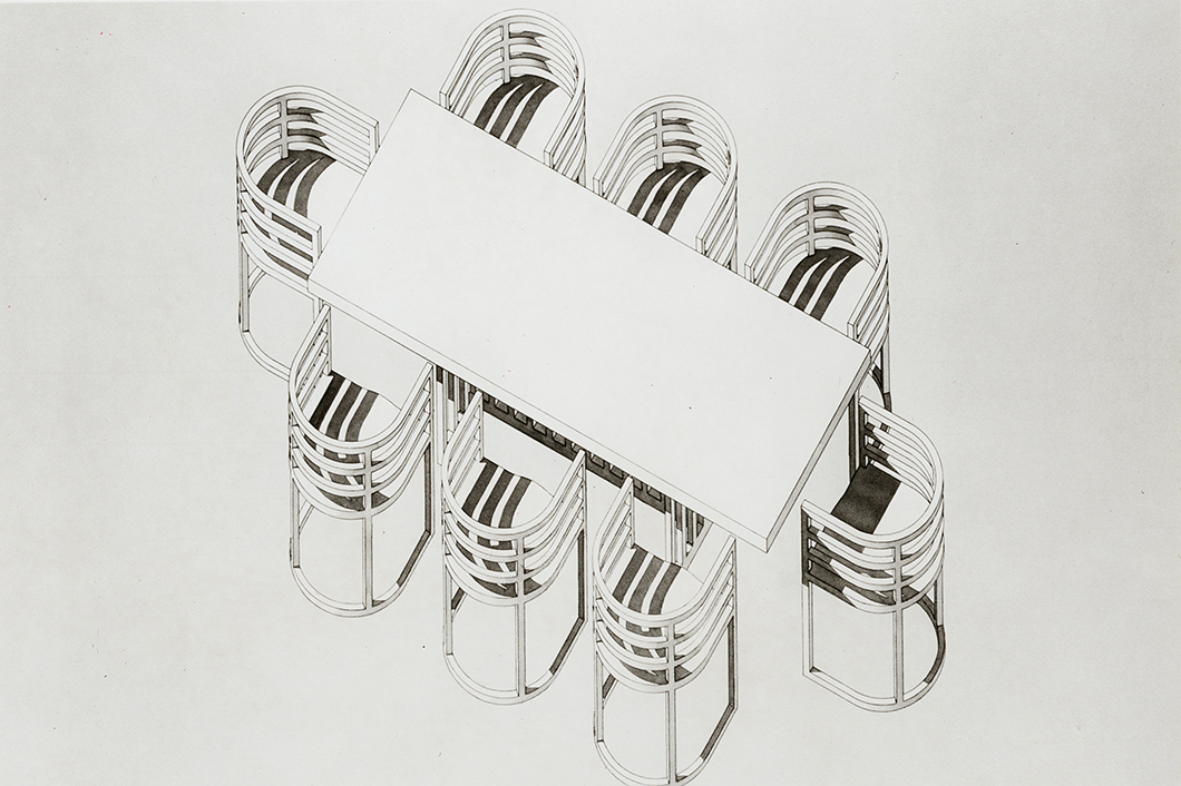
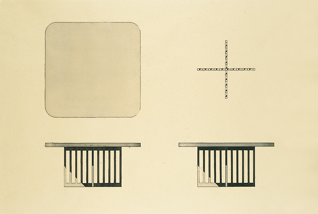
Drawing for a table in the Richard Meier Collection. Image from the Knoll Archive.
But despite the handsome outcome, Richard Meier’s expressly modern furniture once again succumbed to modernism’s tragic flaw—its ultimate usability. The designs, for all their beauty, were deemed by critics to result in a slightly uncomfortable sit—or, as Goldberger put it, “not quite what the orthopedist would recommend.”
It seemed that even Meier was aware of the one crucial shortfall in his design. Speaking about his daughter to The New York Times years later, the architect said, “The furniture she’s designed I could never do because it’s very comfortable. My furniture is uncomfortable. I’m more concerned with what it is as an object.”
