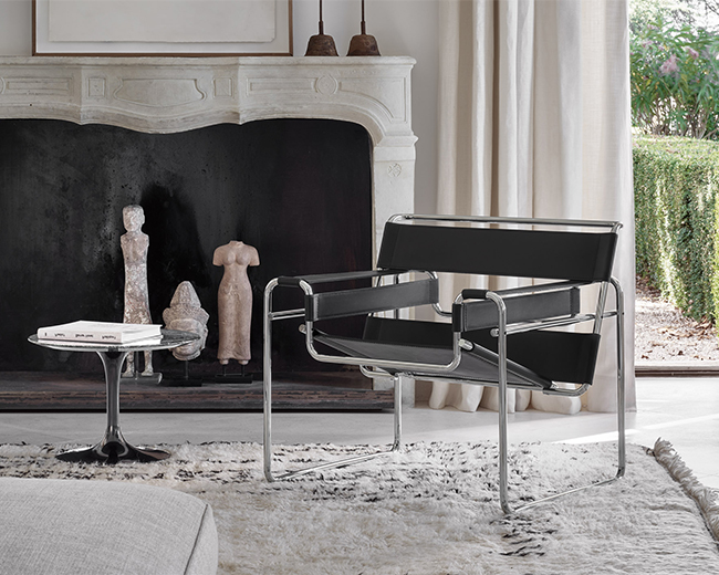
The title of a new exhibition at the Museum of Modern Art in New York poses a question that has plagued designers from time immemorial. In the context of the interior, the question of how we should live can be split even further: How should we sit? How should we eat? How should we relax? How should we work?
In attempt to address these questions without providing a definitive answer, curators Juliet Kinchin and Luke Baker set up a series of vignettes that represent historic experiments in interior design. Among them are several designers and works from the Knoll constellation—the woodwork of George Nakashima, the geometric textiles of Anni Albers, the furniture and spaces of Mies van der Rohe and Lilly Reich, the shell form chairs of Eero Saarinen, and the pioneering showroom designs of Florence Knoll and Herbert Matter. Tying the many elements in the exhibition together is the unwavering desire of mid-century modernists to push the potential of design to its furthest limits, a commitment that remains potent after decades. Knoll Inspiration met with the organizers of the show to discuss exhibition design, the role of the museum, and the influential networks of mid-century women designers.

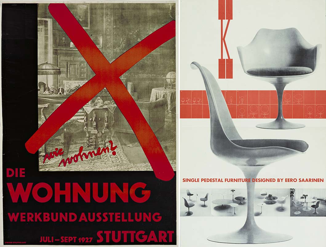
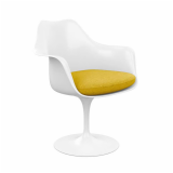
Left: Willi Baumeister. wie wohnen? Die Wohnung (How Should We Live? The Dwelling) Poster for the Deutsche Werkbund exhibition at the Weissenhofsiedlung, Stuttgart, Germany. 1927. Right: A Herbert Matter poster for the pedestal furniture designed by Eero Saarinen for Knoll c. 1957. Courtesy of the Museum of Modern Art.
Knoll Inspiration: The show was conceived around select vignettes of interiors. Why did you choose to include the 1948 Knoll New York showroom and what part does it play in this spectrum of interior design?
“How one extends technological innovation, new materials, and innovation to the widest possible constituency—these are ideas that have been fundamental to the founding educational mission of MoMA.”
—Juliet Kinchin
Juliet Kinchin: All the materials are drawn from the collection, and Knoll has been a very important part of MoMA’s history and collection development. The whole concept of an integrated approach to architecture and design, modern thinking about new ways of living, and how one extends technological innovation, new materials, and innovation to the widest possible constituency—these are ideas that have been fundamental to the founding educational mission of MoMA. The museum was just opening its doors at the end of the 1920s when there was an international focus amongst architects, designers, and manufacturers on new concepts of “how should we live?” And that’s the burning question.
We take part of the title from an exhibition that took place in Stuttgart at the Weissenhofsiedlung in 1927. Philip Johnson, who brought back this poster from the Stuttgart exhibition, was still a student when he went there. But I think he was very engaged—as was Alfred Barr, the founding director of MoMA—in new concepts of the interior, so this whole subject area is a very natural fit with MoMA and its collections. We're focusing on three decades, from the late 1920s to the end of the 1950s, when experimentation and idealism was at its most intense.

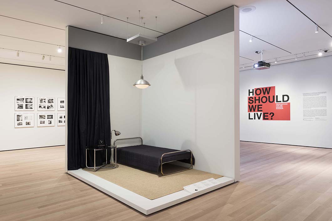
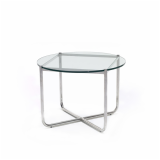
A recreated vignette of the bedroom in Philip Johnson's apartment, designed by Mies van der Rohe and Lilly Reich, featuring the 1927 MR Table. © 2016 The Museum of Modern Art. Photo: Martin Seck
The act of absorbing these objects into a museum collection is an authoritative one, in some ways shaping the answer to the question of “how should we live?” What is the museum's role in determining what our domestic spaces look like?
JK: I think MoMA’s mission has remained consistent—the idea of art as a transformative agent that can inspire, that can open us up to new ways of thinking, and show us the relevance of art to our daily lives. In the field of architecture and design, of course, that is done in a very applied sense. But we also wanted to get across the sense that these are propositions. This isn’t an exhibition about how people generally lived, but it was about choosing nodal points where we felt there was a network of people trying to transmit a new proposal.
So they’re less answers and more hypotheses.
JK: Yes, and obviously some were more immediately successful than others. But one of the things that defines the modern interior is the way it is mediated through temporary exhibitions, a new flood of print material—magazines, printed advertising—and increasingly, through film and television. Of course, it’s not just about designers working in isolation, but the connection with manufacturers and retailers like Knoll. In fact, the showroom is a very important way of putting those propositions out there in public. That’s why these vignettes take slightly different forms—in some cases, it’s designers’ own living environments, while others relate to exhibitions.
“You can see these spaces as natural emanations from the human form. And they do, in a sense, clothe us.”
—Juliet Kinchin
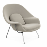
The description of the Womb Chair on display states that its name comes from Eero Saarinen’s claim that humans have been uncomfortable ever since they left the womb—so it offers a return to a sort of fetal state. Can we think of domestic interiors similarly? Are they meant to be protective, womb-like spaces?
JK: The other exhibition currently on view, which also relates to the theme of “how should we live?” is entitled Insecurities, and that’s about the fundamental, universal need for shelter and security. And that’s something we all need. But in a more psychoanalytic way, you can see these spaces as natural emanations from the human form. And they do, in a sense, clothe us. It’s not just the clothes we wear, but the way we clothe our immediate environments.

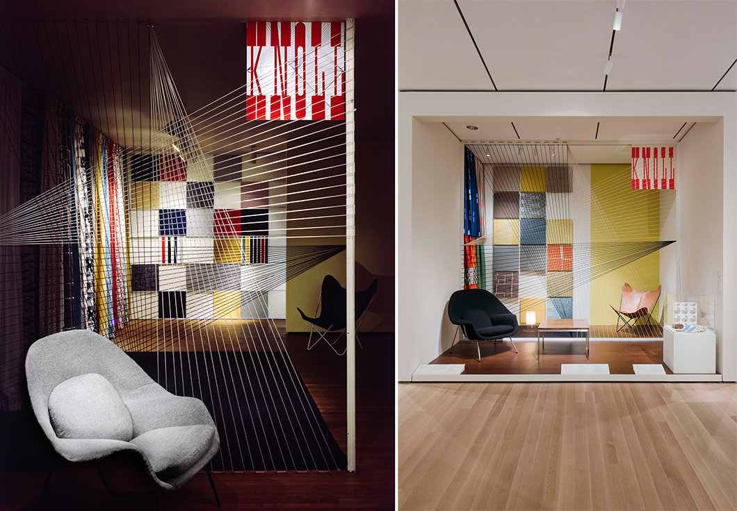
Left: The 1948 Knoll showroom in New York, designed by Florence Knoll and Herbert Matter, with Jorge Ferrari Hardoy's butterfly chair and a prototype of Eero Saarinen's Womb Chair. Right: A recreated vignette of the showroom at the Museum of Modern Art. © 2016 The Museum of Modern Art. Photo: Martin Seck
I want to ask about the practicalities of recreating the 1948 Knoll showroom. What was the process like? Where did you start, and were there any big obstacles?
As I said, our starting point was the collection. With this installation, we had to spend time working out the relative proportions of the screening elements and the textile grid, and we were helped by the way it had been so beautifully photographed. In fact, it was published in 1948 with very helpful verbal descriptions and layouts. You’re always working from multiple sources, related documentation, and the actual objects, which often give you the lead. In a sense, they begin to group themselves once you start to try and get into the mindset of Florence Knoll and Herbert Matter.
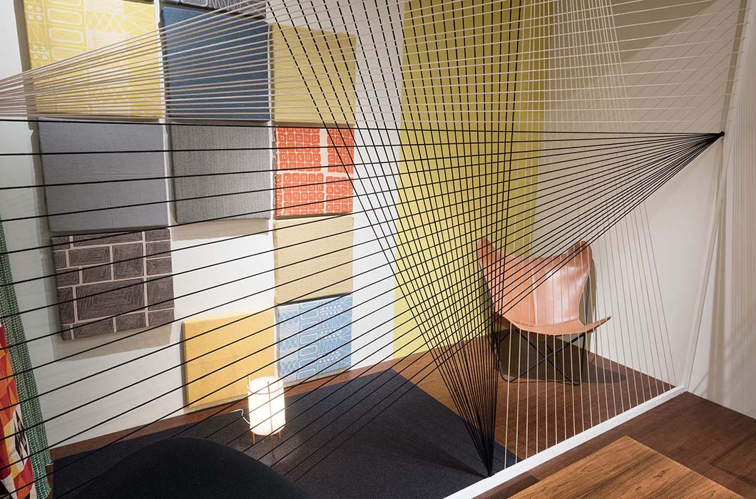
One of the things we had to consider was the relative weight of the cord—trying to get an appropriate type of cord for the Herbert Matter screening element, because we didn’t want a cord that was too wobbly or synthetic. It’s about thinking things through in minute detail and being responsive to the textures and materials and colors, not just looking at this installation but images of some of the other Knoll showrooms, some of which are, fortunately, in color.

The grid of KnollTextiles designed by Florence Knoll and the thread screening element designed by Herbert Matter in the recreated Knoll New York showroom. © 2016 The Museum of Modern Art. Photo: Martin Seck
Apart from the Knoll showroom, there is the Velvet Silk Café designed by Lilly Reich and Mies van der Rohe. Are these the only vignettes that aren’t necessarily private spaces but more public interiors?
JK: Well, that connection between public and private is continually blurred. In fact, when Philip Johnson was writing to his mother about commissioning Lilly Reich and Mies van der Rohe to redesign his apartment, he said, “this will be the best possible publicity for my style.” He saw a direct continuum between his private environment and his curatorial practice as an architect and interior designer himself. And of course, the interiors of Eileen Gray’s house, E-1047, which she built with her partner Jean Badovici, were widely published and discussed in public forums.
In a sense, all the vignettes occupy private and public spaces. The Frankfurt Kitchen was a staple of many exhibitions at the end of the ‘20s and beginning of the ‘30s, related to minimal living and to the practical kitchen. As well as being manufactured and reproduced in tens of thousands, these were kitchens used by families in Frankfurt over decades. But they were also spaces of public education.
“The Velvet Silk Café is an interesting example in that it was an immersive environment. This was the first occasion in which the public could try out those cantilevered chairs.”
—Juliet Kinchin
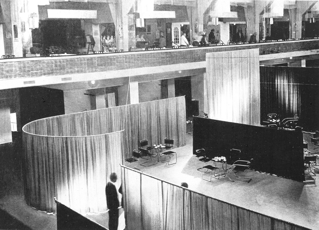
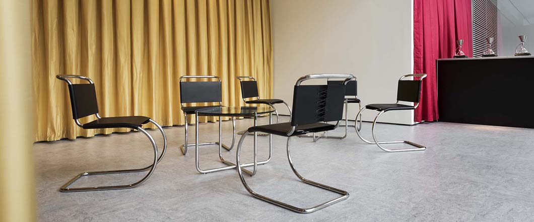
It’s also partly a case of helping people appropriate or identify with certain ideas, and I think the Velvet Silk Café is an interesting example in that it was an immersive environment. This was the first occasion in which the public could try out those cantilevered chairs. I think it’s wonderful that the public can get a sense of the smell of the coffee, the music, the textiles, the springy feel of the cantilevered chairs—you’re literally drinking in those concepts with your coffee.

The Velvet Silk Cafe, designed by Lilly Reich for the 1927 Women's Fashion Exhibition in Berlin. Courtesy of the Museum of Modern Art.
The exhibition does a great job of highlighting the contributions of women to architecture and design and it seems to avoid the danger of limiting that contribution to domestic spaces. Women like Florence Knoll and Lilly Reich were venturing out of the domestic realm with their work, but it seems like the world was coming into the domestic interior as well, if that makes sense?
JK: Yes, it’s still the case that many of the decisions about using and shaping the home ultimately resided with women. While that pattern has been shifting, it’s been centuries of women being identified with the interior space. But one of the key ideas of modernism was to bust apart those preconceptions of what is public and what is private, what is interior and what is exterior, what is masculine and what is feminine. I think the café does a particularly good job at blurring those distinctions. It shows textiles, a rather feminized material, in a very architectural role, just as Florence Knoll’s treatment of the textile samples in a grid gives them a structural, architectural role within the space. Herbert Matter’s defining of space through thread again shows this architectural role.
“We experience interior spaces in our working lives, in our travels to and from the workplace, and in our leisure activities, so it’s no longer a purely domestic experience.”
—Juliet Kinchin
We experience interior spaces in our working lives, in our travels to and from the workplace, and in our leisure activities, so it’s no longer a purely domestic experience. You’ll find many of these ideas or products spanning institutional, commercial, domestic environments. One of the things Florence Knoll has had such a major role in is developing the contract market simultaneously with the domestic one, so there is a very free flow between these different spaces.

A recreated and fully operational vignette of the Velvet Silk Cafe, furnished with MR Tables and MR Chairs from Knoll. © 2016 The Museum of Modern Art. Photo: Martin Seck.
Luke Baker: We did try to highlight the contributions of women, not just as designers, but also as patrons, curators, executives, critics—as people contributing to the discourse. They played many different roles to create this ongoing dialogue, to create notions of taste, or to politicize interior space. There are so many complex connections, whether geographical, professional, people working with each other or having visited the same sites, like the Machine Art exhibition or the Weissenhofsiedlung.
We wanted to highlight some of these intersections and refer to the ways in which these professional and personal networks allowed women to help themselves gain more footing in a male dominated industry, so we created a graphic that showcases some of that information and gives brief biographical overviews, but also indicates where these networks and connections lie. The visitors see for themselves how many names are repeated throughout the graphic, and who knew whom.
“We wanted to highlight some of these intersections and refer to the ways in which these professional and personal networks allowed women to help themselves gain more footing in a male dominated industry.”
—Luke Baker
Almost as a matter of course, we need to do some corrective cataloguing when we look at or display works, in the case of some of the competitions that MoMA ran in the ‘40s and ‘50s, or other exhibitions. For example, we had a show in 1946 on new furniture by Charles Eames. We have to reference this and explain that it was the convention that often the the male component was credited and not the female. So it’s trying to call out women in a number of different ways. But the show isn’t explicitly about women, it’s just that they are so clearly present in all of this.
JK: It’s about presenting many objects in the collection with which people will be familiar, but contextualizing them in a new way, with a slightly different slant. We snuck in, for example, a photograph of the Eames show that Luke mentioned, which shows Ray Eames looking at the exhibition—she was largely responsible for the actual design of the installation—with a cigarette, sitting out of view.

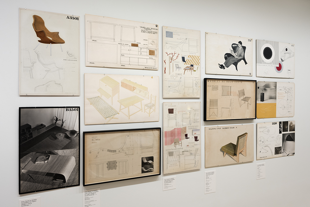
Entry panels submitted to the 1940 Organic Design in Home Furnishings, International Low-Cost Furniture Design, and Lamp Design competitions held by the Museum of Modern Art, including joint submissions by Eero Saarinen and Charles Eames (extreme left). © 2016 The Museum of Modern Art. Photo: Martin Seck.
Lastly, I want to talk about the Good Design competition that MoMA ran in the 1940s, to which Eero Saarinen and Charles Eames submitted a joint proposal for molded shell armchair.
JK: That was the competition for Organic Design in Home Furnishings. Suddenly, that was the competition that launched the careers of both Saarinen and Eames. We wanted to reference that in competition panels, but show the direct relationship with [the Eames'] work from the ‘50s featured at the other end of the gallery, or with Saarinen’s work for Knoll. Florence Knoll’s furniture featured in, I think, every one of the Good Design exhibitions that ran from 1950 to 1955, including the small coffee table that we have on display. Many of the textile designers or designers like Noguchi, with whom she had a good relationship, were also stalwarts of the MoMA Good Design program and these competitions.
Ending on the present—while “Good Design” was very explicitly defined in the 1940s, do you think that the definition has changed since? Or do the criteria stay timeless?
JK: I think a lot of the values remain the same—the search for compact, economic, aesthetically satisfying spaces and products. Obviously, there have been some major materials technology and developments, with different sources of energy and utilities feeding into spaces. There’s also the impact of the digital world both on the practice of design but also on how much time people spend in a domestic environment and how they use space. But design can never be a definitive solution—it’s never about definitive typeforms.
“A lot of the values [of Good Design] remain the same—the search for compact, economic, aesthetically satisfying spaces and products.”
—Juliet Kinchin
Maybe it’s about an ideal to constantly aspire to.
JK: Yes, but I think the underpinning concepts, the values, and the idealism are still very relevant and current. It’s constantly a question of how we engage the widest possible constituency with these values, and take it beyond questions of merely style.
I think museums like MoMA have an important role, not just with our digital audience, but in presenting material reality and constellations of materials in a very physical way. Once you see the combinations of textures and subtle detailing—though you’d go mad if you were always registering these very consciously—you experience the recuperative value of interacting with a quality material or space.

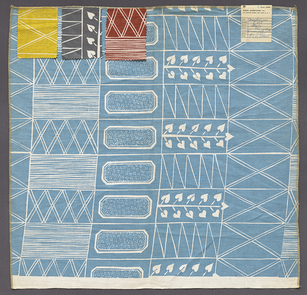
Fabric sample designed by Sven Markelius for KnollTextiles, c.1943. Courtesy of the Museum of Modern Art.
